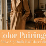
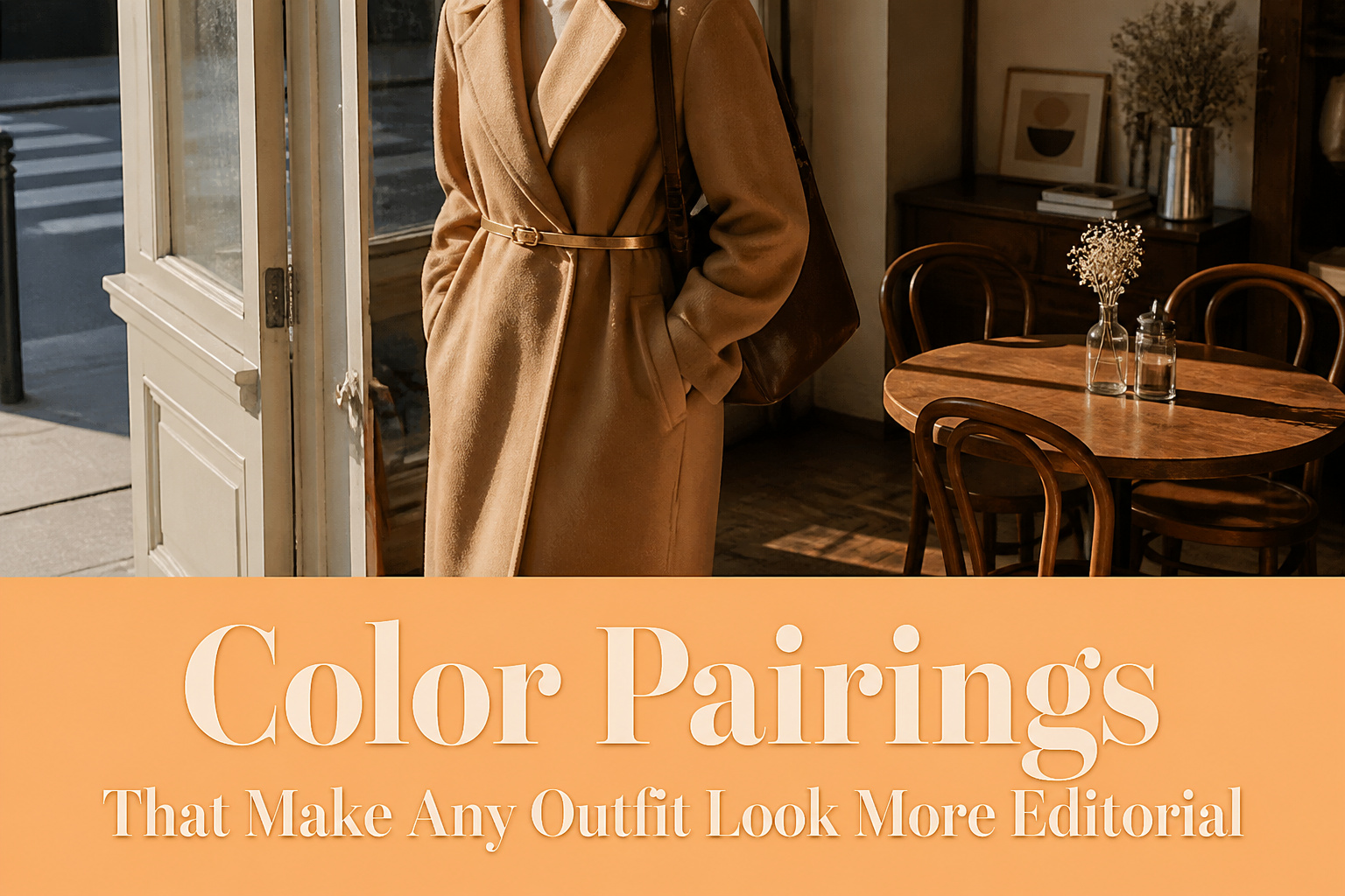
The right color pairing turns a basic outfit into something that photographs like editorial styling, but only if you control the proportions. A camel coat reads thrown-on until a thin gold belt or hoop earrings reframes it as intentional. The restraint is what makes it work.
1. Brown + Gold

Brown spent years in the outdated pile, then came back through high-end designer collections and landed squarely in the polished category. Gold is what finishes the upgrade.
The pairing works because brown anchors while gold flashes, not the other way around. Wear a camel coat and the eye registers the coat; add a thin gold belt or gold hoop earrings and the same coat reads styled rather than thrown-on. The deeper you take the brown, toward espresso, the more metallic you can handle without tipping into costume. A chocolate trouser suit with a gold chain at the neck feels luxe in a way that beige and white never quite manages.
Hardware counts here too. Brown leather with gold buckles on a boot or bag gives you the combination without buying anything gold-colored per se. That distinction matters if you build from pieces you already own: examine what brown you have, then locate one gold accent point, jewelry or metal, rather than distributing it everywhere. The restraint is what makes it editorial.
2. Blue + Yellow

Powdery, soft blue tones with yellow deliver a chic result, but the saturation balance decides whether the pairing reads editorial or garish. Muted blue belongs with mustard or butter yellow; the lower intensity on both sides lets each color register without competing for attention. Royal blue against lemon yellow does not work the same way, and I learned that the hard way when I tried a cobalt crewneck with a highlighter-bright marigold skirt and spent the morning looking like a sports mascot rather than someone with intention behind the outfit.
Denim and butter yellow has become a reliable base, though wearing it alone can read flat. Layering in slate blue adds the depth that keeps the combination from feeling accidental. The distinction is saturation, not hue name: keep both colors dusty or keep both colors muted, and the pairing builds a palette that looks purposeful rather than loud.
3. Sage + Beige

Sage and beige together read expensive in a way either color alone rarely manages. The muted green carries enough pigment to register as deliberate, while beige does the structural work of brown without the weight. In three separate styling sessions last fall, women with olive or neutral undertones looked instantly pulled-together in this pairing. Cool pink undertones, though, tended to wash flat against the beige, so olive and warm-neutral complexions get the most mileage here.
The editorial quality comes from tension held quietly. Sage has that slightly weathered, European-garden quality; beige keeps it from reading as costume. A sage silk blouse with wide-leg beige trousers gives the better shape than the reverse, since color near the face is what photographs as intention. For daytime, a beige trench over a sage knit works the same logic: the Interesting thing moves, the stable thing frames.
What breaks it is texture matching. Same-matte sage and beige look like a uniform; mixing a matte base with something luminous in the accent is what makes the pairing look styled rather than selected by algorithm.
4. Black + White

Black and white only looks editorial when white does the talking. The runways this season flooded monochrome through with white as the predominant color, and that ratio is what separates magazine-page dressing from a catering uniform. Roughly 70% white to 30% black keeps the contrast alive without turning social; the black becomes punctuation, not the paragraph.
The 50/50 split is where I went wrong for years. Equal halves flatten the eye and read as costume, not choice. A white trouser suit with a black belt and slim black loafers carries authority. A black skirt and white blouse in matched weight just carries trays.
5. Rust + Khaki

Rust and khaki sit together like they were mixed from the same tube of oil paint, and that cohesion reads as money the minute you walk into a room. The warmth in rust flatters most complexions in a way orange never quite manages; it catches light like a low sunset without tipping into costume territory. Khaki grounds it quietly, a step darker than cream, a step earthier than tan, so the pairing looks chosen rather than stumbled into.
What convinced me, paging through enough lookbooks to bore a normal person, is how this combination works across textures. A rust silk blouse against a khaki cotton trench reads editorial because the colors talk to each other while the fabrics argue just enough to keep it interesting. The trick is balance: let one color carry about sixty percent of the look, usually khaki as the base with rust as the punctuation. Reverse it and you risk looking like a leaf pile. Let khaki do the structural work, jacket or trousers, and rust shows up where you want the eye to land.
6. Pink + Red

Pink and red used to read as a mistake your mother stepped in to fix, the kind of combination that made people ask if you meant one or the other. Now it lands as one of the most directional pairings in a wardrobe, and the shift comes down to treating them as tonal neighbors rather than opposites clashing for attention. Both colors sit on the same branch of the color wheel, which means matching saturation levels matters more than matching the shade itself. A dusty rose beside a brick red looks considered and editorial; a bubblegum pink against a true cherry red still feels like two outfits arguing.
I saw this work cleanly last season with a sleeveless lavallière-neck bow top in a soft petal pink tucked into a high-waist red midi skirt. The blouse had enough fluidity to keep the look from feeling costumed, and the skirt’s deeper tone carried the weight so the eye moved down rather than bouncing between the pieces. The same pink top with a candy-apple mini skirt did not translate. The red was too bright, too flat, and the whole thing flattened into something that read junior rather than intentional. The difference was maybe two ticks of saturation, but it was the whole outfit.
A pink dress with a red logo cap, or the reverse emphasis on a blouse and midi skirt, keeps the pairing wearable from summer through winter. The color-blocking effect works on jumpsuits and mini dresses too, though I find the single-column shape of a midi skirt and fitted top most forgiving across body types.
7. Navy + Cream
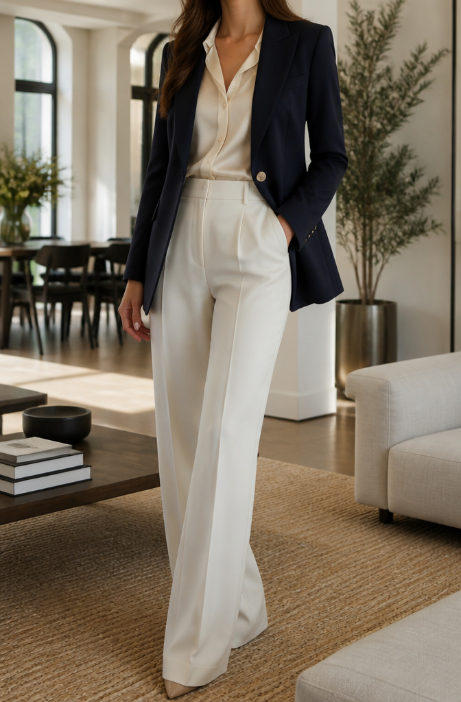
Navy and cream reads as quietly expensive in a way black and white rarely manages. The difference sits right against the skin: cream warms up most complexions where white tends to flatten or wash out, and navy carries the same authority as black without the harsh contrast that ages many women past thirty.
What I notice in fitting rooms is how cream softens navy’s severity without diluting it. A navy blazer over a cream silk blouse gives the jacket somewhere to go visually: the lighter tone breaks up the expanse so the navy looks chosen, not default. Black against white demands perfect tailoring to avoid looking like a uniform. Navy and cream forgives a softer shoulder, a slightly relaxed pant.
The pairing works lean for casual mornings too. Cream cashmere with navy denim, or a navy cotton sweater over ecru trousers, carries the same pulled-together signal without the stiffness of formal dressing. Cream makes navy look intentional; navy keeps cream from reading as merely safe.
The "expensive" effect sources note comes from this mutual balance. Neither color overpowers, neither apologizes. For women building closets that rotate between work presentations and Saturday coffee runs, that versatility is the point.
8. Orange + Stone
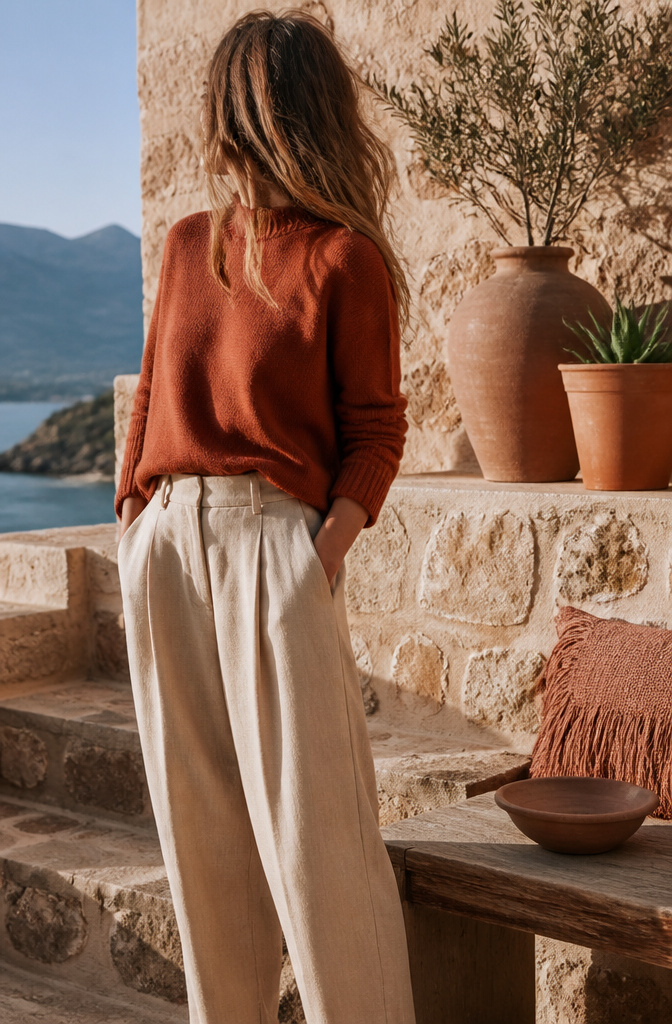
Orange landed hard last year and stayed put, which surprised me. I kept waiting for it to slide back into novelty territory, but the pairing that keeps it alive is stone, not white or black.
The orange that works is the one already halfway to earth: burnt orange, terracotta, rust. These carry enough brown to feel like neutrals themselves. The bright stuff, the traffic-cone variants, will still read like a costume change no matter what you pair them with. Stone picks up the clay undertone in terracotta and lets the whole thing settle. It functions less as a contrast than as a room to breathe.
What stone gives you is permission to wear orange through seasons that do not want loud. A rust knit with stone trousers reads warmer than beige would allow, but it never shouts. The editorial trick is restraint on both sides: neither color competing for the eye.
If you own one piece in this pairing, make it the stone layer. It carries more outfits than orange ever will, and it buys you the option to add that single shot of warmth when you want it.
9. Beige + Chocolate Brown

Same-tone dressing lives or dies by texture. Beige and chocolate brown stacked in the same matte cotton read as one muddy mass; the eye has nowhere to land. Split the finish instead: a matte linen shirt against glossy chocolate leather, or rough nubby cotton trousers with a smooth silk camel-colored camisole. The color stays quiet but the surface catches light differently at every angle, which is what makes an outfit look considered rather than accidental. I learned this the hard way with a monochrome brown suit in 2019 that photographed like a paper bag until I swapped the matching shirt for a cream silk shell. The palette barely changed. The photograph changed completely. For this pairing specifically, the warmth needs physical form; a flat beige sweater and flat brown pant is just a uniform. Add one woven element, one reflective one, and the editorial quality shows up without any extra color at all.
10. Lavender + Butter Yellow

Pastels flatten each other when they share the same lightness, which is why an all-pale outfit can read as costume instead of choice. Lavender needs to sit one shade deeper than butter yellow to keep both from washing out. That value gap creates tension without breaking the softness.
The pairing works four seasons because neither color shouts spring the way mint and coral do. A lavender cashmere crewneck with butter yellow trousers registers as neutral-with-interest: enough color to replace your usual beige-and-white, quiet enough for a client dinner. I reach for it when I want the ease of a neutral outfit but have worn my navy and cream rotation thin.
The yellow should stay warm, almost edible, and matte. Satin or high shine sends it toward Easter territory. Lavender in cotton twill or brushed wool keeps it grounded. Together they do what a beige outfit cannot: read intentional, not safe.
Color Theory for Outfit Building

The color wheel still works the way you learned it in school: red, yellow, and blue sit as primaries, and orange, green, and purple fill in as secondaries. What changes is how you read distance. Complementary pairings place colors opposite each other, like the ochre skirt and dusty purple sweater Miu Miu sent down the runway, or Tory Burch’s forest green against deep red. One color carries the look; the other frames it.
Analogous schemes keep things closer, neighboring hues that share a temperature and blend without looking matched. Triadic spreads the distance evenly, the red-yellow-blue primaries or the orange-purple-green secondaries Willy Chavarria and Gucci have color-blocked. These three reads sharper, so the balance matters more.
That is where the 60-30-10 rule lands: sixty percent dominant, thirty secondary, ten accent. I have found the math holds across palettes. A full triadic scheme risks costume unless you pick one color to own the outfit, one to support, and the last to appear as a belt or a shoe. The proportion saves the pairing from looking like you tried too hard; the proportion is the point.
Color Seasons and Your Undertones

The color season system, built on warm versus cool undertones, explains why some pairings look expensive on one person and drained on another. Warm undertones carry a golden or olive tint and read better in gold metal; cool undertones show pink, red, or bluish tones and lean toward silver. Springs and autumns fall warm; winters and summers fall cool.
For years I misread myself as an autumn, drawn to the rich espresso and mustard palette. The colors looked beautiful on the rack but turned my face sallow in daylight. I was actually a summer, needing the muted side of cool: mauve, ashy brown, stormy blue. Cream will read cleaner than pure white on warm skin; pure white or black will carry winter features.
The test that corrected me was the black-and-white photo filter. Strip the color from a naturally lit selfie and the contrast level becomes obvious: high contrast points to winter, low and soft to summer. Once the undertone is settled, the editorial pairings start working with you instead of against your skin.
How Color Reads as Mood

Warm colors carry their own momentum. Red reads as passion, sometimes too much of it; orange and yellow tilt toward happiness and a kind of nervous energy that can lift a flat Monday morning. Cooler tones settle the opposite direction. Blue and green signal calm, and tranquility can feel like armor in a week stacked with obligations.
The pandemic pushed this from theory into practice. Dopamine dressing became a term people actually used, loading on saturated color because the gray days needed something to fight back with. Six years later, that impulse still holds, but I’ve narrowed it. Color works better when it names the mood I’m trying to reach rather than the one I’m trying to escape.
A rusty red is my shortcut to presence without aggression. For neutral ground, I skip black; it blocks the energy of whatever sits next to it, and lighter neutrals like beige can sap a brighter piece into submission. Moody shades with complex undertones do the heavier lifting, colors that read differently in daylight versus lamplight, a taupe that shifts cocoa to camo depending on the room. That variability keeps an outfit alive across the hours you actually wear it.
Neutrals as Structure

Neutrals earned their name because they step aside without disappearing entirely. A warm camel or deep cocoa lets a rust or plum accent glow without fighting it, while cool charcoal or true navy does the same for cobalt or emerald. The mistake most of us make is grabbing beige or black by default, but those obvious choices can flatten color rather than frame it. A complex neutral whose undertone shifts in different light, more taupe in shade and more khaki in sun, gives an accent room to move.
Temperature matching matters more than the color wheel ever let on. Warm neutrals, cream and olive and that moody brown, play best with warm accents; cool ones, pure white and charcoal and navy, set off cool tones without muddying them. Pair a warm camel with a cool jewel blue and both look slightly off, like a conversation in mismatched keys.
My own closet ratio runs about three neutrals to every statement piece. That might sound conservative, but it means the red or teal I do own actually gets worn and looks intentional when it goes out. The neutral does the heavy lifting; the accent gets to be the moment.
Frequently Asked Questions
What colors go well with pink?
Pink pairs editorially with red when both share the same saturation level, dusty rose beside brick red being the cleanest example. For a softer route, butter yellow sits one shade lighter than lavender in a similarly muted pairing that reads neutral-with-interest. The article also notes that pink with a red logo cap, or a pink blouse with a red midi skirt, carries through all four seasons.
How can I wear pink as an adult without looking too girly?
Choose clean, simple cuts without ruffles or frills, and pair pink with bold contrasts like black, charcoal gray, or dark blue to pull it out of juvenile territory. Sophisticated fabrics such as silk, wool, or leather read more grown-up than tulle or chiffon; a leather jacket over a pink dress works as a quick shortcut. The article adds that matching saturation levels matters more than matching the shade itself when pink meets red.
What is the complementary color to pink?
Green sits opposite pink on the color wheel, making it the technical complement. The article does not cover this pairing directly, but pistachio green gets mentioned as a crisp accent that lifts a pink-and-gray palette without weighing it down.