The payoff of wearing bold color combinations with confidence is not owning fifteen new outfits; it is learning which three or four pairings your specific skin undertone actually wants. Most people get stuck at the same stage: they lay two bright pieces on the bed, see them fight each other, and retreat to all-black. The fix is not better taste; it is checking the pair in daylight from five feet back, peripheral vision, so you catch when one color flattens before you walk out the door. I still have a cobalt shirt and too-orange pants hanging in my closet as proof that temperature matters more than name.
1. Black and White
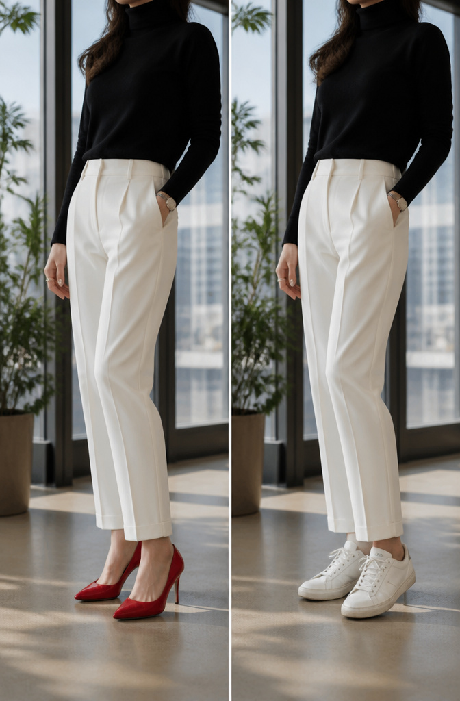
Black and white is the original power pairing, sharp and endlessly adaptable, which makes it the safest place to test how one bold accent actually reads on your body without the color warping against other brights. A white trouser and black turtleneck sit quietly enough that a single scarlet shoe or cobalt bag becomes the entire point of the outfit rather than one noise among many. The same base handles a printed blouse placed up top, with solid darkness anchoring it below so the pattern does not start reading as costume. This is the pairing for the meeting where you need to look considered but not predictable, or dinner where you want the coral clutch you just bought to register. The balance works because the two neutrals refuse to compete, so any third element you introduce arrives with full permission to speak.
2. Beige and Cream
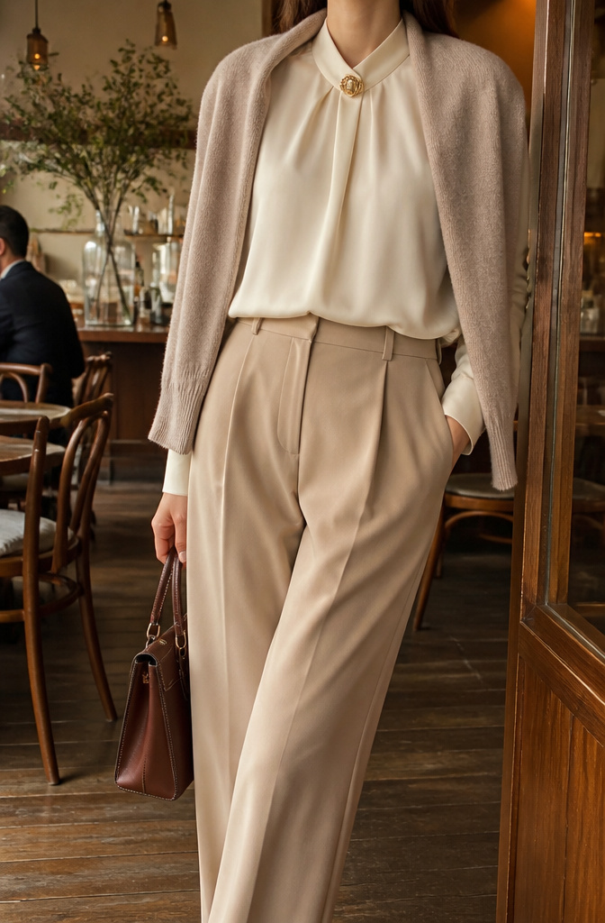
A cream silk blouse tucked into tailored beige trousers reads as quiet confidence in a way bright primaries never could at the negotiating table. The warmth of this pairing comes from tone-on-tone layering that lets texture do the talking instead of hue. At a client lunch last spring, I watched a colleague pull this off with a soft cashmere crewneck over wide-leg pants and a single vintage gold brooch at the collar. No one registers beige as bold until you add one saturated accessory deliberately. A cobalt croc-embossed belt or a structured burgundy bag turns the whole outfit into a statement about restraint versus release. The visual weight arrives where you choose it, not everywhere at once. For offices where authority matters more than visibility, this is the move that still lets you own the room without shouting across it.
3. Red and Navy

Navy reads as authoritative without the severity of black. Add red to mix and it cools the aggression that red carries on its own, giving you a palette that is powerful but still wearable for a work lunch or a weeknight dinner.
I wore a navy wrap dress with a thin red leather belt to my college roommate’s birthday party last spring, and three separate people asked if I had a meeting afterward because the combination looked so purposeful. One of them ended up borrowing the belt for a job interview the next week. The navy did the heavy lifting of making the red feel chosen rather than loud; the red gave the navy something to do besides sit there being reliable.
A full navy suit with red heels works the same equation in reverse. The shoes read as punctuation, not costume, because the navy grounds them. You do not need to keep the proportions even. A small red accessory against a navy base often lands with more confidence than equal halves of each.
4. Emerald Green and Gold

Emerald green and gold read richest after dark, when metallic finishes catch lamplight against deep green fabric and the two colors do the heavy lifting without a third competing. A silk dress in emerald carries gold as the single accent. Velvet handles the pairing with more weight, which means the gold stays small and scattered.
What convinced me, reading through a dozen evening looks that worked against ones that felt costumed, was keeping jewelry almost absent. A slim gold clasp at the shoulder, a thin belt, or a pair of small earrings. Anything larger starts a fight for attention that the colors win only when the shapes stay quiet. The fabric choice changes what gold can do. Silk lets a single gold bracelet register against the green. Velvet needs even less, since the material itself supplies the drama.
Gold here works as a neutral, not a statement. It warms without adding another hue to manage. The mistake is treating this as permission for stacked necklaces or chandelier drops. The combination turns gaudy fast, and the confidence comes from restraint, not accumulation.
5. Mustard Yellow and Burgundy

Mustard yellow and burgundy carry a warmth that flatters almost every skin tone because both sit in that middle-spectrum zone between orange and red. The pairing reads as seasonal richness without looking like a costume. I spent years throwing a black blazer over a mustard sweater for office days, thinking the black would ground it. Instead it flattened the whole look into something harsh and cafeteria-adjacent. Switching to burgundy trousers changed the entire temperature: the colors started talking to each other, layer on layer, and my complexion actually looked alive in the reflection. A mustard knit with a burgundy skirt, or the reverse with a burgundy coat over golden tones underneath, gives you that same depth without the draining contrast black introduces against yellow. If your skin reads neutral pink-peach like mine, the warmth in burgundy does the lifting makeup otherwise has to.
6. Spring Pastels

Pastels only read as bold when you wear them at full saturation, two together, head to toe. Lavender against pistachio, or bubblegum with baby blue, works because neither color gets diluted by white or cream. The minute you soften either shade with beige accessories, the whole look drifts into Easter-egg territory.
Silhouette is what keeps two saturated pastels from looking like an accident. A straight-leg trouser and a tucked-in crewneck, both in solid blocks of color, signal intention. Ruffles, tucks, or mixed prints fight the palette and make the eye read confusion instead of confidence. Clean edges let the colors do the arguing.
The reader came for how to wear bold color combinations with confidence, and this is the move: treat pastel like any other strong palette, not something that needs toning down. I have seen this fail in my own closet when I threw a pastel cardigan over a pastel dress and wondered why it looked like pajamas. The volume was wrong, the layers muddied the shapes, and the colors cancelled each other out. One clean piece per color, fitted close to the body or structured deliberately, and the combination holds.
7. Summer Brights
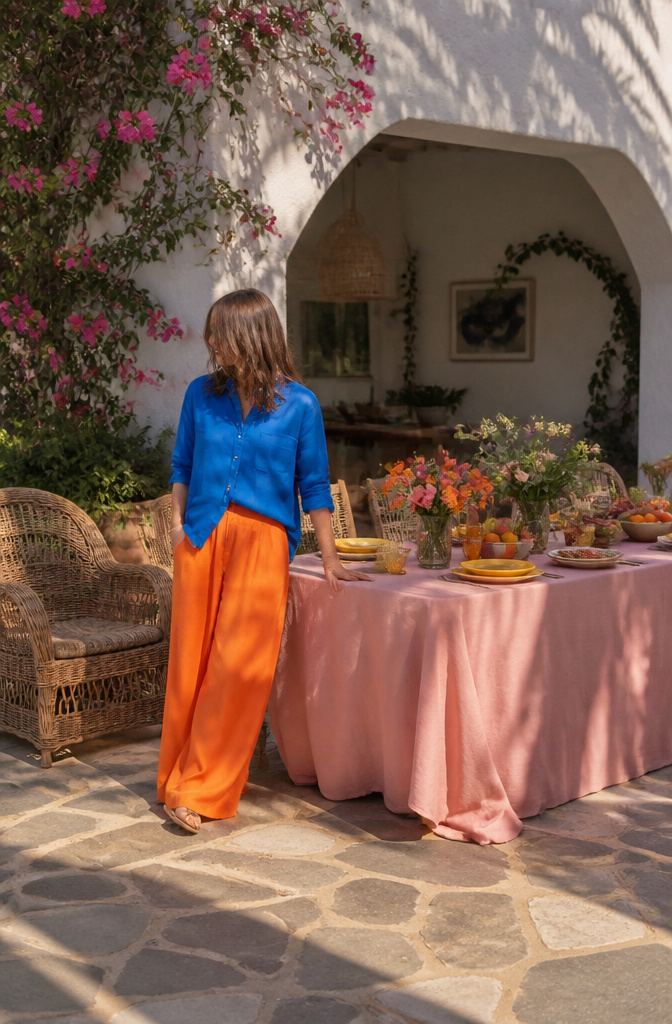
Cobalt and tangerine hit hardest when the temperature climbs past eighty degrees and everything else in your closet starts feeling sleepy. I learned this by accident after buying a cobalt linen shirt from J.Crew on sale and wearing it three times with white shorts before the combination started feeling like a uniform. The fix came from a friend who walked into brunch wearing hot pink with coral, which I would have sworn would look like a sunscreen commercial but instead looked like she had planned it for weeks. That convinced me to add tangerine wide-leg pants from Everlane to the cobalt shirt, though the first attempt failed: the shades were too close in value and my eyes kept sliding off the outfit instead of landing anywhere. The second try worked because I found a tangerine with more yellow in it, a pair from Madewell that read closer to marigold, which let the cobalt sit on top and the pants anchor below without competing for the same attention. Hot pink and coral operate on the same principle. The pink needs to carry enough blue to stay sharp; otherwise coral, which already wants toward orange, will muddy the whole thing. Sézane does a hot pink blouse in silk that keeps that edge, and pairing it with coral cotton trousers from & Other Stories gives the effect of stepping into fuller light rather than wearing two things that happen to rhyme. The trick for testing any of these is to lay both pieces on your bed and step back until you can see them in your peripheral vision. If one flattens or disappears, the balance is off; the brighter piece should hold your eye first, and the second should pull it somewhere new. I still have the cobalt-and-close-tangerine failure hanging in the back of my closet as a reminder that color temperature matters more than color name.
8. Autumn Warmth

Rust, olive, and burnt sienna together read as costume on some people until you desaturate one piece. An olive trench with a burnt orange knit and deep brown boots grounds the warmth, and the olive cools just enough to keep the other two from looking like a leaf pile. I learned this the hard way wearing head-to-toe rust to a dinner last October and realizing in the bathroom mirror I looked like I was about to hand out candy corn.
The pieces that bridge from summer brights are the ones you already own in softer forms. A faded coral tee you wore in July washes toward burnt sienna by November under a tobacco cardigan. Cream and white linens from August stack fine here too; they read as intentional neutrals against these deeper tones rather than leftover summer.
For your own wardrobe, pull from what you already own in warm, rich versions of deeper colors. Cognac belts, deep forest green trousers, warm burgundy scarves: these project the same confidence as summer reds but with undertones that flatter autumn complexions without the jolt. The visual authority stays; the seasonal whiplash goes.
9. Winter Jewel Tones

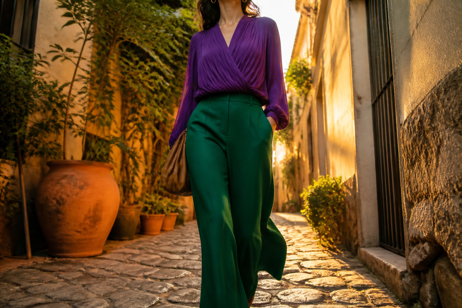
Three jewel tones do the heavy lifting once the temperature drops: amethyst, sapphire, and ruby. Deep winter skin reads as higher-contrast, so these pure tones register as belonging rather than shouting. Fabric weight matters as much as hue. A ruby wool coat carries the color with seriousness; the same shade in summer rayon tips toward costume before you reach the door. Velvet, heavy silk, and structured crepe give jewel tones the anchoring they need against black trousers or a black cashmere turtleneck. One piece tends to read as expensive intention; two paired together can look collected. Three unbroken jewel tones in one outfit, and you have left confidence behind for dress-up. Use black as your actual punctuation: sapphire wide-leg pants, black silk shirt, single amethyst earring. The black soaks up excess shine and keeps the color from performing too hard. I treat ruby as my single-statement exception. A ruby lip with otherwise amethyst and black felt right at a January gallery opening; ruby coat, ruby bag, ruby heel would have felt like I was handing out envelopes at the Oscars. The line is specific, and you know it when you cross it because the mirror starts reading thematic rather than personal.
10. Bold Color Singles
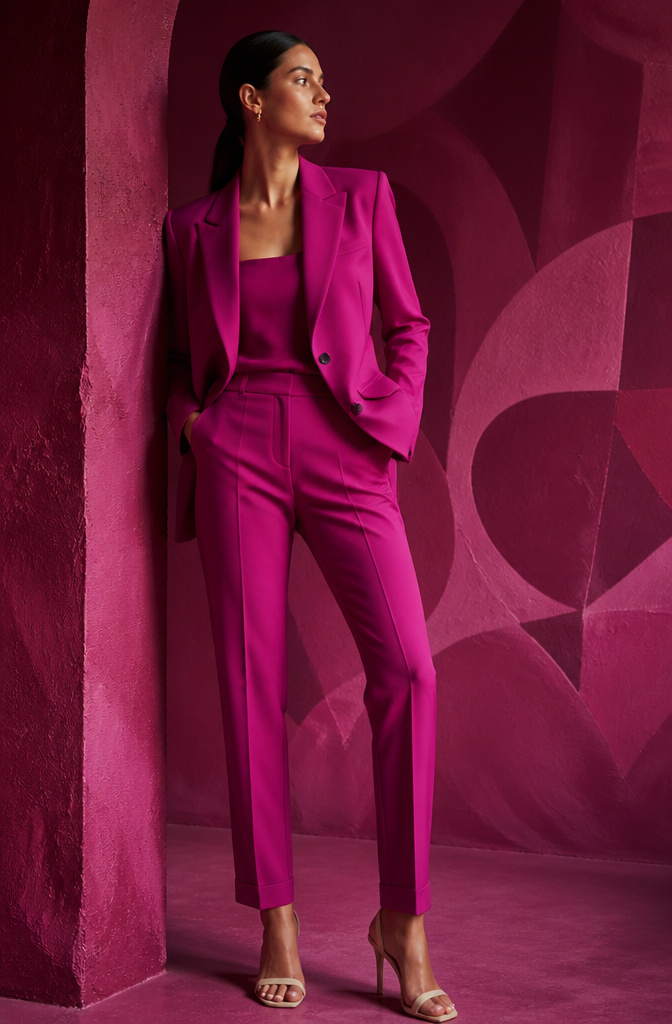
Magenta, chartreuse, aubergine, and orange each earn their place as the full story rather than a supporting detail. The first time I tried head-to-toe magenta, the color did the work; a single bold shade communicates intentionality in a way that mixing never quite matches. The 60-30-10 rule still governs: 60% dominant, 30% secondary, 10% accent. In a monochromatic look, that 60% becomes the magenta itself, with the 30% filled by a deeper or lighter shade of the same family, and the 10% coming from texture, not color at all.
Chartreuse worn wall-to-wall reads creative, almost editorial. Worn at 60% against cream or stone as the 30% becomes wearable for a Tuesday. Aubergine and orange behave the same way; the shift is not in the color but in how much of it the eye takes in at once. A full aubergine suit asks for one quiet accessory. An aubergine trouser with camel knit and burgundy shoe spreads the risk and widens the occasions.
The 10% accent matters most when the dominant is quiet; with these four, the accent often works best in metal or neutral rather than competing hue.
11. Classic Blue

Classic blue carries authority without the severity of black. In a pitch meeting, a true navy suit reads as intelligent without aloofness, the color of someone who doesn’t need to shout to be heard. Psychological research consistently places blue as the most favored color worldwide, and darker shades suggest competence and seriousness.
The same jacket thrown over a white tee and jeans at weekend brunch shifts entirely: approachable, calm, certain. It functions as a bold color without the aggression of red, never registering as trying too hard because its confidence is quiet.
A navy color combination with crisp white delivers polish reliably across contexts. Pair it with cream accents if you want to soften the impression slightly; the warmth keeps the trust signal intact while loosening the formality. I’ve watched this shade work across industries and occasions, which is why it dominates boardrooms and courtrooms globally. The stability it communicates builds rapport before you speak.
12. Solid Green
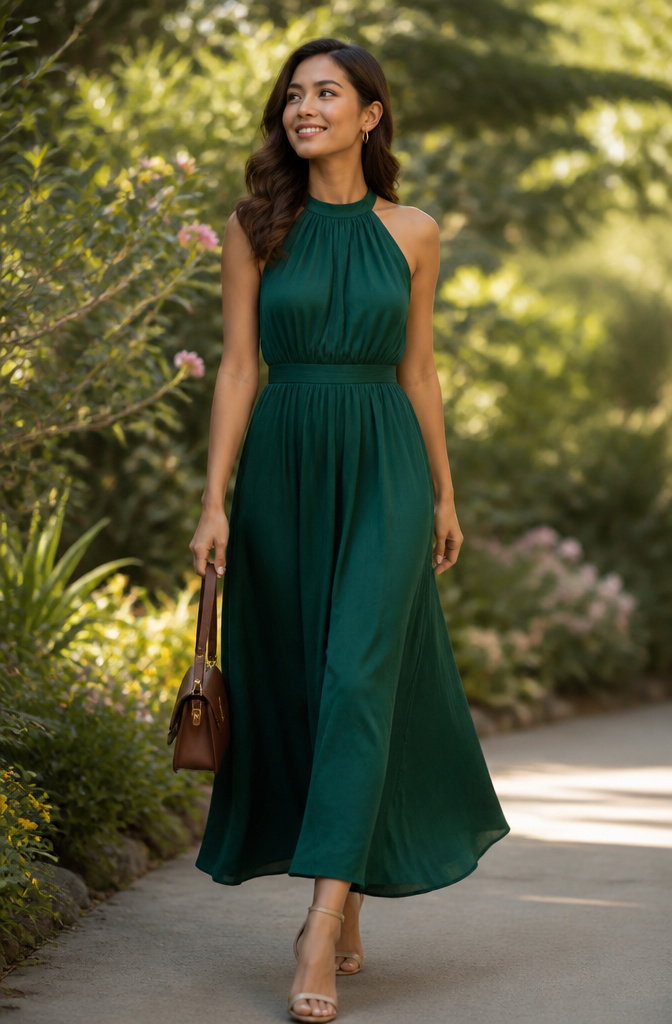
Solid green is the color equivalent of walking into a room and owning it without saying a word. The catch is picking a shade that actually works with your skin instead of against it.
Yellow-based greens, like olive and deep forest, flatter warm undertones; they read as rich and grounded rather than jarring. Blue-based greens, including true emerald and teal, do the heavy lifting for cool undertones, giving that jewel-box effect without the costume-y edge.
I learned this the hard way with kelly green, which I bought on sale and wore exactly once. The yellow in it was too warm for my coloring and left me looking washed out, like the shirt was wearing me. Deep forest green, by contrast, lands every time. It carries the same boldness but with an undertone that actually supports my complexion.
If you are warm-toned, lean into those earthy versions. If you are cool-toned, go for the blue-leaning shades. The wrong undertone turns a statement piece into a regret; the right one makes people stop and ask where you got it.
13. Deep Navy

Pyschological tests place blue as the color of reliability and calm certainty, and shades deep enough carry authority without the severity of black. Deep navy reads as intelligent without grey’s aloofness and certain without red’s aggression, which is why boardrooms and courtrooms favor it worldwide.
I moved navy in as my black replacement about three years ago. Not all at once. The first swap was a single navy blazer for client meetings, then slowly trousers, a wool coat, finally the everyday cardigan I had worn black in since my first job. The difference in how coworkers responded showed up faster than I expected. My navy days drew more direct eye contact in conference rooms and brief unsolicited compliments on "looking pulled together" that black rarely earned. The frequency tells the story now: navy gets worn four days out of five in my work wardrobe, black reserved for evenings where I want to disappear slightly into a crowd.
True navy, midnight blue, indigo, and dark royal blue all function as this authority color. For maximum boldness, vivid cobalt or deep burgundy compete, though neither carries the same universal permission across industries and occasions.
14. Rich Burgundy

Bright red projects dominance, but it often projects aggression too. Burgundy carries the same confidence signal with more sophistication and less risk of triggering defensiveness in whoever sits across from you. I learned this the winter I wore a crimson blouse to a salary negotiation and spent the whole meeting trying to soften what my own outfit was saying. The next round, burgundy did the talking instead.
Burgundy works with both warm and cool neutrals in ways true red cannot. Pair it with cognac or tobacco for a deep Autumn look, or layer it over charcoal and slate without the jarring temperature clash that red creates. A burgundy coat over golden mustard reads as seasonal richness; the same coat over dove gray reads as editorial restraint. Red forces you to choose a camp. Burgundy lets you move between them.
15. Vivid Cobalt

Vivid cobalt carries a different weight than the standard navy most people default to. The saturation itself reads as intention: you chose this, you stand behind it. Wear it when you want the room to know you arrived with a plan.
What surprised me, wearing a cobalt silk blouse to a final-round interview against the advice that I should "blend," was how the color functioned as almost a neutral against the right pieces. Under a charcoal blazer with black trousers, it projected the deliberate authority of crisp white with more visual force. Against camel or cream, it becomes the single bold note that structures the whole outfit. Surrounded by other saturated tones, jewel blue or electric, it holds its own without shouting.
The sources I found disagree on one point: whether cobalt belongs in high-contrast pairings or needs softer framing to keep from overpowering. Two ways to play it. A white shirt under navy reads decisive; vivid cobalt under charcoal reads visionary. The softer surround wins if the room is already skeptical. High contrast wins if you need to claim space the second you walk in.
Color Psychology

Red walks into a room before you do. The first time I understood this was not from a magazine but from watching a colleague close a difficult negotiation in a cherry silk blouse; the color raised the stakes without her saying a word. Red demands attention because it literally raises heart rate, which reads as power and passion. Too much of it, and you signal aggression rather than confidence, so I reserve it for moments that need that push.
Blue operates on the opposite end. Navy gets me through interviews because it projects quiet competence; light blue softens first meetings where rapport matters more than authority. The shift between them is a move I make on purpose now, not from mood.
Green became my team-setting choice once I understood it signals cooperation and growth. Dark green carries weight in financial or traditional spaces; lighter shades read as fresh starts. Purple I wear when I need to stand apart as creative, not eccentric. Orange stays casual; yellow, I keep muted unless I want to read as energetic rather than frantic.
Knowing the code means choosing how I am read. That beats dressing from whatever I feel that morning.
Mixing and Matching

Complementary colors sit opposite each other on the wheel, like red and green or blue and orange, and the contrast hits hard enough that people notice you immediately. That is the draw. Analogous colors, blue and green for example, sit side by side and read as calm, intentional, and easy to look at for a full day at work.
The 60-30-10 rule keeps either relationship from fighting itself: 60% dominant, 30% secondary, 10% accent. Your skin undertone matters here more than people say. Cool undertones in me take to true reds, blues, and purples; warm undertones need the olive greens, fiery reds, and oranges. What looked noisy on one woman in a boardroom looked electric on another because of that shift.
The real trap is the near-complementary. Almost red with almost green, not quite opposite, and the eye keeps searching for an alignment that is not there. Hold the two fabrics against each other in daylight, not store light. If they vibrate, pick one and anchor it to a neutral. The 80/20 rule, 80% neutral and 20% bold, runs safer while you are learning which colors your undertone actually wants.
Accessorizing with Color

The colors that drain you can still live in your closet if you know where to put them. Challenging shades belong below the chin or well away from your face entirely, which is why shoes, bags, and scarves at hip level or lower become the safest experiments. I learned this the hard way with canary yellow, a color I love in theory and look sick in near my skin. A canary bag swinging at my knee reads cheerful; the same tone as a turtleneck makes people ask if I am tired.
Scarves complicate the rule slightly, since they sit at the neck. Fold one so the bold color falls toward the ends, or knot it to keep the more flattering shade closer to your jawline. Shoes, though, are the simplest entry point. An electric blue pump or an acid green loafer carries all the impact of the hue without the complexion consequences. The investment is smaller than a full garment, and the commitment ends when you take them off. Wear your challenging colors where they cannot compete with your skin tone, and you stop avoiding half the color wheel.
Building Personal Confidence

Wearing a bold color acts like psychological armor. That line stuck with me from the research I did before trying it myself, and three weeks of adding one loud piece to every outfit proved it out.
Day three was cobalt trousers with a white button-down to a dentist appointment. Nothing about the visit changed, but I caught my reflection in the lobby mirror and stood straighter without thinking. By day twelve, the habit had a name: I was carrying myself like someone who expected to be noticed, because I already was. A neighbor stopped me in the elevator to ask where the emerald blouse was from. A barista said the mustard scarf "made the whole morning better." Those comments fed a loop I had not expected; the colors made me more visible, and the visibility made me more present.
The shift was not in how others saw me first, but in how I moved through space after. Bold color works from the inside out, not as a costume that fakes confidence but as a prompt that changes what you do with your shoulders, your pace, your willingness to start a conversation. Some days the piece was a scarf, some days a shoe. Keeping a photo log helped me spot which combinations produced that lifted posture (emerald, cobalt) versus which ones felt like a performance I was checking off (red and pink, on me, never settled). The journal was the useful part. Without it I would have kept forcing the pairings that looked right on a hanger but wore wrong on my body.
The point is not to wear the loudest thing in the room. It is to wear the color that makes you feel specifically like yourself, and to collect the data on which one that is.
Personal Color Palette

Silver against the collarbone catches light differently than gold, and that difference is the whole trick for figuring out your undertone. Hold both metals up to clean skin in natural daylight. One will make you look subtly brighter, almost like you slept eight hours; the other will cast a faint gray or yellow shadow across your jaw. Silver usually signals cool tones, and gold usually signals warm.
I ignored this for years because the rules felt like something from a 1980s department store. Then I bought a chartreuse silk blouse on sale. The color itself was stunning, folded on the shelf. On me, it brought out every red undertone in my cheeks until I looked feverish. No amount of bronzer fixed it. That was the moment the metal test stopped being theory and started being useful. Jewelry metals and fabric work the same way: match the temperature to your own, or the color wears you.
The payoff isn’t restriction. Royal blue might flatten you while navy brings your eyes into focus, or vice versa. Coral can read healthy on one person and sunburned on another. The goal is knowing which boldness belongs to you before you commit to the piece.
Frequently Asked Questions
What is the most confident color to wear?
Deep navy is the most confidence-projecting color. It carries the authority of black with more approachability, and the intelligence of blue without the diffidence of pale shades. For maximum boldness, vivid cobalt or deep burgundy are strong alternatives.
How do you style bold colors?
Start with one bold color as the centerpiece and balance it with neutrals like black, white, or beige. The 60-30-10 rule helps: 60% dominant color, 30% secondary, and 10% accent. Confidence matters more than perfection; the color should read as intentional, not accidental.
What colors should I avoid if I want to look confident?
Avoid pale pastels, muddy mid-tones, and washed-out colors that project tentativeness rather than confidence. Colors that lack visual commitment signal uncertainty. Confident colors make a clear, decisive statement.
How can I wear colors that don’t flatter me?
Wear them away from your face or in accessories. Challenging shades belong below the chin or at hip level and lower, in shoes, bags, or scarves. The color gets to live in your outfit without competing with your skin tone.
How do I mix and match bold colors?
Use complementary colors for high contrast, or analogous colors for calm intention, and balance with neutrals. The 80/20 rule, 80% neutral and 20% bold, runs safer while you learn which colors your undertone wants. Hold fabrics against each other in daylight; if they vibrate, pick one and anchor it to a neutral.