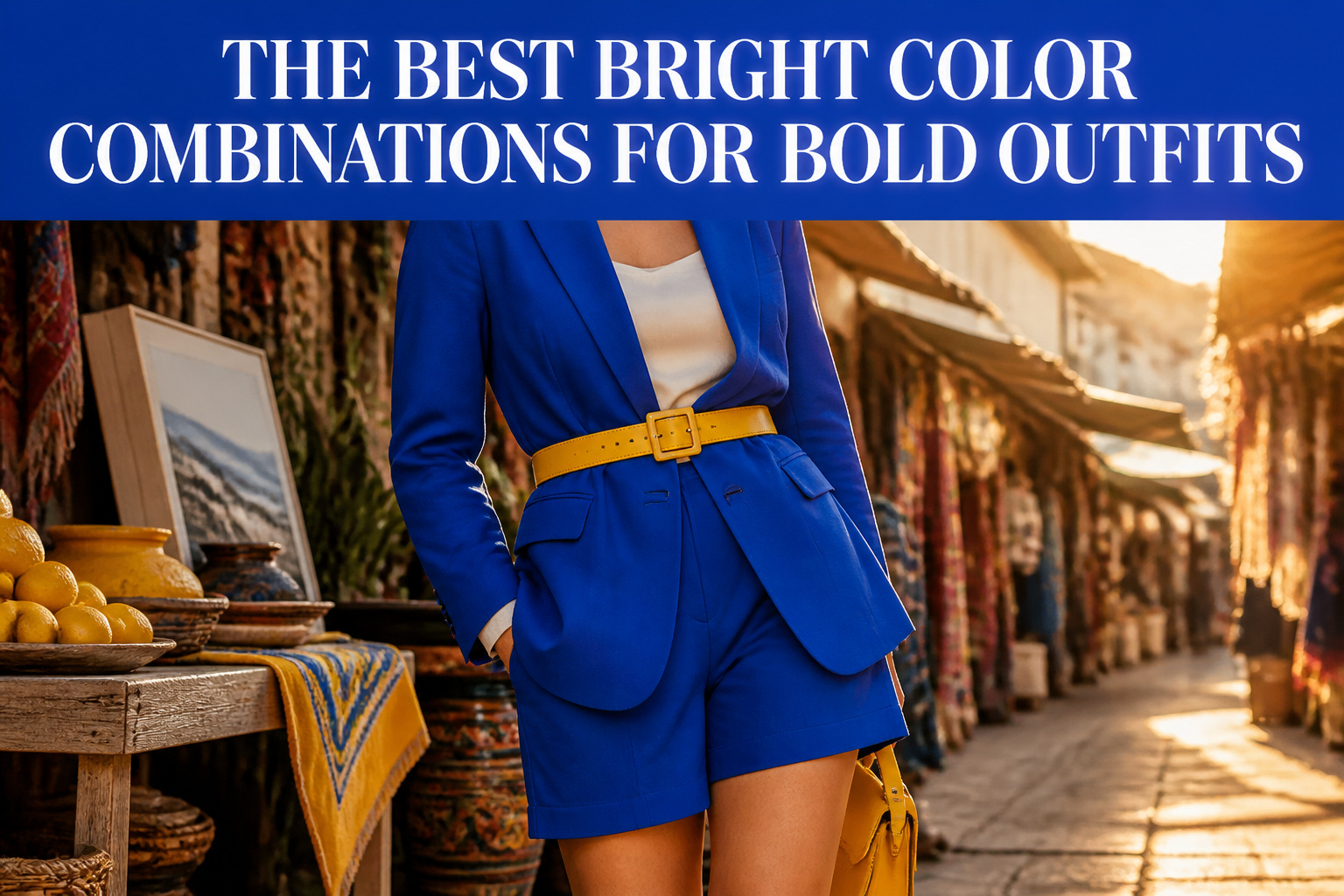
The best bright color combinations for bold outfits require one color to anchor and the other to accent, never a 50/50 split. Cobalt blue with sunny yellow collapses into costume the moment both colors hold equal weight; the same pairing reads elegant when yellow appears only in a belt or bag against a cobalt blazer and shorts. That proportion rule, applied across every combination here, is what separates deliberate from accidental.
Cobalt Blue and Sunny Yellow

Cobalt blue and sunny yellow sit opposite each other on the color wheel, which means they intensify each other the moment you put them together. The cobalt reads as a deep, bold base while the yellow does the lighting work, so the outfit registers as elegant and playful at the same time rather than shouting in two directions.
The proportion is what keeps this from looking like a sports uniform. One color anchors while the other accents; a cobalt blazer with matching tailored shorts gets the sunny yellow in a belt, a bag, or a bucket hat, never in equal halves. I have seen this combination hold up at city lunches and museum dates where the wearer needed to move between daylight and indoor dimness without the whole look collapsing into costume.
For cooler weather, the same ratio applies in reverse. A fine-knit cobalt turtleneck with cream wide-leg trousers gains its yellow from a small scarf or a shoe detail rather than a second large block. The saturation is already high on both colors, so the eye needs somewhere neutral to rest. Brown leather accessories warm the blue and keep the whole thing from reading as too primary, too fast.
The mistake is treating these two as a 50/50 split. They are not partners of equal weight. Cobalt carries the structure, yellow carries the surprise, and the space between them is what makes it work.
Hot Pink and Crisp White
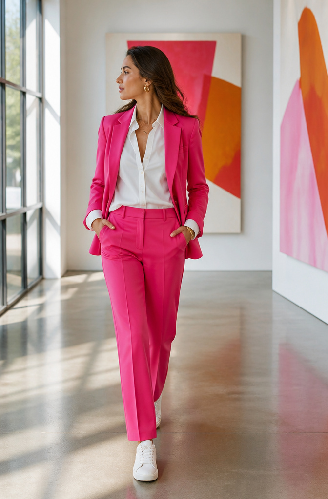
A hot pink blazer with matching straight-leg trousers turns commanding when layered over a crisp white button-down, then slips into weekend mode with white low-top sneakers swapped in for pink pointed flats. White tames the intensity without flattening it; the contrast reads modern against clean backdrops rather than costume. Gold jewelry and a white leather tote soften the look without competing.
The ratio that keeps this wearable is about 60 percent white to 40 percent pink when pink is the statement piece. Reverse it and you are a highlighter. For pool parties or outdoor gatherings, pink accessories with white footwear let you test the pairing before committing to a full suit.
Texture matters here. A single-breasted blazer in wool reads office-appropriate; the same color in something lighter moves toward occasion dressing. One source pushes metallic shoes or a silver bag to push the boldness further, but in practice that risks the costume threshold most women under forty want to avoid.
Lime Green and Lavender

Lime green and lavender sit just far enough apart on the color wheel to create real tension without clashing. The green carries warmth from its yellow undertone, while lavender pulls cool from its blue base, and that push-pull keeps each color readable rather than letting one swallow the other. I have seen this pairing described as fresh and joyful, which matches where it actually works in a wardrobe: spring and summer days when the light is strong enough to let both shades hold their own.
For real-world wear, the balance matters more than the saturation. A lime that veers neon will flatten most complexions and read costume-like by noon; a slightly softened lime, almost apple-tinged, plays nicer with lavender’s natural grayness. The passages emphasize playful yet balanced, and that balance comes from proportion, not muting. One color leads, the other accents. A lavender summer dress with a lime belt or bag gives you the combination without the commitment of full color-blocking.
Where this pairing risks failure is in fabric sheen. Both colors amplify under gloss, so matte linen, cotton, or a flat jersey keeps the look grounded in actual plans rather than photograph-only territory. If your wardrobe needs pieces that transition from a morning errand to an outdoor dinner, keep the lime below the waist and the lavender higher, where the eye naturally rests and where the cooler tone flatters most faces.
Teal and Coral

Teal and coral read as bold only when the proportions are deliberate, not equal. A teal blazer with a coral camisole underneath pulls the eye to the warmth without tipping into tropical costume; coral pants with a teal shell does the same in reverse. The depth of teal keeps coral from floating away, and the warmth of coral keeps teal from reading as too cool or corporate. This is the pairing that wakes up a neutral wardrobe mid-season, when black and ivory start to feel like a uniform but you’re not ready for full summer saturation.
Cooler skin tones carry it more naturally, since the blue base in teal picks up pink undertones without clashing. Warmer complexions can wear it too, but the coral needs to lean more orange than pink to avoid looking like a sunburn echo. Spring and early fall are its natural seasons: bright enough for sun, grounded enough for overcast days. I’ve seen this combination look expensive at a rooftop dinner and slightly too "resort gift shop" at a daytime office event, so the difference is fabric weight and finish, not the colors themselves. Structured silk or wool twill elevates it; anything too flowy or rayon-heavy tips the balance toward pretty rather than bold.
Mustard Yellow and Deep Navy

Mustard yellow and deep navy carries an energy that still reads as polished, which makes it one of the best bright color combinations for bold outfits when you need to look intentional rather than loud. The navy functions as a true neutral here, but unlike black, it lets the mustard keep its warmth rather than flattening it into a caution-sign effect.
In a professional setting, this pairing works because the navy grounds the look while the yellow signals confidence without crossing into casual territory. A navy blazer over a mustard blouse reads capable and approachable; the reverse, a mustard jacket with navy trousers, makes the statement louder but still controlled.
The shade of mustard that actually survives repeated washing is the deeper, more ochre-leaning tone rather than the paler, almost-chartreuse versions. Those lighter shades tend to shift unpredictably and show wear faster. The ones with a brown undertone keep their character through dozens of cycles and pair more naturally with navy’s own depth.
For balance, let one color dominate. Two strong blocks of equal weight fight each other; a 60-40 or 70-30 split keeps the eye moving without chaos. Navy as the larger share is the safer professional play, though a single navy accessory anchoring a mustard-forward look can work if the cut is sharp enough.
Chartreuse and Magenta

Chartreuse and magenta sit nearly opposite each other on the color wheel, which is why the pairing vibrates the way it does. The eye keeps moving between the lime-leaning yellow and that blued red, so neither color ever goes flat against the other.
This much contrast demands commitment, and it pays to decide upfront who is leading. A chartreuse coat with magenta shoes reads intentional and still office-possible, at least in creative fields. Split the two fifty-fifty, say in a color-blocked dress, and you have moved into statement territory: weddings after dark, gallery openings, anywhere the room expects someone to arrive looking like she meant it.
Magenta dominance is the more forgiving choice for most skin tones in its pinker register. Chartreuse dominance flips the warmth forward, which can turn sallow if your undertone runs cool. The risk runs higher, but so does the payoff when it lands.
Where this pair fails is half-measure. Dusty or muted versions of either color look accidental, like a laundry mistake rather than a choice. Boldness here is all or nothing.
Electric Orange and Royal Purple

Electric orange and royal purple sit exactly opposite each other on the color wheel, which means they vibrate together at full volume unless you break the plane between them. I tried pairing a purple silk blouse with orange trousers once and looked like a sports team mascot; the problem was both pieces sharing the same flat, shiny finish. Matte wool in one color against textured weave in the other gives each its own territory, and adding a third neutral bridge, even a thin tan belt, slows the eye down enough to register shape before color.
This combination works beyond single events only if you build it into a repeatable formula rather than a costume. A deep purple cashmere coat with orange leather gloves reads considered in October through March because the outer layer stays constant and the accent shifts. The reverse, orange outerwear with purple details, tends to stay trapped in holiday party territory. For daily wear, keep the ratio closer to 75–25 and reserve the full 50–50 split for pieces you can remove. A purple scarf against an orange sweater travels better than a dress in both colors, which commits you to one statement for the entire day.
Orange and Light Beige

Orange against white reads like a traffic cone, loud and stark in a way that flatters almost nobody’s skin. Swap in a warm light beige and the whole pairing settles into something you can actually wear past noon. I learned this watching a friend pull camel-colored trousers with a tangerine silk shirt; the combination looked expensive in a way orange and white never does on her.
The beige needs enough yellow in it to read as warm. A pink-tinged or grayish beige will pull orange toward pumpkin and drain the life out of both pieces. Think oat milk, not sandcastle.
This pairing outperforms orange and white when you need the brightness to feel grounded, not playful. It works for client dinners, parent-teacher conferences, anywhere you want to be noticed for confidence rather than costume. The light beige acts as a bridge if your skin has warm or olive undertones and pure white tends to make you look tired.
Texture matters more here than with white. A matte beige cotton against a shiny orange satin looks accidental. Pair matte with matte, or match sheen levels deliberately. A ribbed beige knit under an orange blazer has become my go-to for Zoom calls where I need to look alert but not try-hard.
Brown and Gold

Brown and gold read expensive for a reason most people mix up. Metallic gold is not yellow with ambition. Yellow reflects light flat and loud; gold absorbs half that energy and throws back a narrow, warm beam that sits behind brown like candlelight on wood paneling rather than neon on a wall.
The distinction matters when you’re choosing finishes. Matte or brushed gold needs the deeper browns, chocolate toward espresso, because both sides dial down the volume and the outfit whispers instead of shouts. High-polish gold wants lighter brown foundations, camel through soft taupe, so the contrast stays legible without tipping into costume. Pair polish with espresso and the metallic turns theatrical; pair matte with camel and the whole thing goes muddy.
What convinced me, reading through the comparisons, was how skin tone governs which side of this you land on. Warm undertones pick up the red in deep brown and the copper in brushed gold; the combination starts to look like it grew there. Cooler complexions can still wear it, but the lighter taupe-to-gold range keeps the warmth from reading sallow.
This pairing works especially well in accessories against a brown base, or split across separates where the darker color sits lower and closer to the body. The rule is to let one finish dominate, never both, because half matte and half polish in the same view splits the eye and breaks the quiet luxury effect the combination is built for.
Black and White

A black-and-white outfit only reads as bold when the contrast is sharp enough to hurt your eyes a little. Wide-leg white trousers with a fitted black turtleneck does it; a greyish off-white tee with washed black jeans reads as what you grabbed because everything else was in the wash. The difference is saturation at both poles, nothing muddy in between.
Proportion decides whether the pairing looks intentional or like a uniform. I think the boldest move is uneven split: a black blazer over a white column dress, or a white coat with black boots and bag breaking the line. Equal halves, top and bottom, flattens the eye; letting one color dominate and the other interrupt it creates movement.
Texture separates memorable black-and-white from the forgettable kind. Glossy black vinyl against matte white cotton, or a chunky ivory knit with slim black satin, gives the contrast a reason to exist beyond just being two neutrals. Without that variation, you might as well be in catering attire.
Where it fails is soft fabrics in both colors. Two drapes, no structure, and the high contrast starts to look like a mistake you tried to soften rather than a choice you made on purpose.
Burgundy and Beige
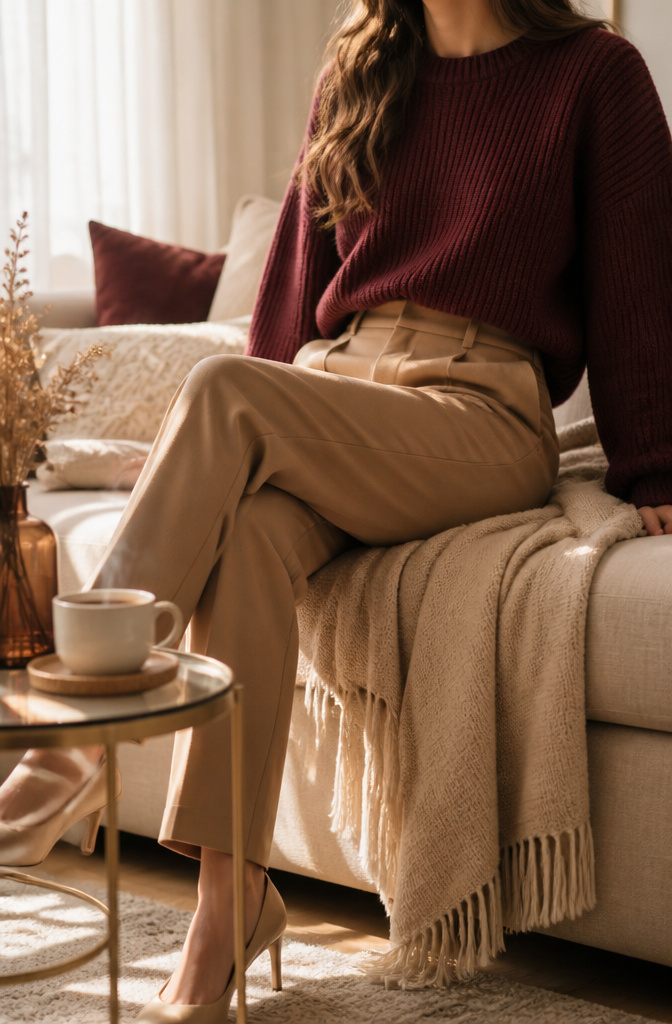
Burgundy delivers the warmth of red without the volume. Where a true scarlet takes over a room, this deeper wine tone sits back just enough to let a pairing breathe. I learned that difference the hard way after a head-to-toe cherry dress got me through one client lunch looking like the emergency exit sign.
Beige is what keeps the pairing alive rather than archival. Warm beige, camel, and light taupe pull the same autumn register without tipping into the oatmeal territory that reads as nineties office park. Deep burgundy against warm beige flatters daylight skin in a way cooler neutrals flatten out.
The occasions tilt toward where you need presence without performance. A burgundy knit with camel pants reads pulled-together for a dinner when you are meeting someone’s parents; a beige blazer over a burgundy dress works for a presentation where hot pink would undercut the data. It is the combination to reach for when the event matters enough that you want color, but loud enough to compete would cost you credibility you have earned.
Navy and Cream

Cream changes the whole proposal. White against navy reads nautical in a way that can look like costume, especially in summer, but cream softens the contrast just enough to lose the sailor-suit association without losing the crispness. The result still looks fresh and professional, and the combination builds something that reads as more expensive than it is: the tonal shift tricks the eye into registering quality fabric rather than obvious color-blocking. A navy blazer over a cream knit, or cream trousers with a navy silk shell, does the work of a uniform but with the ease that lets you wear it off-duty. For business-casual offices or days that move from desk to dinner, this pairing has the structure of navy and white without the literalism.
Grey and Blue

Grey gives you a safe base, but the wrong blue turns the whole look into corporate sleepwear. I learned that from a light-blue button-down and charcoal trousers that read as "interview outfit" even on a Saturday. The difference is saturation. Muted or medium blues keep grey from flattening into boredom, while anything too bright fights against it instead of waking it up. A navy blazer over grey reads polished; a softer denim blue keeps it human.
This pairing works as a gateway if brighter mixes feel risky. The grey does the quiet work, the blue adds just enough life, and you notice what color actually does for an outfit without the volume turned all the way up. A medium saturation is the tipping point: clearer than navy, quieter than cobalt. Once that reads right, moving into yellows or corals becomes less startling because you have already felt what one bold element does against a neutral.
Emerald Green and Gold

Emerald green carries enough depth to hold metallic gold without the pairing defaulting to holiday costume territory. The trick is separating what gold does as an accessory from what gold fabric does to the whole look. Gold jewelry against emerald reads as evening warmth, catching low light the same way gold drop earrings catch candlelight against a velvet wrap dress. Gold hardware on a tailored blazer works closer to the body and reads as modern luxury, restrained because the metal stays small and structural. Gold fabric itself, or a gold satin clutch, shifts the balance entirely: now the outfit is half green, half reflective warmth, and the eye bounces between the two rather than settling. The first approach lets emerald stay the story while gold plays supporting role. The second makes the combination itself the statement, which is harder to wear to anything that is not a formal dinner or winter wedding. For the closet you actually own, a green silk dress with one gold cuff keeps the regal tone portable.
Red and Navy

Red and navy settle somewhere between striking and safe, which is exactly why this pairing works for real days, not just runway photos. Navy reins red in without extinguishing it the way black would. A red blazer over black trousers reads costume or Santa; that same blazer over navy chinos reads like you made a deliberate choice before coffee.
The ratio matters more than the pieces. For a morning interview, keep red at 20 percent of the look: a thin belt, a heel, a silk square peeking from a navy jacket pocket. Navy carries the message that you belong in the room while red does the work of being remembered. Shift to evening by letting red own 40 to 50 percent: a burgundy silk blouse, the wine shade that sits a notch deeper than cherry, against a navy midi skirt. The sources that rank for this pairing favor that richer, wine-adjacent red for exactly this handoff from desk to dinner.
Color Theory for Outfit Building

The color wheel maps out the same relationships whether you are mixing paint or pairing a skirt and top, but fabric behaves differently than pigment. Complementary schemes, sitting opposite each other on the wheel, deliver the highest contrast: cobalt paired with sunny yellow, or red against emerald green. That punch reads confident at a Saturday market but can feel like a costume under fluorescent office light. Most days, one piece carries the loud note and the other sits closer to a neutral.
Analogous schemes, three to four neighbors on the wheel, are the safest entry point. Think coral bleeding into tangerine, or teal into cobalt. Colors this close share undertones, so even saturated pieces feel like they belong together. The risk is muddiness: without enough value contrast between pieces, the whole look flattens into a single blur.
Triadic combinations, pulling three evenly spaced hues, are the advanced move. Red, yellow, and blue is the textbook example, but wearing all three at full saturation demands that you delegate. One color leads as the largest surface area, usually the dress or trousers, while the other two show up in smaller shapes: a belt, a bag, perhaps shoes. The sources frame this as a spotlight-and-backup hierarchy, and getting that ratio wrong is exactly how an outfit tips from intentional into circus. A 70/20/10 split keeps triadic schemes wearable.
How Colors Read on Different Skin Tones

A bright color only works if it works against your skin, and the quickest way to check is the lipstick test. Swipe a true red on one side of your mouth and a coral or orange-red on the other, then step into natural light. If the blue-based red makes your eyes look clearer and shadows less pronounced, you likely have cool undertones. If the warmer shade performs that trick, you lean warm.
Most of the combinations that read as "bold" rely on one color carrying the warmth and one carrying the coolness, so undertone matters more for which color you place next to your face. Cobalt with sunny yellow, for instance: cobalt flatters cool undertones worn as a top, while yellow does the favors for warm undertones. The safe move is to keep the less flattering shade below the collarbone or limited to accessories. Lime green and lavender splits similarly, lavender siding with cool skin and lime with warm.
I spent an afternoon once holding fabric swatches to my wrist in a specialty store, and the clerk was right that the vein test holds up. Blue-purple veins suggest cool; green-tinged veins suggest warm. Neither rule excludes anyone from any color. The question is where you put it and how saturated it reads against you. A warm-skinned woman can wear cobalt beautifully as a shoe or bag. A cool-toned one can carry mustard if it sits at the waist or in a scarf worn with distance from the face. The flatness comes from matching the wrong saturation to the wrong placement, not from the color itself.
The 60-30-10 Rule in Practice

The 60-30-10 rule keeps bright color combinations from turning into visual noise. I think of it as outfit math: sixty percent dominant color, thirty percent secondary, ten percent accent. Two colors in the same ratio look completely different when those percentages flip.
Take cobalt blue and sunny yellow. Sixty percent blue as your base, thirty percent yellow, and ten percent neutral grounding gives you a classic nautical feel. Reverse it to sixty percent yellow with blue as the thirty percent accent, and the same two colors suddenly read cheerful and retro instead of polished.
Hot pink and crisp white behave the same way. Mostly white with pink accents feels clean and wearable for work. Flip to mostly pink with white trim, and the combination turns party-ready without adding a third color.
Lime green and lavender might seem risky, but the rule holds them steady. Sixty percent lavender softens the green into something almost pastel, while sixty percent lime makes lavender read as an unexpected cool note against the heat. The ten percent accent, usually a neutral shoe or bag, does the work of settling the eye.
Texture and Pattern When Colors Compete

Two bold colors need negotiation, not just placement. The satin purple midi skirt from the source passages makes this literal: its shine does the arguing with whatever you pair it against. Matte textures recede; satin advances. A fuzzy violet knit sweater works the same trick in reverse, its pile catching light unevenly so the periwinkle reads softer than a flat weave would allow. Matte against shine is what keeps both colors from shouting at the same volume.
Print scale works the same way. A large pattern in one bright color against a solid in another gives the eye a place to rest; the source’s cream wide-leg trousers against that textured purple do exactly this, even without a print per se. The fuzz acts as pattern, irregular and eye-engaging, while the cream stays flat and grounding.
When both colors live inside one pattern, they share a rhythm and the clash resolves into relationship. Separated across garments, the contrast sharpens and you control it with cut and proportion. The quilted black handbag in that purple-satin pairing keeps the competition orderly: same color family as the top, different texture entirely. I reach for this rule most mornings now. If both pieces are loud, one needs to lie flat in texture or the outfit starts to jitter.
Frequently Asked Questions
What are some bold color combinations for outfits?
Cobalt blue with sunny yellow, hot pink with crisp white, lime green with lavender, teal with coral, and mustard yellow with deep navy are all strong pairings covered in the article. Each uses proportion rather than muting to keep the look wearable. One color anchors while the other accents, never split 50/50.
How do I mix and match bold colors?
Start with one bold color as the centerpiece and balance it with a neutral or a second bold color in smaller proportion. The article recommends a 60-40 or 70-30 split so the eye has somewhere to rest. Neutrals like cream, beige, or navy can ground the combination without flattening it.
What colors make outfits look expensive?
Brown and gold reads upscale because the metallic absorbs light rather than reflecting it flatly, while navy and cream tricks the eye into registering quality fabric through tonal softness. Both combinations rely on finish discipline: one matte or one polish, never both competing in the same view.