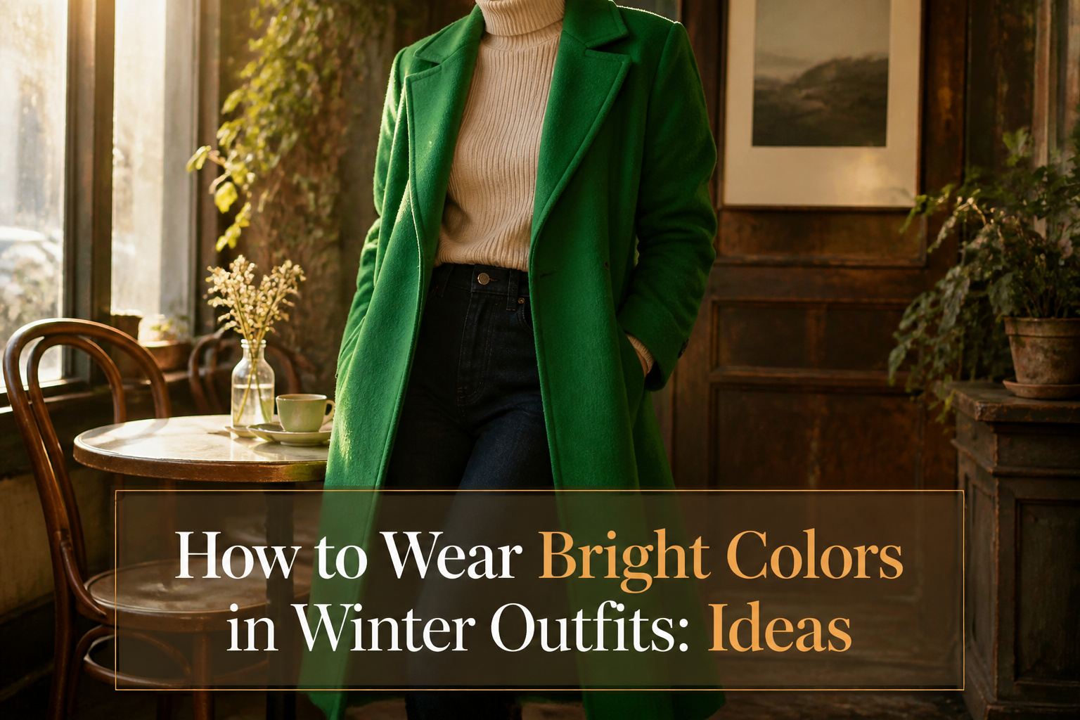
Wearing bright colors in winter outfits takes about five minutes and no new budget if you already own a coat, a sweater, or a scarf. Most people get the stage wrong where they think the brightness has to spread across the whole look instead of hitting at one point. The coat does the work when everything underneath stays quiet: a mustard wool belted over black jeans and a cream sweater, or cobalt against charcoal, reads collected rather than costume.
1. Statement Coats

A coat in red, cobalt blue, emerald green, or mustard yellow does the heavy lifting so the rest of your outfit does not have to. I bought a mustard wool coat three winters ago after realizing I was rotating through the same black and gray shelters every day, and the first time I wore it to coffee with a friend she said I looked "un-sad" before she said anything else. That was the point.
The move is one bright element against neutral everything else: black jeans and a cream sweater, gray trousers and a white turtleneck, beige wide-legs and a camel crewneck. The coat hangs open or closed, it does not matter, because the color hits at eye level and stays there. Red reads as collected and intentional against charcoal. Cobalt feels crisp near black or warm near cream and does not commit you to either mood. Emerald works with the olive and camel already in most winter wardrobes without anyone having to think about it.
Mustard yellow is the one I get questions about. It is essentially a neutral that forgot to be boring, which means it pairs with navy, black, chocolate brown, and even burgundy if you are feeling stubborn. The risk is buying it cheap enough that it turns ochre after two dry cleans. The one I still own is a mid-weight Italian wool blend with a belted midi cut, structured enough for work and relaxed enough thrown over jeans. A tailored cut keeps the brightness from feeling like costume; the tailoring is what earns you the color.
2. Bright Basics

A bright basic does the heavy lifting of an entire outfit rebuild. Last January, I swapped my oatmeal sweater for a chunkier merino in a deep teal, wore it with the same charcoal trousers and black ankle boots I’d pulled on three times that week, and three people asked if I’d done something different with my hair. The color did all the work.
The safest swap is the piece closest to your face, because that is where the eye lands first and where winter light is kindest. A sweater, cardigan, or top layer in an unexpected color against your usual jeans and neutral coat reads intentional, not costume. Cardigans are forgiving for beginners: the open front breaks the color into vertical strips, and you can button or unbutton to adjust the dose.
Jeans come next in difficulty. A bright pair still anchors an outfit because denim reads as a neutral in shape, but the larger the color block, the more your other pieces need to stay quiet. I would keep the top half cream, black, or camel, and let the pants carry the full statement.
If primary red or cobalt feels like a commitment, the territory between neutral and loud matters. Lavender, burnt orange, and teal warm winter complexions without the jolt of summer brights, and they pair naturally with chocolate browns and slate grays already in most cold-weather wardrobes.
One bright basic, one outfit saved from hibernation. That is the arithmetic.
3. Accessories

A saturated scarf against a charcoal coat does the work of an entire outfit rethink. Last season I watched a woman at a coffee pickup pull a Kate Spade Uptown Map oblong scarf from her bag and loop it on; the whole line noticed. That is the math accessories solve. Scarves, beanies, and gloves ask for almost no closet space and zero commitment to a color story you might tire of by February.
Bags move even slower through a rotation, which makes them the most impact per dollar if you choose one in a color you already reach for. The Longchamp Extra Small Cabas in its recycled canvas, or a Brahmin Shayna croc-embossed crossbody, sits against winter neutrals the same way a bright shoe does, but you own it for five years, not one. A beanie in cobalt works the same trick on a bad-hair morning.
The risk is treating the bright accessory as an afterthought. The woman in the coffee line had chosen the scarf before the coat. That order matters. Pick the color first, let the neutral frame it, and you stop buying scarves you forget to wear.
4. Monochromatic Outfits

Wearing a single bright color from head to toe reads as intention, not accident, when the surfaces change enough to catch light differently. Last February I tried this with a cobalt sweater and matching trousers from a Boden set, and the lapis looked flat until I swapped in a ribbed knit top for the original smooth one. The ridges held shadow differently than the pants’ ponte weave, and that alone kept the outfit from looking like stage wear.
Texture does the heavy lifting. A wool coat over a cable-knit dress in the same red gives the eye two places to rest, even when the dye lot is identical. The sources keep recommending this: Boden’s textured stitch cardigan against their Westbourne trousers in the same shade, leather bag against wool coat. The materials carry the variation so you don’t need a second color to declare it.
Gradation within one family works the same way. A true electric blue jacket with a slightly dusted, lighter trouser underneath creates depth without breaking the monochrome. I haven’t seen the exact mid-tone pairing in my own closet, but the principle holds: move one step lighter or deeper and the look gains architecture. The only place this fails is when the two shades are close enough to look like a mismatch rather than a choice. The gap needs to be visible from a few feet away, or it should not exist at all.
A neutral coat thrown over the top is the exit hatch when the full envelope of color feels like too much arrival. I use this at client dinners when I want the dress visible at the table but muted in the taxi there. The color stays present; the volume gets turned down by degrees you control.
5. Layering

A cobalt blouse under charcoal wool reads as practical warmth until you undo the top two buttons of your coat and the color floods the neckline. Let the bright layer peek from beneath a dark topcoat by leaving it unfastened at the collar or rolling the cuff once so a coral sleeve base shows against navy. The reverse works harder: a tangerine puffer over a black turtleneck and trousers turns the neutral set into deliberate scaffolding for the outer shell. I tried the peek technique with a red sweater under a brown herringbone last January, and the mistake was letting too much show; a thin band at the wrist and throat looks intentional, a full sleeve emerging does not. For the reverse, keep the base pieces in the same tonal family so the bright coat does the talking and nothing underneath competes. Both approaches solve the winter problem of looking swallowed by dark fabric without asking you to dress like June in December.
6. Mixing Brights with Muted Tones

Camel and olive do something for bright colors that true neutrals never quite manage: they dull the brightness without killing it, so a red sweater reads as intentional, not costume. One bright piece against two muted ones keeps the ratio wearable; the eye has somewhere to rest. Taupe works the same way, and gray does too, though gray pushes toward office territory while camel keeps things warm. The difference from pairing with true neutrals like black or white is that muted tones share some saturation with the bright, so they belong in the same outfit rather than framing it. I learned this ordering an Open Edit herringbone coat in camel and realizing afterward that I reached for it over black wool whenever a bright scarf came out. The coat did not just tolerate the color; it needed it. Winter light is already flat against white snow, so a bright framed in black can glare. Against olive or mustard, the same bright settles. The error is treating muted tones as neutrals and piling too many of them, which muddles the whole thing. Two muted companions, one bright leadactor. That is the proportion.
7. Bright Bottoms

A bright skirt against gray pavement reads differently than a bright sweater against your own face. Bottoms carry color at a distance, which means the saturation can go higher without the skin-tone clash that happens up close. Last winter I kept reaching for a pair of red pants from Boden, their Kew Cord cut, and the effect was cheerfully loud without ever looking like I was trying to sell something.
Silhouette matters more than shade once the temperature drops. Slim legs or a midi-length skirt keep the color in a clean line that wool coats can layer over without bulk. Wide shapes in brights tend to look like ski gear; the Delaney Kickout Sweater Pants from J.Crew land right in the middle, cropped enough to show ankle boots but tailored enough for office heat.
Shoes are where most of us hesitate. Black works, but it’s a hard stop against cobalt or tangerine. Gray suede or a neutral boot, something like the Roxy Clementine Boots, lets the pant or skirt stay the point. The Boden Mid Rise Slim Leg Jeans in their brighter washes look deliberate with bone or tan leather, accidental with harsh contrast. Pick one bright piece below the waist and let everything else do the quiet work.
8. Patterns with Bright Colors

Plaid and stripes that carry bright colors are often more wearable in winter than a solid block of the same hue. A tight, dense plaid breaks the color into small fragments, which softens the impact without diluting the energy. A wider-spaced stripe does something similar: the eye reads the bright as movement rather than a statement it has to commit to. This is why a cobalt-and-black plaid coat feels approachable in a way a cobalt wool coat can feel theatrical. Pattern density is the dial you turn to control how loud the color reads. Thin, close-set stripes shrink a bright red into something almost neutral; thick, bold stripes keep it assertive. I reach for patterned brights on days when I want color but not the attention a solid demands, and the effect is consistently easier to build around with pieces already in my closet.
9. Textures

Velvet in a bold color carries light completely differently than flat bright fabric, and the difference is what makes a winter outfit look finished rather than loud. A velvet blazer in a deep jewel tone catches shadow along the lapel and brightens where the fabric stretches across the shoulder, so the same color reads as two or three tones without you doing anything. Wool does the opposite work: a bright wool coat or sweater absorbs color into its surface and gives it weight, which keeps the brightness from floating away from the rest of the outfit. Leather, especially in a saturated color, acts like punctuation. A bright leather skirt against a neutral sweater gives the eye something hard to land on after all that soft winter texture, and the polish of it makes the whole combination feel intentional.
The mistake I see often is choosing bright color but defaulting to the smoothest, cheapest fabric available, which flattens everything into one shout of color. Texture gives the color somewhere to go, light to play against, and layers to resolve the brightness into something that reads as depth on a gray February morning.
10. Color Blocking

Color blocking means wearing two or more solid, unbroken blocks of bright color next to each other, which reads as calmer and more intentional than one neon piece floating in an otherwise neutral outfit. A bright sweater paired with trousers that carry a side stripe in a second vivid hue gives you the effect without the jolt of, say, a cherry-red coat over all-black everything. What changed my mind about this was seeing how adjacent brights, think cobalt near teal or a warm coral beside tomato, share enough undertone to sit together without vibrating. The caution is in the proportion: equal blocks of two equally loud colors fight each other, so one area should dominate, a sweater in full view, the stripe merely anchoring the lower half. I keep a Boden Kew trouser with its side stripe on hand for this reason; the cut is ordinary enough that the color does the work.
Why Color Matters in Winter

January light flattens everything into grey. The coat goes on before dawn and comes off after dark, and the wardrobe has narrowed to the same four charcoals and navies that seemed practical back in October. Bright colors in winter outfits matter because they break that loop at the level of your own mirror instead of waiting for April to do it.
The craving isn’t new. People have always reached for color when the days shrink. The saffron thread in a medieval cloak, the red mittens your grandmother owned: these were deliberate insertions of warmth into a season that offered little. Modern closets make it easier to hide from that instinct behind the practicality of dark layers. Resisting it takes a small, specific act of noticing that your mood dips with the daylight, then dressing to counter it.
The practical payoff matters more than theory. A single bright layer, even mustard yellow against black or turquoise against tan, reframes the rest of the outfit without requiring an all-over commitment. Powder blue and pastel purple read as cheerful without shouting. Pink against dark brown or olive green keeps a casual Friday from sliding into uniform territory.
The bold detail here: color works fastest when it sits against a darker dominant, not spread evenly through the look. One concentrated dose beats a washed-through attempt at brightness, and it keeps the outfit grounded enough for real mornings when standing out too far feels like its own burden.
Small doses carried against the body also lift the people around you. That small tingle of recognition when you catch yourself in the office mirror is not vanity. It is evidence that your clothes are doing something the weather won’t.
Color Combinations That Work

Bright colors need something to push against, and camel, taupe, gray, and olive do exactly that. I keep coming back to one part bright to two parts neutral as the ratio that actually holds up outside a studio, and the sources for this piece back that split.
A red sweater against olive pants lands differently than red on black because the muted tone is doing active work, softening the brightness without killing it. Mustard over gray works the same way; the gray reads as intentional, not default.
Layering changes the ratio in your favor. A vivid blouse under a dark coat lets maybe ten percent of the color show, which is often enough to lift a whole look. Reverse it, a bright coat over dark neutrals, and the ratio flips to roughly one-to-one while the eye still has that dark anchor underneath.
Both setups, the muted pairing and the layered peek, solve the same problem. They let you wear the color instead of letting it wear you.
Bright Colors for Seasonal Celebrations

A red sweater bought for a single Christmas party used to feel like a waste by January. The trick is choosing pieces that read festive under holiday lights and normal under office fluorescents. A kelly green wool skirt works with a silk blouse and heels for a New Year’s dinner, then with a gray crewneck and loafers for Tuesday errands. The brightness that felt celebratory becomes the thing that lifts the outfit.
Halloween orange is easier than people admit. A rust-toned cashmere crewneck purchased for October hangs on into March paired with navy trousers and bronze jewelry. The seasonal hook just gets you past the hesitation of buying the color at all.
The real mistake is buying something so literal, a Christmas tree print or candy-cane stripe, that the calendar declares it unwearable. Solid crimson, emerald, or cobalt carry the holiday association without the expiration date. After the party, they are simply the brightest thing in your closet, which is what your winter wardrobe needed anyway.
Frequently Asked Questions
How do I wear bright colors in winter?
Start with one bright element against neutral everything else: a statement coat over black jeans and a cream sweater, or a vivid sweater under a charcoal coat with the collar left open so the color peeks through. Accessories do the same work with less commitment; a saturated scarf against a neutral coat rethinks the whole outfit. One concentrated dose of color beats spreading it thin.
What colors are best for winter outfits?
There are no strict rules; mustard yellow, cobalt blue, emerald green, and red all work against winter neutrals. Lavender, burnt orange, and teal warm complexions without the jolt of summer brights. The real choice is how loud you want to be, not which hue is seasonally permitted.
Can I mix bright colors with neutrals?
Yes, and the ratio that holds up outside a studio is one part bright to two parts neutral. Camel, olive, taupe, and gray do active work that black cannot; they soften brightness without killing it because they share some saturation with the bright piece. Two muted companions, one bright lead actor: that is the proportion.