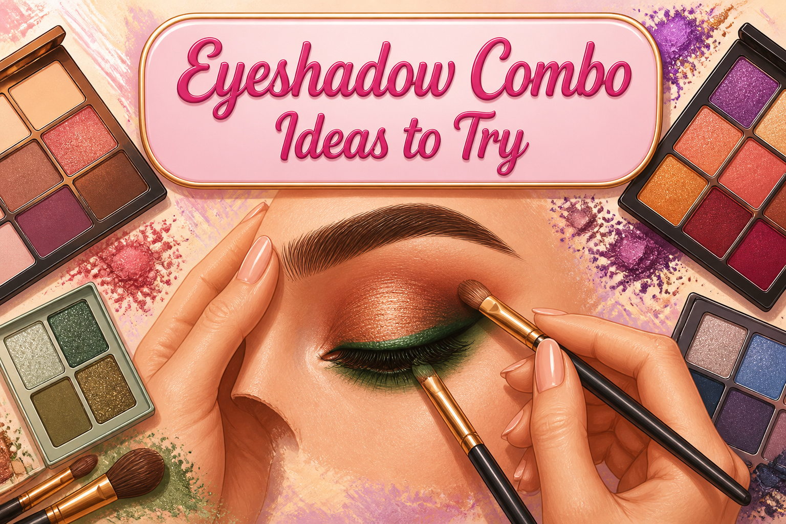
The best eyeshadow combo ideas share one trait: each pairing works only when placement is treated as a rule, not an afterthought.
Green and brown, for instance, collapse into mud the moment the two tones share the same lash line instead of keeping brown above and green below.
The fifteen pairings here range from office-safe taupes to foil-finish metallics, and the deciding factor is always whether you have the specific brush and the patience for where the colors must not touch.
1. Green and Brown
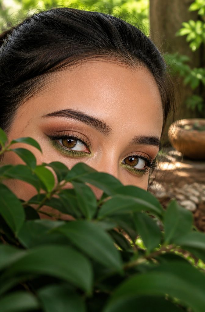
Olive or forest green against warm brown reads like actual foliage against soil, not costume makeup.
The L’Oréal pairing of Bottomless Java on the upper lash line with Golden Emerald below is the cleanest execution I’ve seen: brown anchors the eye’s shape while green adds the unpredictable note.
For day, keep the green sheer and the brown matte. A wash of olive across the lid with a soft café-au-lais brown blended into the crease works under fluorescent office light without looking like you’re auditioning for something.
Come evening, forest green pressed onto the center of the lid with a deeper espresso brown smoked through the outer corner and lower lash line gives the depth that reads intentional rather than accidental.
The brush placement that saves this combo from mud is keeping the two colors on separate lash lines rather than blended across the same skin.
Brown belongs above; green, below. Let them meet only at the outer corner’s natural fold, not blurred together over the whole lid.
When Ashley Kayla builds a similar look, she uses a taupe transition shade as the bridge instead of forcing the two strong tones to blend directly.
That matte gray-brown buffer is what lets the green stay green and the brown stay brown.

☘️Ultra-Pigmented Eyeshadow: Our high quality black green naked eyeshadow palette has intense color payoff, velvety and silky feeling, easy to apply and blend. You'll get intense, flared, visual effects. Perfect for green/hazel eyes. The delicate 3D snake pattern makes this eyeshadow palette even more charming and suitable mother's day gifts for mom!

"ALL-MATTE EYESHADOW FOR MATURE WOMEN: Unlock effortless sophistication with the ""Neutral Elegance"" 12-Color All-Matte Eyeshadow Palette for Older Woman . Specifically curated for those who appreciate understated beauty and refined finishes, this palette contacts Grey, brown, soft-purple, greenish, smokey rose cold gradient colors your secret weapon for creating polished, chic looks that transcend trends and flatter all ages, including seniors

It Gets Better with Sage - Bring home the good vibes with 9 sage, olive and essential neutral shades in Matte, Metallic and Matte Sparkle finishes! It’s good vibes only with this sage palette.
2. Pink and Blue
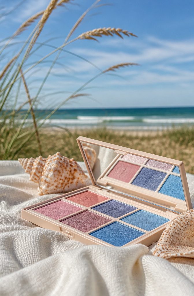
Pink and blue together still feels risky until you see where the two colors actually belong on the lid.
The harmony lives in specific shades: bubblegum or soft rose, the kind L’Oréal Paris catalogs as "Always Pearly Pink," paired with a powdered or denim blue like their "Timeless Blue Spark."
The colors should meet at the crease boundary, not collide on the flat lid. Blue stays on the outer third, blended inward until it ghosts into pink at roughly the pupil line; carried further, you get costume.
Navy kills this combination dead. It drags the whole look toward theatrical, toward something no one adults should wear.
Ashley Kayla’s ombre liner technique offers another way in: run pink across the full lid and crease, then lay blue as winged liner from the outer corner stopping two-thirds across, completing the wing tip in matching pink so the colors fuse at the center point.
The blend point matters more than the blend itself. Soft shadows forgive edges; brights demand that transition sit exactly where lid meets fold, visible only when the eye opens.
A thin line of liquid liner at the inner corner, which Kayla adds for dimension, keeps the shape deliberate rather than accidental.

Matte Eyeshadow Stick: Enjoy highly pigmented with Wugbc cream eyeshadow stick, featuring a highly pigmented formula that provides bold or neutral eye shadow looks. Suitable for building from soft daytime shades to dramatic evening styles

1. LIGHT-SHIFTING PIGMENTS – A soft lilac base transforms into luminous pink blue reflects that shift beautifully with movement and changing light. The multidimensional finish creates an ethereal glow with cool-toned dimension, perfect for dreamy everyday looks and creative artistry

Easy-to-wear shades. All-day wear.
3. Black and Silver
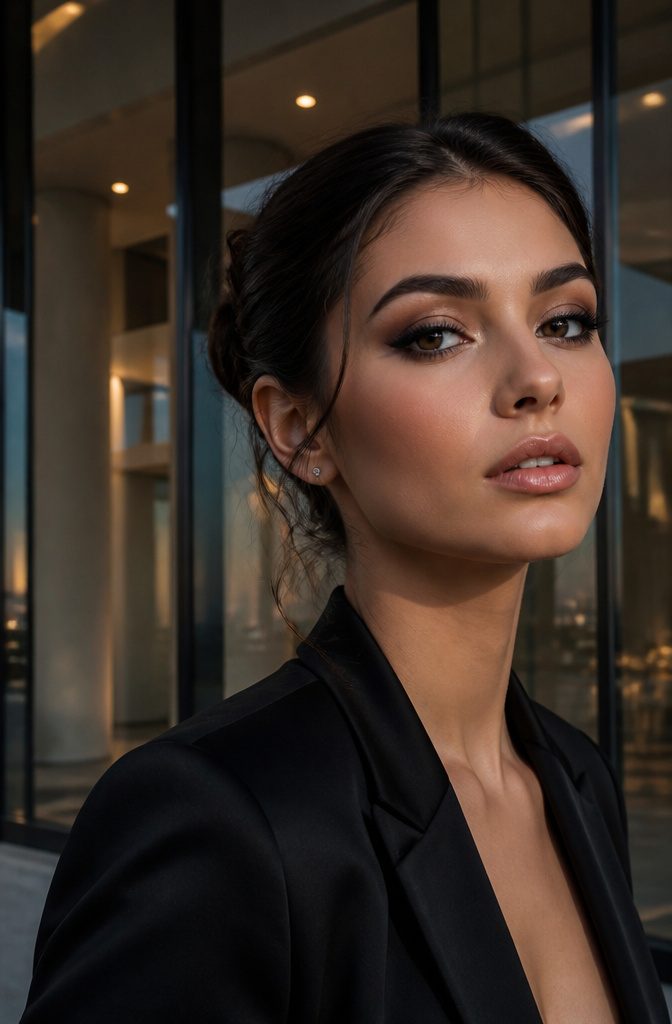
Black and silver reads as timeless on paper and bruised in practice after about age 30.
The difference lives almost entirely in how "silver" is delivered. A flat metallic pressed pigment catches overhead light and looks expensive up to the crease but reads as costume past it.
Shimmer, looser and more reflective, moves with the face and forgives texture; glitter, unless the invitation says "disco," is usually the wrong call for anyone over 30.
Too much black pools in the socket line and turns the whole look into hollowed-out stage makeup.
One brush of matte charcoal or deep graphite between the silver and the black, pulled upward past the orbital bone before either shade fully sets, is what separates editorial dimension from a swollen appearance.
Without that intermediate tone, the two colors meet like a hard line at midnight rather than a recession into shadow.

Look on the Bright Side: Our light-catching silver eyeshadow palette includes 9 cool silvery shimmers and frosty y2k hues to create the perfect mood-lifting looks.

❤. This BLACK METEORS eye palette is mixture of 15 stunning cool toned shades that velvety & go on smoothly texture with matte satin finishes to create next level looks to unleash your artistry. Each blendable, buildable and long-lasting, created to suit every skin tone and eye color.

【❤All-in-One Makeup Pallet for Teens & Women】UCANBE Pretty All Set make up palette features 86 versatile & ultra-blendable shades, including 80 eyeshadows, 2 highlighters, 2 blushes, and 2 contours. Pigmented eye shades ranges from black gray white silver goth eye makeup shades to bright rainbow colors to sparkling metallic glitters to rose rustic nudes & brown taupe neutrals, and multi-finishes ranges from smooth mattes to velvety shimmers to dazzling metallic to fine pressed glitters.
4. Gold and Bronze
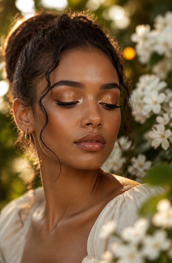
Warm metals read expensive when they stay in their own lanes.
Gold carries a yellow undertone that catches light; bronze runs deeper and redder, almost coppery in the pan. That slight temperature gap is why the pair works across more skin tones than a solo shade ever could.
On cooler complexions, bronze anchors the warmth so gold does not read brassy. On deeper skin, gold pops without getting lost.
The mistake is treating both as lid-to-brow finishes. Shimmer stops at the crease, or you get a disco ceiling nobody asked for.
Keep bronze low and blended across the lid, then press gold onto the center with a fingertip for that wet, molten highlight. The brow bone gets matte or nothing at all.
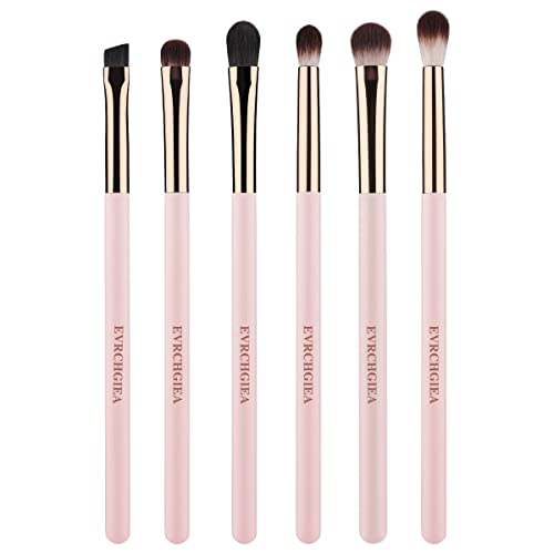
『Special Gifts for Her』The 6pcs eye makeup brush provides her daily eye makeup use. It will show her natural beauty and leave a perfect finish. Ideal gift to her, family or loved one for birthdays, Valentine's Day, Mother's Day, weddings and graduation ceremonies.

EcoTools Enhancing Eye Makeup Brush Set creates the perfect eyeshadow look with (1) Shade + Define Eye Brush Duo and (1) Smudge + Blend Eye Brush Duo - ideal for eye makeup application

THE ULTIMATE EYESHADOW BLENDING BRUSH: This synthetic haired brush is soft and absorbent, and it's medium size gives more control for specific blending needs.
5. Pink and Yellow
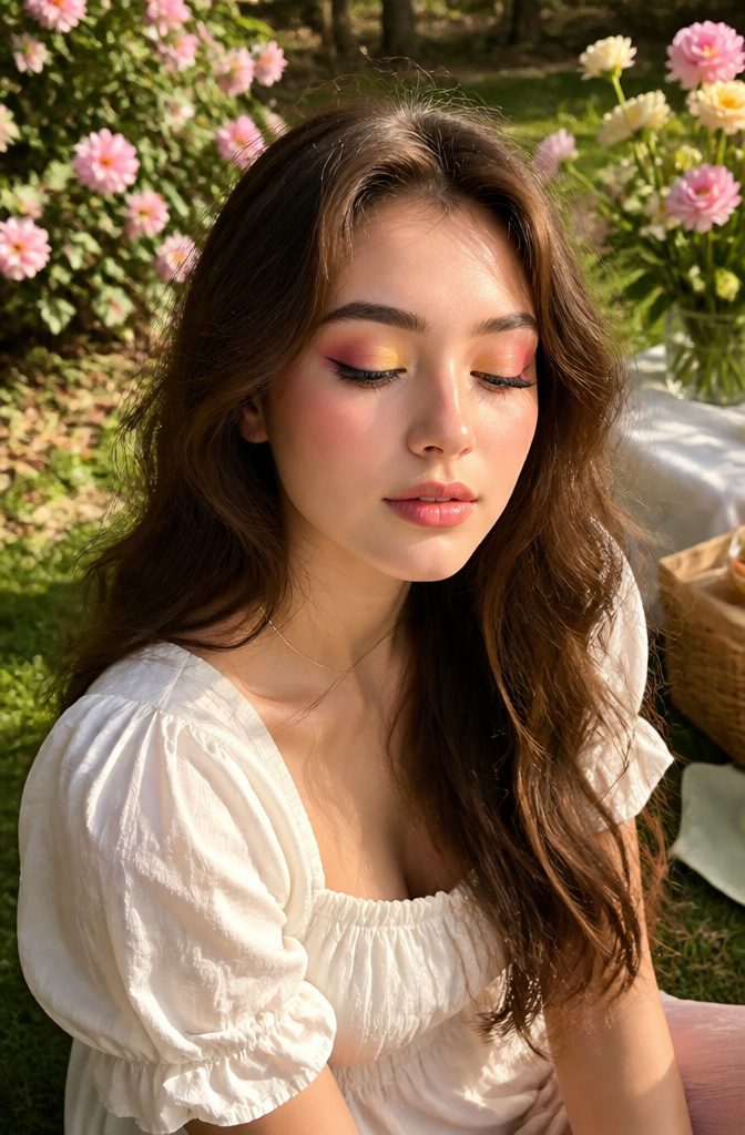
Yellows in the sunrise look land somewhere between ripe lemon and mango sorbet. Anything paler turns ashy, anything neon reads like an allergic reaction on the inner corner.
What convinced me, reading through enough tutorials to glaze over, was the number of people who trusted a pastel yellow and ended up looking feverish. Healthy glow sits in that saturated middle ground that still photographs bright against pink.
The pink half of this pairing needs weight to keep it from nursery territory. A dusty rose or a brick-pink pulls the combo toward modern; bubblegum reverses the dial hard.
I place the yellow on the inner third of the lid, sweeping pink outward and upward, because the gradient direction matters most for hooded lids.
Darker color on the outer V and a lighter pop near the tear duct creates the illusion of lid space where the fold otherwise erases it.
Reverse it and the hood swallows the work. Blend at the center until no line shows, and keep the brow bone either bare or in a neutral cream so two vivid shades do not compete with the brow’s natural drop.

【Feature】When viewed head on there only appears to be one color, however, color shifts become visible when viewed at different angles on a rounded surface and in different lighting.

👾💜 INTENSE COLOR PAYOFF - Chrome green eyeshadows are formulated to deliver rich, opaque color in just one swipe. From bright neon yellow to forest green, emerald dark green shades, usually for a bold, saturated hue green eyes makeup.

High-Intensity Diamond Glitter Eyeshadow: Infused with rich color payoff and a dazzling diamond-like glitter top layer, this eyeshadow delivers stunning duochrome effects with just a gentle swipe. The multidimensional reflectivity adds depth and brilliance to make your eyes pop with vibrant, buildable shine. Ideal for creating head-turning looks effortlessly
6. Classic Smokey Eye
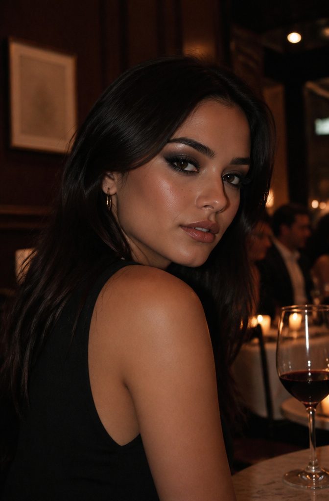
Grey outperforms black for most women because it carries depth without the hard edge that can read harsh under fluorescent bathroom lights or laptop glare.
Charcoal functions as the actual shadow on the lid; it recedes where black would sit flat and theatrical.
Silver’s placement matters more than its shimmer. The lighter note belongs at the inner corner and across the center of the lid, never swept up into the crease where it fights the charcoal.
That overlap, that muddy band where metallic meets matte too high up, is the error that turns a smokey eye into something that reads as slept-on rather than styled.
The finish comes from how the two tones relate, not from adding more.
A clean charcoal base with silver catching light where the eye rounds forward does more work than a third or fourth shade layered in to "complete" the look.
Blend the charcoal past the crease and stop; let the silver sit where the lid is fullest and do nothing else.

THE #1 LONG-WEAR CREAM SHADOW STICK IN THE U.S.*: Source: Circana, LLC, US Prestige Beauty Total Measured Market, Makeup Eyeshadow by Product, Dollar and Unit Sales, Makeup Form: Stick, 12 months ending January 2025.
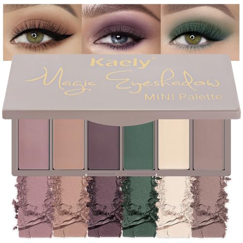
【Eyshadow Palette Travel SIze】This professional level makeup palette features 6 highly-pigmented shadows that glide onto lids & make eyes pop with color. This mini eyeshadow is easy to carry eveywhere for any occasion.

AFFORDABLE PROFESSIONAL QUALITY: Achieve flawless, blendable matte looks with five silky shades that deliver rich, buildable color—perfect for trendsetters who want top-tier style without breaking the bank.
7. Sunrise Hues
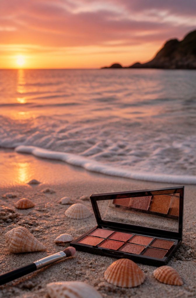
Warm orange and soft pink can read tropical drink fast if the tones are wrong. Coral beats tangerine here; it carries enough white to look like light rather than fruit.
Tangerine, for all its energy, sits too close to neon once blended across the lid. Rust is beautiful on deeper skin but turns muddy against soft pink, so keep that pairing for an Autumn Leaves look instead.
The pink layer matters just as much. Peach works if it pulls more nude than orange, rose if it pulls cooler than coral.
Salmon, that quiet in-between, is what most dawn light actually looks like: a diluted coral with dirty-pink undertones that reads as sky rather than flower.
Horizontal bands mimic the real horizon. Lay coral across the entire lid as the base light, then press rose or salmon into the crease and upper third where the sun has not fully risen.
The lower lash line stays clean or carries a whisper of the same coral; anything darker breaks the illusion.
A finger suits both shades better than a brush for the first laydown, since dawn is diffuse and brush strokes read as stripes.
What fails is reversing the order.
Pink on the lid with orange above looks like a color-wheel exercise, not a morning sky. The warmth belongs where the light source would hit, and on a face that means the lower, more prominent plane.

16 Colors Profesional Eyeshadow Palette --- The purple blue professional eyeshadow palette contains 16 colors, ten mattes and six shimmer. You can blend these colors to create charming eyeshadow makeup what you want. Perfect for artistic make up,smoky eyes makeup, wedding makeup, party makeup or casual makeup, Christmas makeup

❤【8 PCS Eyeshadow Stick Set】8 classic colors,including Desert,Pink,Light Purple,Sky Blue,Dazzling Blue,Greenish Cyan,Mocha Beige and Beige Gold can be used to create smoky,sultry,luminous,metallic finish,and also works well as a highlighter and Eyeliner Pencil.

1. LIGHT-SHIFTING PIGMENTS – An icy blue base reveals luminous lilac pink reflects that shift with every angle and changing light, creating a radiant, multidimensional eye look.
8. Ocean Breeze
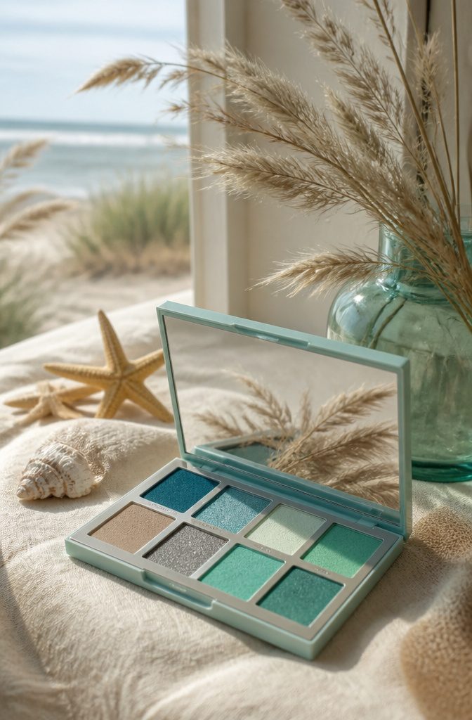
Turquoise and seafoam green sound like mid-July on a sailboat, but the trick is wearing them when the air turns brisk.
Cool weather strips the humidity that usually makes these shades feel tropical, so against pale skin and gray skies they read Cape Cod, not carnival cruise. The blue carries the water; the green carries the beach grass.
What saves this from looking costume is a matte sand or taupish-brown in the crease — something that suggests wet sand, not sparkles. It drags the look back to earth without muting the color story into something beige and apologetic.
For liner, skip black entirely. It pools the eye into something dramatic and evening, which fights the open, windy feeling.
A muted olive pencil, drawn thin and then smudged with a small brush, anchors the lash line the way tide line anchors a shore. It defines without closing anything off.

❤【9 Colors Eyeshadow Palette】 9 Glitter Shimmer and Matte Colors ★DO ANY MAKEUP LOOK★ It has good color combination and you can create a dramatic look or a natural look with this deep, rich and intense eyeshadows. Endless possibilities - It will put you out of your comfort zone to create best glam looks, like everyday eye look, sultry smokey eye look and Glitter and rainbow eye look. Great for exploring colors and makeup artistry.

Glitter, Glitz & Grey - This grayscale eyeshadow palette is a smokey eye lover’s dream. With 3 glitzy metallics and 6 blendable matte eyeshadows, you can create the easiest smokey eyes ever.
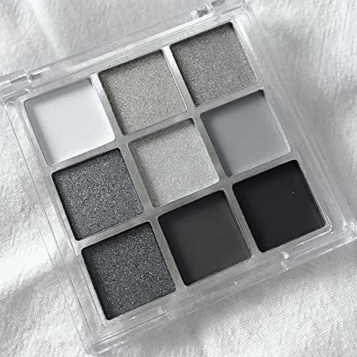
Cool Toned Eyeshadow Palette --- The black smokey eyeshadow palette contains 9 pop colors, four mattes and five shimmer.You can blend these colors to create cool eyeshadow makeup what you want. Perfect for artistic make up, smoky eyes makeup, party makeup or casual makeup, Halloween makeup
9. Autumn Leaves
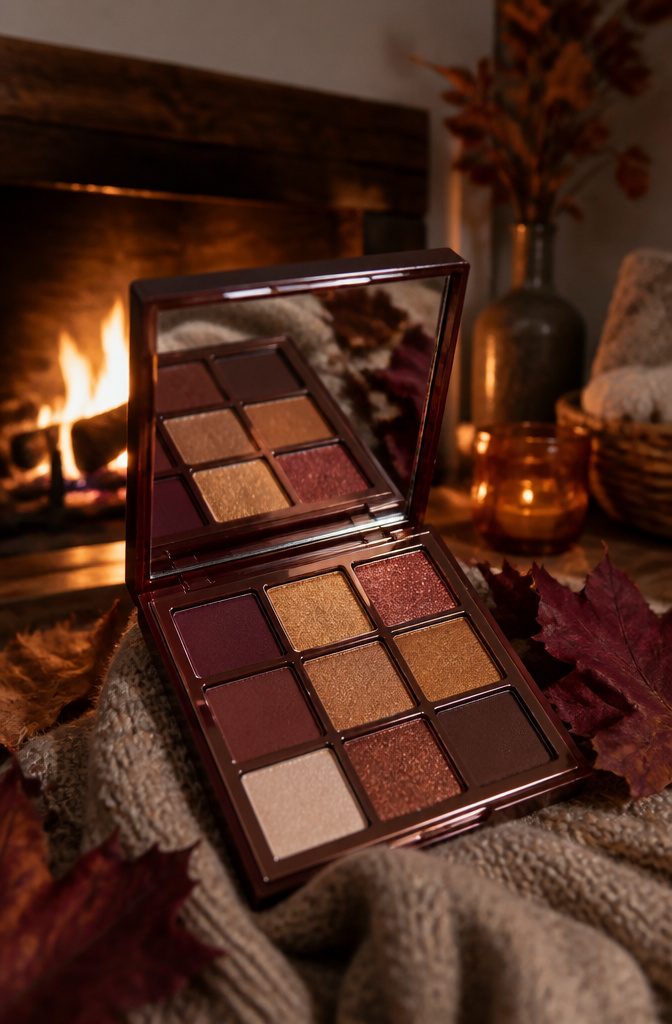
The wrong red is what turns a fall eye into something that looks like irritation instead of intention. Cherry or true red sits on the skin with too much pink, and the whole area starts reading as swollen.
Burgundy reads as foliage because it carries that brown undertone that pools in shadow rather than floating on top of it.
Gold has the same hazard. Yellow gold, especially anything shimmery, fights the burgundy and flattens both colors into a clash.
Antique gold, which carries its own muted, almost oxidized quality, drops back and lets the red do the seasonal work while it handles the light catching.
Placement matters as much as shade choice.
Burgundy belongs in the crease and outer corner, never across the whole lid where it closes the eye down. Antique gold stays on the center of the lid and the inner corner, which keeps the look open.
The result is warmth without weight, and the pairing works because the two tones share the same low saturation rather than competing for attention.

Eye Shade & Blend Set - Eye makeup brush set has 3 go-to tools for daily eye and brow needs: (1) RT301 Base Shadow Brush, (1) RT300 Deluxe Crease Brush, and (1) RT341 Angled Brow Brush and Spoolie

DUAL-ENDED DESIGN: Features two brush heads in one, eliminating the need to switch between tools for seamless eye contouring and blending.

💎【5 Pieces Eye Makeup Brush Set】Package Includes 1× Large Eyeshadow Brush + 1× Medium Eyeshadow Brush + 1× Small Eyeshadow Brush + 1× Flame Smudge Brush + 1× Eyebrow Brush. The large brush is ideal for applying color over broad areas, while the smaller brushes are perfect for refining details in smaller zones like the outer corners, under-eye, and tear troughs. With these eyeshadow brushes, you'll have everything you need for every eye makeup look!
10. Berry Delight
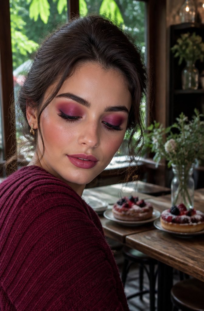
Purple around the eye socket turns bruise-gray on fair skin unless you choose the right family and place it with intention.
Plum, which carries enough red to stay warm, sits safer on the lid than violet, where blue undertones can pool like a shadow nobody asked for.
Aubergine reads almost brown in some light and works best as a soft wash through the crease, not a packed lid.
Raspberry splits the same way.
A blue-pink raspberry pulls the whole look into costume territory, especially next to violet, so I reach for the red-pink side, the shade that looks like crushed summer fruit rather than neon. That warmth keeps the purple honest.
Placement is what saves it. The darker tone stays at the outer third and below the crease line, never up toward the brow bone where purple goes muddy.
The raspberry sits on the center of the lid, blended just to where the two meet, with a clean highlight at the inner corner to break up the density.
On fair skin, the gap between colors needs to be deliberate; too much blending and they gray out, too little and you read injured.
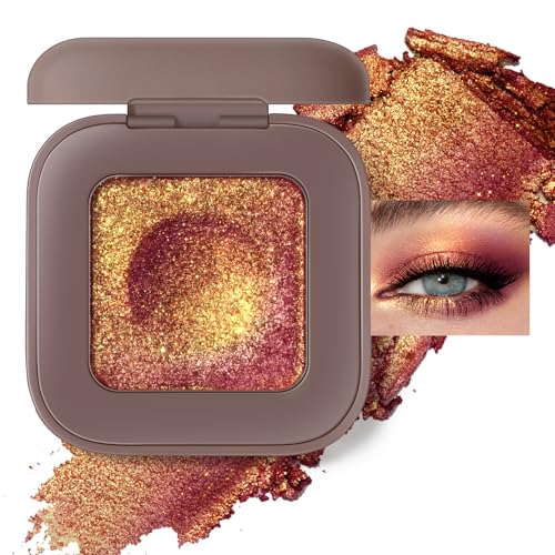
High-Intensity Diamond Glitter Eyeshadow: Infused with rich color payoff and a dazzling diamond-like glitter top layer, this eyeshadow delivers stunning duochrome effects with just a gentle swipe. The multidimensional reflectivity adds depth and brilliance to make your eyes pop with vibrant, buildable shine. Ideal for creating head-turning looks effortlessly
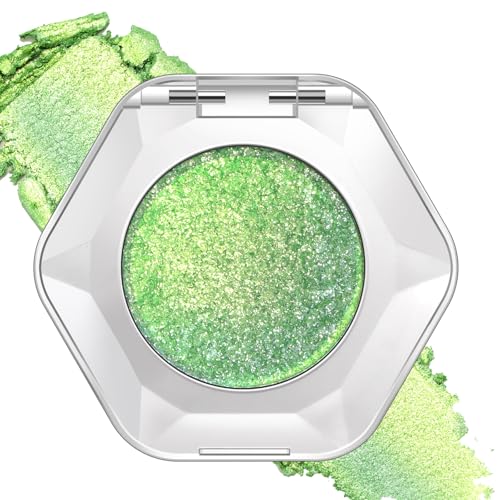
Mesmerizing Color Shift: Experience a stunning holographic and duochrome effect that shifts and dances in the light. This versatile pigment is your go-to for any look, from a soft, ethereal fairy-core glow to a bold, head-turning party shimmer. Wear it alone for a sheer wash of color or build and layer it for an intense, multidimensional sparkle that captivates from every angle

AMPED UP EYE LOOK: Get an amped up eye look with e.l.f. Liquid Metallic Eyeshadow! This liquid eyeshadow delivers a high-impact, metallic finish through multi-dimensional metallic pearls. The shade Aurora is jade green with green shimmer.
11. Golden Goddess
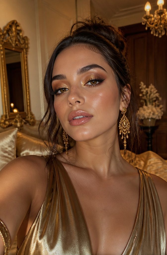
Glistening gold paired with bronze becomes its own category when the ratio shifts from equal balance to a two-thirds gold, one-third bronze split, and when both shades carry a wet or foil finish rather than standard shimmer.
That heavier gold presence with reflective intensity reads as lit-from-within in photos, while the bronze anchors the warmth so the metallic flash doesn’t wash out facial structure.
The placement also separates this from simpler gold-and-bronze looks. Bronze sits across the entire mobile lid and softly into the crease; gold is pressed only onto the center of the lid and the inner corner as a pinpoint highlight.
This concentrated placement creates dimension on camera that blended-all-over metallics flatten out.
Skin prep matters here because foil and wet-finish shadows amplify texture. A smoothing eye primer is non-negotiable, and I layer it over a lightweight eye cream that has fully absorbed.
Any residual tackiness or dry patches will grab the metallic pigment and photograph as uneven. The finish reads luxurious only when the skin beneath reads smooth.
12. Cool Contrast
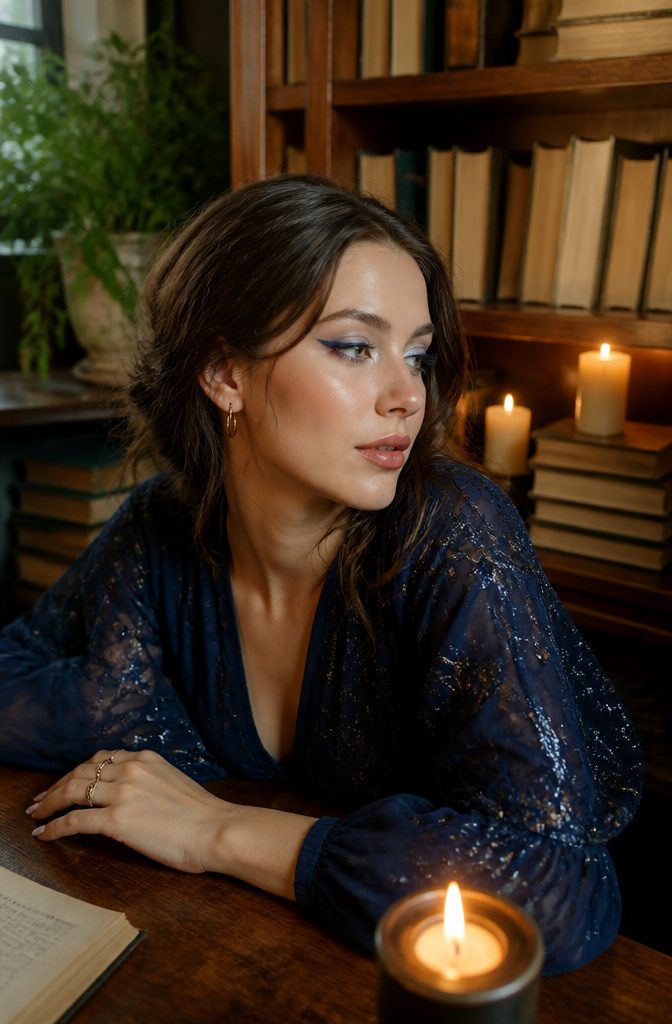
A cool blue and icy white pairing reads as definition rather than costume, but only if the blue depth matches the eye color it frames.
A navy or deep cobalt near the lash line flatters brown eyes without overpowering them, while a mid-tone slate or denim blue does the lifting for blue and green eyes that darker shades would flatten.
The white belongs in the inner corner and along the brow bone, and it should look like candlelight, not craft paint: satin or pearl finish, no chalky opacity, no visible glitter chunks.
The disconnect happens in the middle.
Without a transition shade, the two tones sit like separate stickers. A soft blue-gray or a muted lavender blended through the crease bridges the gap.
I have watched tutorials where the creator skips this step to save time, and the result is always the same: a sharp line where the color stops and the bare lid begins, two colors existing in parallel instead of one shape holding together.
13. Pastel Dreams
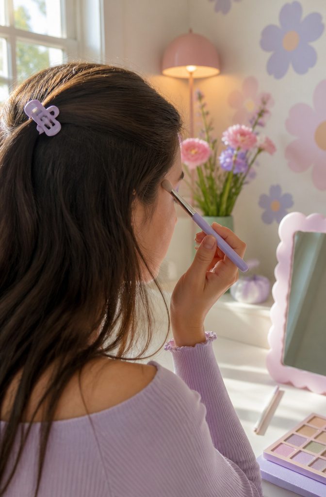
Both lavender and mint green draw their softness from a shared white base, which keeps them from clashing even when they sit right next to each other on the lid.
The trouble starts when you try to build them up. Pastels need opacity to read as intentional, but heavy layers turn chalky fast.
A cream shadow base matches to each color separately solves this: lavender over a pale lavender base, mint over a mint one, so each reaches true saturation in two thin layers instead of four caked ones.
The seam where they meet, usually right at the socket line, is where the real skill shows.
I blend that zone with a clean, dry brush and no added product, working in small circles until the edge looks like weather, not effort.
Green eyes pull this off most naturally; the mint deepens the color without competing, and the lavender adds a cool contrast that looks deliberate rather than like a bruise.
Hazel and brown eyes can wear it, but the look reads softer and needs a tight black liner along the lashes to keep the pastels from washing the whole face into one note.
14. Sunset Glow
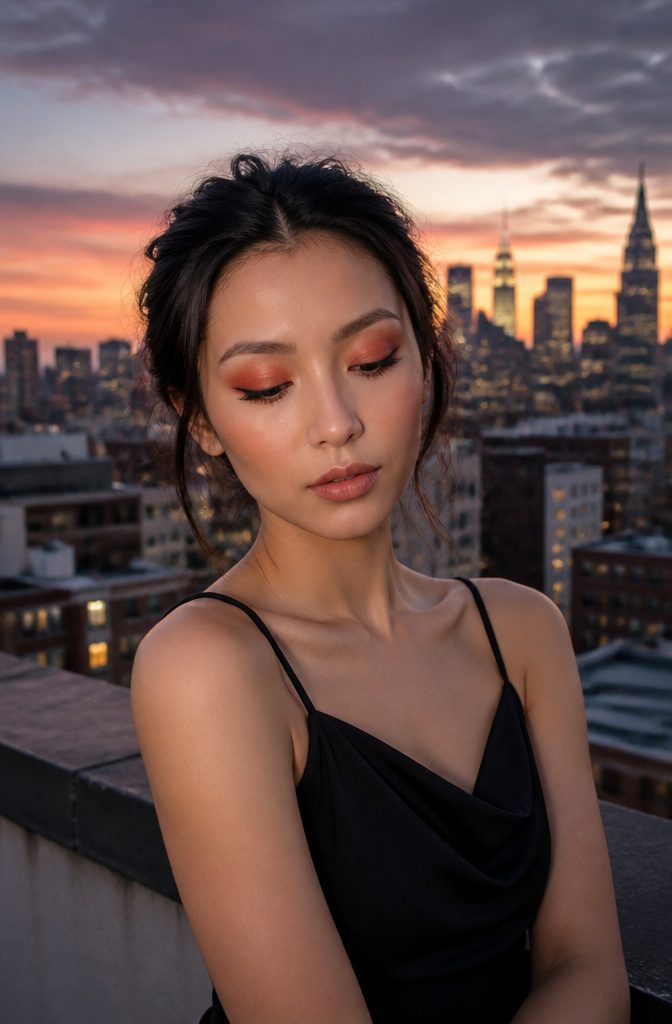
A vertical gradient of reds and burnt oranges reads evening rather than morning because the pigment sits deeper and more saturated.
Where Sunrise Hues keeps things soft and diffused, Sunset Glow chooses a direction: color starts richest at the lash line and lightens as it travels toward the brow bone, never pretending to come from all sides at once.
The red that works is the one that leans brick or rust, not cherry. Blue undertones around the eye bring out irritation in anything too cool or too true.
I had to learn this by comparing three failed attempts against one that finally looked intentional. That workable red lands closer to terra cotta or dried chili than to anything you’d call berry.
Daylight wears this best with the outer edge kept tight and the lightest point of the gradient hitting just below the arch of the brow.
A clean lower lash line in the same burnt orange, applied thin and close to the lashes, anchors the heat without letting it bleed into the surrounding skin.
Skip shimmer on the top lid if the office has windows behind you; the matte version reads as color choice rather than costume.
15. Earthy Neutrals
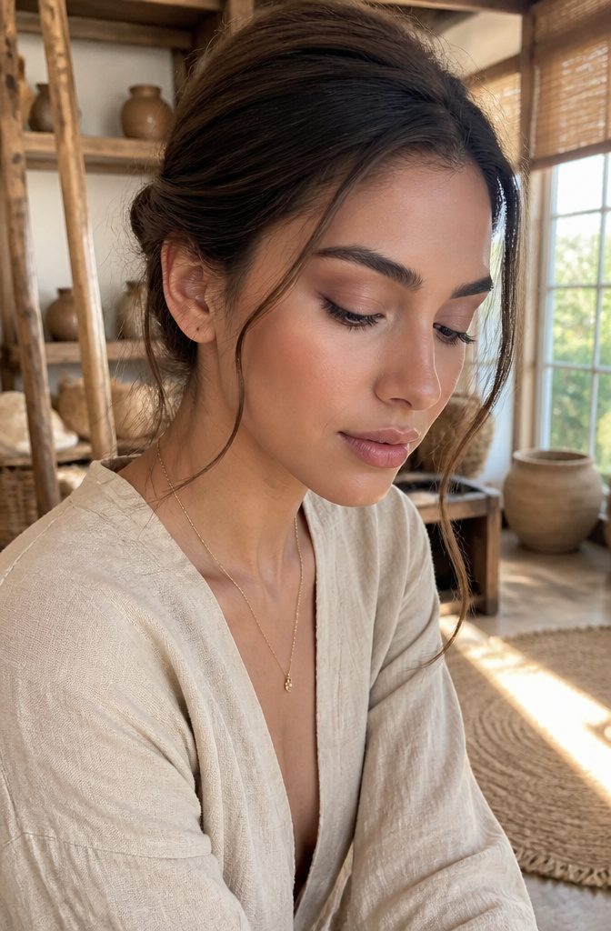
Taupe outperforms beige for every eye shape because the gray undertone actually creates shadow instead of just washing color out.
A wash of cool-toned taupe across the lid defines the socket line even on days you skip liner, while soft browns built into the outer corner and lower lash line add the structure that a beige shade would absorb back into the lid.
The depth of brown matters more than most people sort out.
For morning meetings or video calls where the light is flat, a medium brown two steps deeper than your natural skin tone gives enough contour without registering as "done up."
Deeper espresso browns belong to evening, not because of a clock rule but because artificial overhead light swallows medium shades and leaves the eye looking half-finished.
What makes this pairing the real workhorse of any eyeshadow combo ideas list is how it accepts interference.
A shimmery green across the front lid, a bright greenish-yellow at the inner corner, even a dark grayish-black at the outer lash line — all of it sits cleaner over a taupe-and-brown foundation because the transition shade is already doing the blending work.
The base doesn’t compete; it recedes so the pop can register.
Choosing Combinations That Actually Work
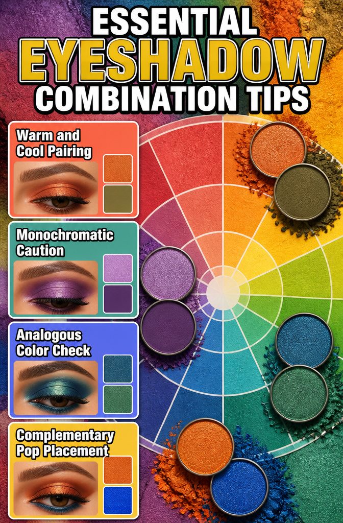
Every source mentions color theory, but standing in front of three open palettes at Ulta last month, I realized almost none of them explain how to actually use it.
The color wheel tells you green and red are complementary, which sounds like Christmas on your eyelid until you learn it means a muted olive with a soft rose-brown, not literal grass and stop-sign.
Cool with warm is the rule that trips people most.
A warm orange popped just above a neutral brown crease, like the technique from that Juvia’s Place Warrior II palette demo, adds dimension without looking like two different people made each eye.
The key is keeping one tone dominant and the other to a small placement, not a fifty-fifty split that fights itself.
Monochromatic looks fool you into thinking they are easy. A dark purple with a light purple only works if the textures differ enough, one matte and one with some shift, or you end up with a bruise-gradient.
Hold the palette at arm’s length in store lighting: if the two shades melt to the same value, skip them.
For analogous pairings like blue and green, the adjacent colors on the wheel, check your veins in natural light first.
If they read purple, cool analogous wins; if green, warm analogous flatters more. This is the only test that uses your actual face instead of a theory about it.
Understanding the color wheel can elevate your beauty routine… One of the best ways to pick a combo is to select two complementary colors. Green and red, blue and orange, or purple and yellow. These shades really pop when worn together.
What this means in practice: those pop shades belong on the center lid or lower lash line, not blown out to the brow bone, unless you are aiming for editorial.
Layering and Blending
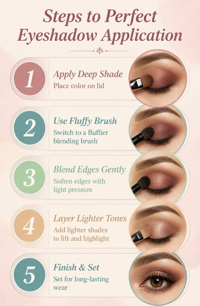
A paddle-shaped laydown brush deposits color with its packed bristles pressing straight into the lid.
That pressure packet of color is layer one. The moment you switch to a fluffier blending brush, the goal changes entirely: lighter pressure, sweeping circular motion, and the edges of that first tone soften without the center disappearing.
Most tutorials skip the density switch entirely, which is why the crease color eats the lid color and you wind up repainting the same patch of skin three times.
The order matters because shadow has weight. Start with the deepest shade in the outer V and every lighter tone layered after it lifts forward visually.
Reverse it, lay shimmer across the whole lid first, and the matte crease sits on top like dust on glass instead of sinking into the depth you built.
Three brushes minimum for any combo that uses more than two shades: one to place, one to diffuse the edge, one clean and dry to rescue overload before it sets.
When Season Meets Skin Tone
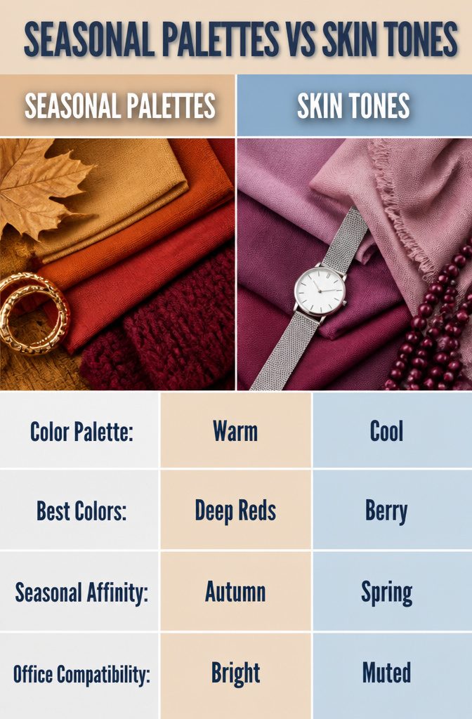
Seasonal palettes are a starting point, not a script. The same rich golds and deep reds that read as cozy autumn foliage in October fluorescent light look bruised and theatrical under March’s flat overcast skies.
I learned this the hard way wearing a scheme built on warm oranges and soft pinks to an 8 a.m. January meeting.
The sunrise hues that glow in July online catalogs turned ashy on my cool undertone. The trick is separating the color relationship from the lighting it was photographed in.
Berry and burgundy combinations carry the same warmth as those gold-red autumn pairings, but they survive office lighting because they rely on depth rather than amber reflection.
If your undertone is cool, borrow the structure of a seasonal combo but swap the temperature.
Pink where orange sat, mauve where rust lived. The seasonal name is just a mood board.
Frequently Asked Questions
How do you choose eyeshadow color combinations?
Start with complementary colors on the wheel, but interpret them as muted versions rather than literal pairings: olive with rose-brown instead of grass with stop-sign red.
Keep one tone dominant and the other to a small placement, not an even split.
For analogous pairings like blue and green, check your wrist veins in natural light; purple veins mean cool analogous flatters you, green veins mean warm analogous works better.
What are some popular eyeshadow color combinations?
Green and brown reads like foliage against soil when olive or forest green stays below the lash line and warm brown anchors above.
Pink and blue works as a crease-to-lid gradient with bubblegum or soft rose meeting powdered blue at the pupil line.
Black and silver stays modern past age 30 only when silver is delivered as shimmer rather than flat metallic, with a charcoal buffer pulled past the orbital bone before setting.
How can I apply eyeshadow for a polished look?
Use a paddle-shaped laydown brush to deposit color with pressure, then switch to a fluffier blending brush with lighter, sweeping circular motion to soften edges without erasing the center.
Start with the deepest shade in the outer V so every lighter tone layered after it lifts forward visually; reverse the order and matte crease sits on top like dust on glass.
Three brushes minimum for any combo over two shades: one to place, one to diffuse edges, one clean and dry to rescue overload before it sets.