
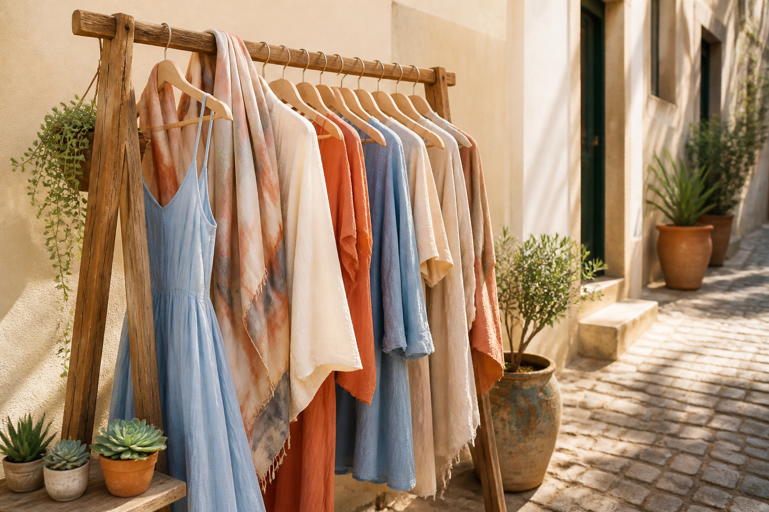
Building an outfit around a color palette means choosing clothes so every piece shares the same temperature and mood, not just matching random favorites that looked good on the rack. The trap is buying a "statement" piece in a tone that fights everything else you own. Start with the two-minute test: hold white fabric under your chin, then swap it for ivory. If white wakes your skin up, you run cool; if ivory does the glowing, you lean warm. That single result shapes every color that follows.
Identify Your Color Palette

A color palette only works if it works on you. The first test takes two minutes and a window with natural light: hold a scrap of white fabric under your chin, then swap it for ivory. If white makes your skin look alive, your undertone is cool; if ivory does the glowing, you lean warm. Silver jewelry flatters cool undertones, while gold tends to read better on warm ones. Neutral undertones play well with both metals.
Seasonal color analysis, the system professional stylists use, sorts these undertones into four palettes. Winter and Summer are cool; Spring and Autumn are warm. Within each season the contrast level shifts. Winters and Springs carry brighter, higher-contrast coloring, while Summers and Autumns live in softer, more muted territory.
Mood matters just as much as biology. Colors carry emotional weight whether we plan it or not. A muted teal reads calm and pulled-together where a saturated red pulses energy. Before you commit to a palette, ask what story it tells about your day. The three criteria have to line up: personal style, actual complexion, and the mood you want to project.
Choose a Base Neutral

Black, navy, brown, or khaki quietly do most of the heavy lifting in bottoms, outerwear, shoes, and bags. But let me mention a distinction that tripped me up for years: in color theory, only black, white, and gray count as true neutrals because they lack color entirely. Fashion stretches the term to include brown, khaki, and navy because they don’t compete with brighter shades and read as emotional blank slates.
The warmth or coolness of your chosen neutral matters more than the color itself. Classic capsule guidance ties black, beige, tan, and cream to warmth, while white, gray, and navy skew cool. Sticking to one temperature, warm or cool, keeps the palette from fighting itself when you start adding color. Nearly all my pants were black and my favorite coat was too, so my wardrobe had already voted. I listened. A small family of neutrals—ivory, camel, espresso, black, taupe—creates a timeless backdrop before any accent enters the picture.
Select Main Colors

The color wheel is where this gets practical. Red, yellow, and blue sit as primaries; mixing any two gives you the secondaries, green, orange, and purple; cross a primary with a neighboring secondary and you land on a tertiary like teal or coral. Those relationships are what let you pick two to four main colors that actually cooperate.
Complementary pairings, red against green or blue against orange, create the sharpest contrast, which means one color needs to do the heavy lifting while the other plays a supporting role. Analogous schemes, blue flowing into teal into green, read as calmer because the hues share common DNA. Triadic spacing, picking three colors equally distant on the wheel, gives you the balance of variety without the clash, though it takes restraint to keep all three from competing. Monochromatic works within a single color family, navy through sky to baby blue, and lets texture carry the interest instead of hue.
Proportion matters once you have chosen. One dominant color, roughly sixty percent of the outfit, a secondary at thirty, and an accent at ten keeps the eye from spinning. A slate coat over oat trousers with a whisper of rust at the neck reads intentional; three colors at equal volume rarely does.
Add Accent Colors

Accent colors work best as punctuation, not paragraphs. The 60-30-10 rule keeps them in line: sixty percent dominant color, thirty percent secondary, and ten percent reserved for that single bright note. A sunny yellow belt against olive and cream does what a semicolon does for a sentence; it redirects attention without starting a new thought entirely.
One accent is usually enough. Two or three can coexist if they never appear at equal strength at the same time, maybe a red earring today and a teal scarf tomorrow. They should each pair with every neutral in your base and at least two of your main colors so a single piece earns its place across several outfits rather than demanding new companions. Reds and yellows grab the eye anyway, so a little goes further than you think.
Where most people slip is treating an accent as a main color in disguise. A bright coral blouse, not a swatch; a mustard bag, not a coat. Keep the pieces small, keep the placement strategic, and let the ten percent do the work of fifty.
Mix and Match Combinations

The real test of a palette happens when you rotate which color does what. A moss green tee and matching balloon pants felt, on me, like a full crayon costume; swapping the tops created a color-blocked look with actual contrast, and that was the outfit that earned compliments at the grocery store. The same two pieces, different roles.
This is where the capsule wardrobe concept actually lives. A base neutral keeps you grounded, but the supporting colors let you shift the mood without adding volume. Try an analogous pairing like blue and teal for something gentle, or complementary rust and turquoise if you want the look to read deliberate rather than accidental. The more striking the contrast, the more your accessories need to speak the same visual language; a color-blocked purse in adjacent red and blue hues can tie a green-and-pink block together without matching either one.
Neutrals and bold statements both work as anchors, though the effect changes. Navy grounds everything quietly; crimson forces every other piece into a supporting role. Once you have three or four pieces in a shared undertone, warm or cool, the math gets simple. Eleven possible outfits from four items is not exaggeration; it is just counting.
Evaluate Under Different Lighting

Colors that looked like peaceful neighbors on your bed at ten a.m. can turn into quarreling strangers by dinner. The morning light through a kitchen window gives the truest read, soft and balanced enough to show which tones actually share an undertone and which were just getting along under a yellow bulb. Fluorescent office strips are the usual saboteur: they flatten saturation and push everything toward gray, so a sage blouse that pulled olive from a cream trouser at home suddenly reads as plain beige under the ceiling panels. I learned that one walking into a meeting and realizing the outfit I had checked in my hallway mirror had dissolved into mush.
Late afternoon storefront glass amplifies warmth. What reads as restrained coral in your closet can flare under those angles, competing with any accent you planned. Evening restaurant dimness narrows the range even further; two colors that held distinction in daylight can collapse into one muddy shape across the room from your date. The photograph under your phone’s flashlight is worth taking before you leave, but only as a warning shot, since screens add their own blue cast.
Pack a lightweight neutral layer, a jacket or scarf, for the moment you move into light you did not test against. That move saved me more than once when a dinner ran long and the Uber ride home happened under streetlamps that made my central color unrecognizable.
Color Temperature and Contrast Levels

Warm colors carry yellow, and cool colors carry blue; that single distinction governs whether two pieces look like they belong to the same outfit or two different ones. When I first sorted my closet by temperature, entire categories fell into place. Rust and olive green suddenly looked coherent against camel. A cobalt sweater that had always felt off with my black trousers made sense once I saw the competing blue undertones.
Contrast works on the same axis: the distance between light and dark, or between two saturated hues, creates visual energy. Too little and the eye glazes over; too much and the outfit wears you instead of the other way around. Seasonal palettes like Winter or Autumn are one useful lens here, not a rule to obey. A Winter palette favors high contrast and pure, cool tones, while Autumn leans warm and muted with gentler jumps between values. But these are starting points, not covenants. The real test is what happens on your own frame.
| Lens | Warm Range | Cool Range | Contrast Level | Typical Effect |
|---|---|---|---|---|
| Temperature | Red, orange, yellow-gold, olive, rust, camel, cream | Blue, green, purple, charcoal, navy, soft pink, pure white | n/a | Pieces share undertone; ensemble reads unified |
| Value contrast | Light-to-dark within warm family | Light-to-dark within cool family | Low: adjacent values | Subtle, blended, can flatten some wearers |
| Hue contrast | Warm against complementary warm | Cool against complementary cool | Medium: near-opposites | Energetic but still harmonious |
| Full opposition | Warm hue vs. cool hue | Cool hue vs. warm hue | High: temperature clash | Striking; needs commitment to read intentional |
If your features are high-contrast, like very light skin with very dark hair, bolder jumps between light and dark or saturated and muted tend to look integrated rather than jarring. Lower-contrast coloring usually softens the same combinations into something that competes with your face. What flatters is specific, not universal; the seasonal framework helps you ask the right questions, but your own mirror answers them.
Color Theory Basics

The color wheel still works the way you learned it in grade school: red, blue, and yellow sit as the primaries, green, orange, and purple as the secondaries you’d get from mixing any two of them, and the tertiaries—yellow-orange, red-orange, red-violet, blue-violet, blue-green, and yellow-green—fill the gaps in between. What shifts in fashion is how you apply the harmonies. Complementary pairing, those opposites like blue and orange, gives you the highest contrast and the boldest statement. Analogous schemes, neighboring hues such as navy into cobalt into teal, read quieter and more expensive because nothing competes. Triadic combinations, any three colors equally spaced on the wheel, keep the energy high without tipping into costume territory.
The 60-30-10 rule, borrowed from interior design, translates cleanly here: one dominant color for the bulk of the outfit, a secondary shade at roughly half that presence, and a single accent for the last tenth. Neutrals—white, gray, beige—can serve as any of the three roles, which is how a coral blazer stays wearable over a cream base rather than fighting a red-orange shirt. The color wheel itself never changes; what you change is the proportion and the fabric choice.
Personal Color Analysis

Skin undertone is the first filter most stylists use, and the tests are simple enough to do at a mirror with a lunch break. Hold white fabric under your chin, then swap it for ivory. If the white makes you look awake and the ivory makes you sallow, you probably read cool. If ivory warms you up and white throws a gray cast across your face, you likely run warm. I did this under a bathroom skylight around eleven in the morning and the difference was immediate, though a north-facing window would have worked just as well. The gold-silver test follows the same logic: warm undertones pick up gold; cool ones flatten against it and come alive with silver.
Professional color typing slots those undertones into four seasons—Winter and Summer for cool complexions, Spring and Autumn for warm—but the framework is one route among many, not a gate you must pass. Someone with warm skin and muted, low-contrast features reads Autumn; bright, high-contrast warm coloring reads Spring. The sixteen subcategories add nuance, yet plenty of people build coherent wardrobes without ever naming their season. Confidence in a color matters as much as where theory would file it. If a teal flatters your face and your mirror agrees, the fact that it sits in a Winter palette and you type as Summer is trivia, not a veto.
Capsule Wardrobe Connection

A defined color palette turns a closet from storage into something that earns its keep. Mine shrank from somewhere around forty or fifty pieces down to roughly thirty-five once I stopped buying colors that fought each other, and the outfit count actually went up. When everything shares the same handful of neutrals and related hues, a single blazer works with five bottoms instead of two. The editing gets simpler too: silhoettes and fabrics fall into place once the color question is settled, because a shape you love in a tone that clashes is still a piece that sits unworn.
That restraint is what makes quality over quantity possible. A capsule built on warm earth tones or soft neutrals with matching undertones gives you quiet richness without the scatter of unrelated brights. Color becomes the filter that lets you invest in better construction, because you know the item will live in heavy rotation. The palette does the coordinating so the pieces do not have to. Still, this only holds if you commit to colors you actually want to wear, not just the ones that look sensible on a chart. The sources that push capsule thinking all note the same tension: the mental overhead of narrowing down is real, and the payoff is mornings when getting dressed works without caffeine-fueled improvisation. For some women that relief is worth the discipline; for others a slightly looser frame, a few accent pieces outside the core, keeps the system from feeling like a uniform. Either way, the colors have to cooperate first.
Frequently Asked Questions
How do I know if colors go together?
Use color theory principles like complementary, analogous, or triadic pairings from the wheel, or simply hold pieces up together and trust your eye. A basic understanding of warm versus cool undertones helps, but your own reaction, wince or smile, is a valid test.
What is the 60-30-10 rule?
It is a proportion guideline for outfit color balance: sixty percent dominant color, thirty percent secondary, and ten percent accent. A slate coat over oat trousers with a rust scarf follows this exactly, keeping the eye from spinning.
How do I determine my skin undertone?
Hold white fabric under your chin in natural light, then swap it for ivory. If white makes your skin look alive, you are cool; if ivory does the glowing, you lean warm. Silver flatters cool undertones, gold flatters warm.
What are complementary colors?
They are opposites on the color wheel, such as red against green or blue against orange. Because they create the sharpest contrast, one color needs to dominate while the other plays a supporting role so the outfit reads intentional, not accidental.