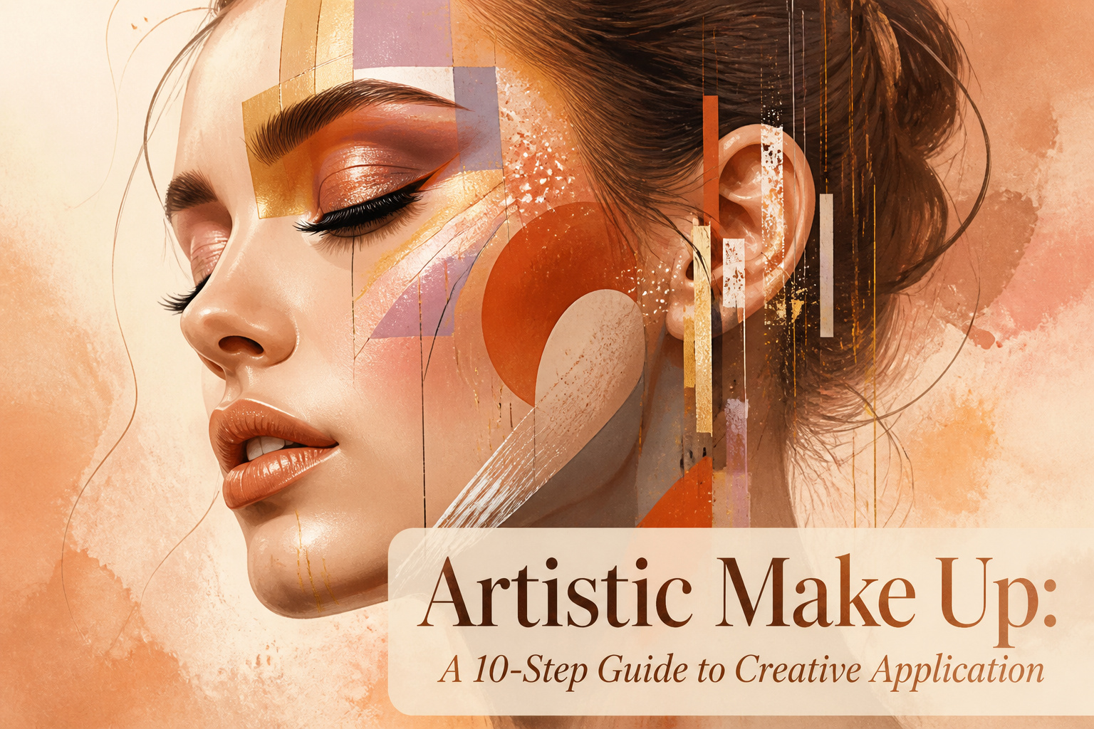
Artistic make up is creative application that treats the face as a painted canvas rather than a surface to correct. The difference between stage paint and something wearable comes down to how thin your layers are; three sheer washes of pigment read richer than one heavy swipe, and they stay where you put them. That same principle, pressed into skin with a fingertip rather than swept, is what lets shimmer sit on top of the work instead of muddying into it.
Prep the Skin
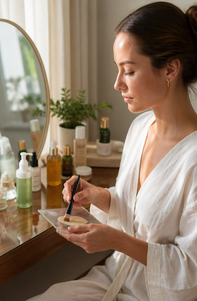
Clean skin holds pigment the way a canvas holds paint: unevenly when dirty, smoothly when bare. I always start with a cleanser matched to oily skin needs mattifying primer, dry skin needs hydrating primer, and the gap between the two is where most creative looks fall apart. Skip moisturizer on a dehydrated face and foundation catches on flaking patches; skip primer on an oily one and color slides off by hour three. A flat foundation brush works well for primer, though fingers do the job if you prefer warmth over precision.

【14-PIECE BRUSH COLLECTION】 Cover all your needs of all Your Makeup. Using BS-MALL blending brush, eyebrow brush, eyeshadow brushes and so on can give you results similar to makeup applied by a professional makeup artist!

THE ULTIMATE BLUSH BRUSH: Apply and blend Camo Liquid Blush—and other cream and liquid blushes—like a pro with the e.l.f. Cosmetics Liquid Blush Brush.

Complete Your Look - Applies, blends, sets, and defines with 8 essential makeup brushes for foundation, concealer, powder, blush, eyeshadow, and brows to help create a seamless, full-face look.
Blend Makeup
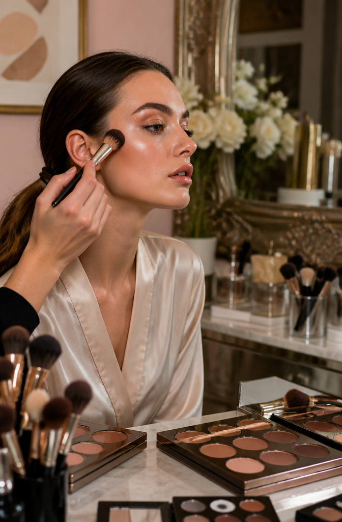
Soft circular motions with brushes or beauty sponges are what keep artistic make up from looking like stage paint. The motion should feel like you’re pushing product into skin, not wiping it across. Cheap tools shed fibers or drink foundation, so you end up building heavier layers to compensate, and heavy layers never blend. I hold brushes up to light to check for even bristle density along the ferrule; gaps mean streaks.
The finish tells you when to stop. Foundation that still shows pores or edges around the jaw needs more work. Overdone skin looks flat and slightly chalky, like the product is sitting in a film rather than becoming skin. With eyeshadow, the transition between colors should read as a third color, not a muddy smear. If you can name exactly where one shade ends and another begins, you haven’t stopped in time.

PORE MINIMIZING & ANTI-WRINKLE PRIMER: The pore-minimizing formula of our primer face makeup tightens pores and gives a lifting effect to dull and saggy skin. This makeup primer for face with collagen helps to minimize the appearance of wrinkles, fine lines, and smooth skin texture so that it avails skin to be seamless.
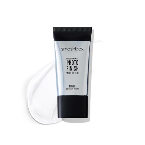
Formula: Instantly smooths and blurs the appearance of fine lines and pores, creating a flawless base that helps makeup apply more evenly and last longer throughout the day.

Pore Minimizer Face Primer: A pore blurring makeup primer, Baby Skin goes on like a moisturizer to help create a smooth canvas over which to apply foundation, and leaves the skin looking matte and poreless
Define Eyebrows
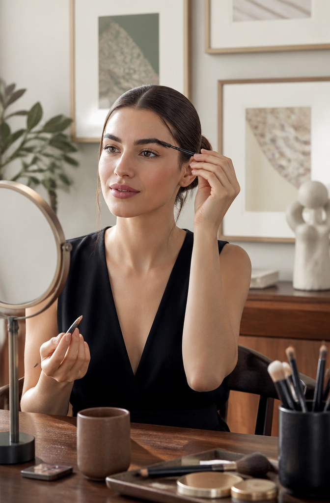
Sparse brows need filling before any artistic eye work reads as intentional. The pencil or powder goes only where hair is missing, not across the whole brow, and a spoolie brushed upward afterward is what keeps the result from looking drawn-on. Bold brows frame the face the way a mat frames a painting; without that structure, glitter or graphic liner floats instead of anchoring. The common mistake is following the pencil’s edge like a stencil rather than the natural growth pattern, which leaves a hard line even after brushing. Powder tends to forgive more than pencil if the pressure is light; pencil rewards a hairlike flick in the direction of growth, then immediate spoolie work before the product sets. Either way, the test is daylight at arm’s length; bathroom mirrors lie about heaviness, and artistic make up depends on brows that hold up in both.

DESIGNED FOR MATURE, DRY & SENSITIVE SKIN: Created for dry, normal, mature, or sensitive skin, this hydrating primer smooths the look of fine lines and dry patches while prepping your face for even, long-lasting makeup. Also suitable for combination skin when applied to dry-prone areas.

GLASS SKIN GLOW: Lightweight formula provides a radiant glow

Face Primer For Up To 24H Wear: Drip, glide, grip with Grippy Serum Primer. This face primer for makeup is ultra blendable with Serum-To-Grip technology, after 20 seconds the fresh serum texture transforms to a sticky feel that grips makeup for up to 24H
Apply Eyeshadow
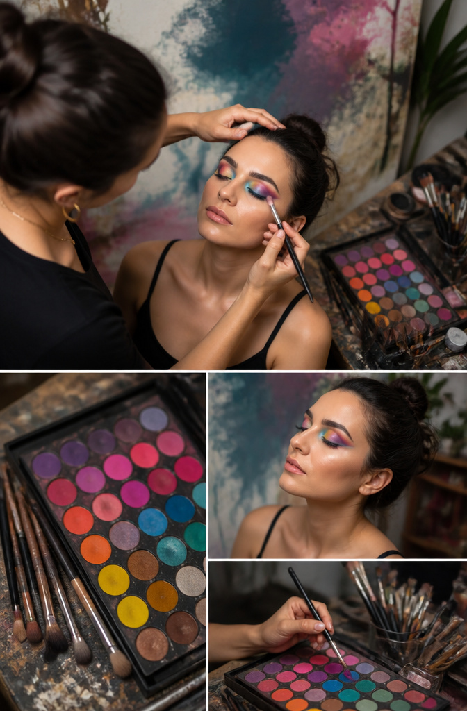
A neutral base on the lid lets you build color without muddying the next layer. I learned this the hard way after skipping it once and watching a turquoise turn swampy where it met my skin’s natural tone. The usual everyday approach stops at two close shades, maybe a soft brown in the crease and a shimmer on the center lid, but artistic make up demands you think like a painter. Complementary colors create the real pop: the passage about blue against brown eyes is onto something, and purple does something similar for green eyes because those pairs sit opposite each other on the wheel. Layering matters more than placement here. A thin wash of the boldest shade, let it set, then another. Three thin layers of pigment read as richer than one heavy swipe and stay where you put them. The difference from daily makeup is the willingness to let the crease color clash with the lid color on purpose. Everyday blends toward harmony; artistic make up builds toward contrast that still feels intentional. Mattes hold structure, shimmers catch light exactly where you want the eye to stop. I reach for shimmer last, fingertip only, pressing rather than sweeping so the sparkle sits on top of the work instead of mixing into it.

Value Pack Makeup Sponge Set — Includes 4 Miracle Complexion Sponges for easy refills and restocking of your go-to blending sponge for makeup; 2025 Allure Best of Beauty Award Winner

SEAMLESS BLEND – Super-soft foam helps blend foundation, powder, and cream products for a smooth, even-looking finish

Design: Our powder puff is actually designed with triangle and circle style, when you put the foundation on your cheeks and forehead, you can use the round side, when you put foundation on the eye and contour, you can choose the triangle side. Say goodbye to uneven makeup!
Eyeliner Application
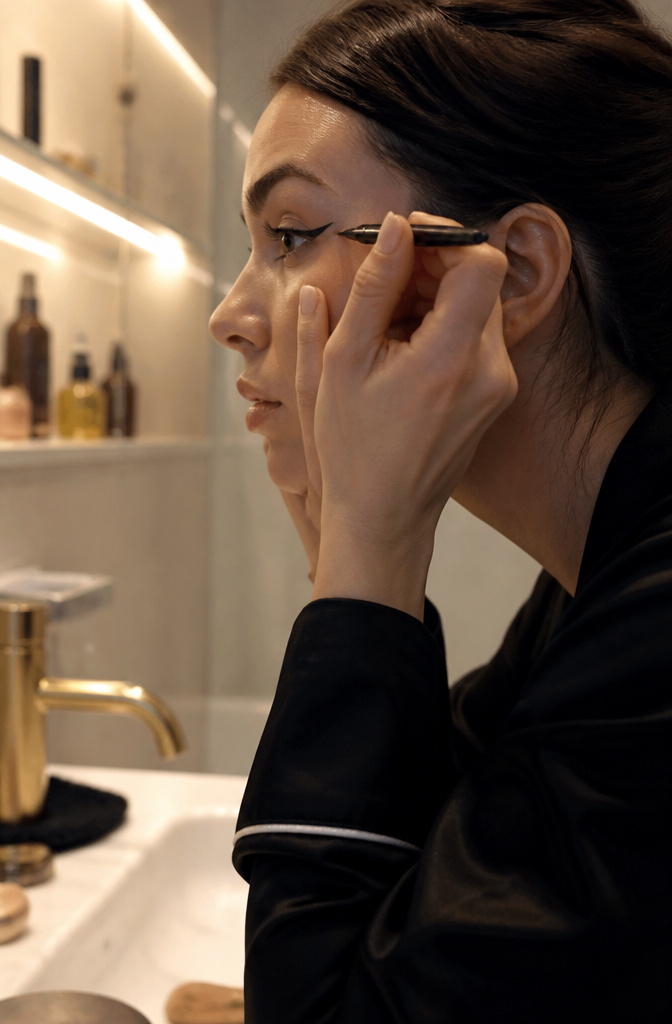
Fine-tipped liner gives the wing its sharpest edge. A brush pen or felt tip with real control lets you draw the lash line first, then flick upward in one motion. The wing angle should follow your lower lash line’s natural slope, not some universal 45-degree rule. Hooded eyes need a thicker baseline so the wing stays visible when lids open; round eyes pull off a longer, straighter flick that balances the curve. Monolids often do best with a floating wing placed above the crease rather than trying to fight the lid shape entirely.
When the line wobbles mid-flight, stop. A dry cotton swab pressed flat against skin lifts the mistake without smearing it into a gray ghost. Let the area dry fully before drawing over it, wet liner over wet corrector just digs the trench deeper. I’ve learned that small wings built in two strokes beat one dramatic sweep that misses and has to be redone from scratch.
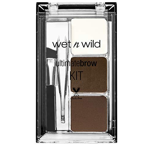

Unique longwearing wet/dry powder: use dry for everyday effortless brow look, or wet for dramatically defined brows
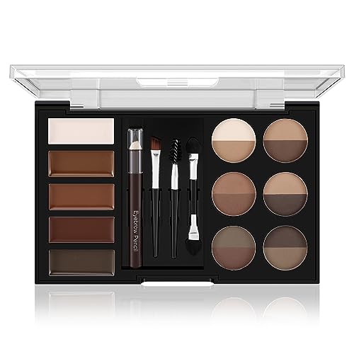
Colourful: Choose from 12 colours of brow powder and 5 colours of brow balm, which can be used as a brow powder, contour, eyeshadow or eyeliner, to easily match any outfit you want to wear and suit all skin tones.
Add Lashes
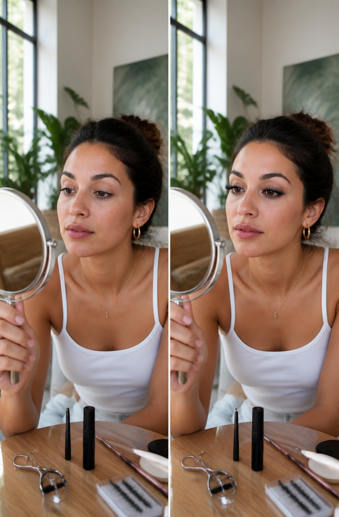
Curling your lashes before anything else goes on changes how the whole eye opens up. The lash curler lifts from the root, and that upward bend frames whatever color or liner already sits on the lid. Without it, even thick shadow can look heavy and downward.
Mascara is the everyday choice for volume, but the formula matters for an artistic finish. Wet, clumpy mascara breaks the clean edge you may have built with liner or precision shadow. A drier layer, combed through while still tacky, keeps definition without drifting into spidery territory. False lashes flip the look into something else entirely: the band and the fiber length add a graphic line that reads as deliberate design rather than enhancement. Sources pair this with dramatic effect, and the point holds; synthetic clusters or a full strip turn the eye into a shape you drew, not one you found.
Choosing between them for an artistic look comes down to whether the lashes are supporting a larger composition or becoming it. Mascara lifts an existing palette. Lashes build one.

Eyeshadow Brush: Blend eyeshadows effortlessly with the NYX Professional Makeup Pro Blending Brush; Long rounded two tone vegan bristles are super soft and flexible, making it ideal for blending eyeshadows of all textures and finishes

These makeup brushes are suitable for applying, blending, and shading products such as foundation, powder, eyeshadow, concealer, blush, and highlighter

🧶Upgrade Your Beauty Routine With This 18-piece Professional Makeup Brushes Set, Designed For Powder, Blush & Eyeshadow for Beginners for Flawless Application Of Liquid Foundation, Concealer, Blush, And Eyeshadow. Perfect For Both Beginners And Pros!
Highlight
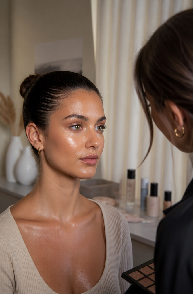
Highlighter applied wrong turns a face into a reflector panel. The first time I saw that mistake was under my kitchen pendant light, where three stripes of shimmer looked like runway stripes on each cheekbone.
The actual high points that matter are fewer than the packaging suggests. Cheekbones, the bridge of the nose, and the Cupid’s bow get the glow where skin naturally catches light. Anything beyond that under direct or flash lighting reads as grease, not radiance.
Too much highlighter under indoor lighting is visible from twenty feet. Under soft restaurant bulbs, the same amount disappears entirely and tempts you to add more for the Uber ride home. The fix is layering less than you think, then checking the face at arm’s length in whatever light you’ll actually stand in that evening.

Pore less smooth skin perfection

Instant Pore-Blurring & 24HR Wear: Formulated with Water Jelly technology and pore-minimizing polymers to deliver an immediate, skin-like blur that locks in makeup for up to 24 hours of fresh wear.

SMOOTH PRIMER BASE: Creates a flawless, smooth canvas that helps makeup apply evenly and last longer throughout the day under foundation or concealer.
Lip Application
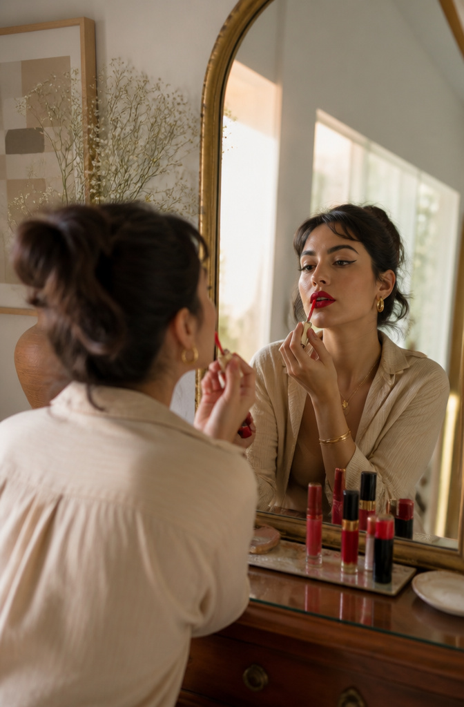
A bold lip can instantly elevate any look, but the real choice is whether it competes with dramatic eyes or lets them lead. Sultry reds and playful pinks work here, though on days when you’ve built up shadow and liner, a quieter mouth tends to read more intentional than underdone. The balance turns on saturation, not absence.
Matching lip liner defines the shape; filling with lipstick locks the color in place. For dimension, a small dab of highlighter on the Cupid’s bow and the center of the lower lip catches light without adding new color into the mix. I’ve learned this the hard way at events where I piled bold onto bold and the whole face fought itself.
When the eyes are already doing the artistic work, a single tone lip in a medium-to-muted range keeps the energy pointing one direction. The highlighter step still matters; it just reads as architecture instead of ornament.

DEEP HYDRATION BOOST: Infused with skin-conditioning ingredients, this hydrating face primer helps moisturize, soft, smooth, and prep skin for seamless makeup application.

DEEP HYDRATION BOOST: Infused with skin-conditioning ingredients, this hydrating face primer helps moisturize, soft, smooth, and prep skin for seamless makeup application.

SKIN-SMOOTHING and GRIPPING PRIMER: Your makeup. It’s not going anywhere. Prep skin with this gel-based face primer that has the power to grip your makeup while giving skin a natural finish for a smoother complexion.
Set Makeup
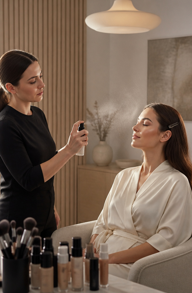
Setting sprays and powders are essential to lock in your makeup and keep it looking fresh all day. Translucent powder mattifies oily areas, while a dewy setting spray leaves a glowing, natural finish. Powder takes the win on oily skin for lasting hold; dry types usually see better comfort and mileage from a spray. Combination skin can split the difference: powder across the T-zone, mist everywhere else to avoid flattening the glow you built. What convinced me, reading through the real-use notes on this, is how much the how matters. Spray from six to eight inches out so droplets land fine and dry fast. Press powder in with a velour puff, don’t sweep it. Sweat and humidity eat artistic make up faster than plain office makeup because the layers are heavier; powder gives insurance against sliding, spray buys you back some flexibility if you’ve laid down pigments you don’t want to crack.
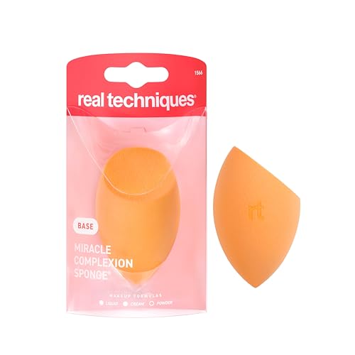
Miracle Complexion Makeup Sponge — Award-winning blending sponge for makeup delivers all-over blending for a lightweight, natural glow; 2025 Allure Best of Beauty Award Winner trusted by beginner and professional makeup artists alike

SHIPMENT CONTAINS: 32 latex-free foam wedges for makeup application and blending

Foam Beauty Sponges: These foam beauty wedges are perfect for makeup application. The sponge blenders offer precise application of powder and liquid makeup.
Wear It With Confidence
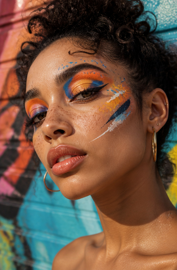
Confidence in artistic makeup shows up in small, watchable moments. The person wearing a cobalt graphic liner and a negative-space cut crease usually notices every uneven edge in the mirror; the viewer across the room registers only the color story and the shape. That gap between what you see up close and what reads to someone three feet away is the whole trick. Start checking your work from arm’s length, not nose distance, because most people will never step closer than that.
When the look starts feeling like a costume, the fix is usually one element too many. Strip it back to the boldest single choice, the one thing you put on first because you were excited about it. Live with that for ten minutes before deciding the rest.

[Eyebrow Pencil Eyeliner Kit]: LAVONE eyebrow kit instantly outlines, defines & fills in your brows no matter how much (or little) eyebrow hair you have. 1 minute to create flawless, symmetrical brow! It’s long-lasting, smudge-proof, and waterproof. Your brows will stay in place all day long.
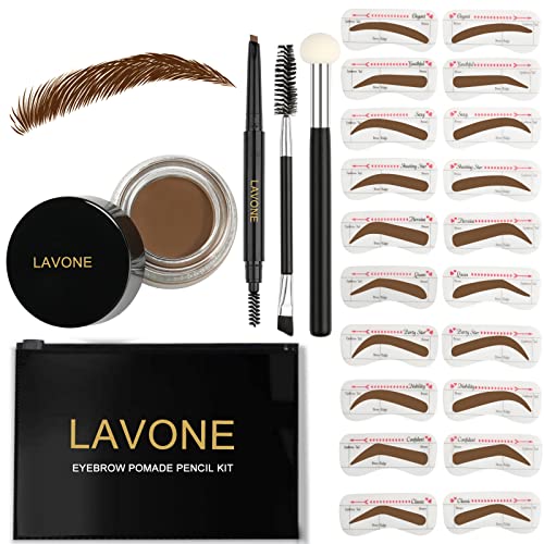
[Eyebrow stamp stencil kit]: LAVONE eyebrow kit instantly outlines, defines & fills in your brows no matter how much (or little) eyebrow hair you have. 1 minute to create flawless, symmetrical brow! It’s long-lasting, smudge-proof, and waterproof. Your brows will stay in place all day long.
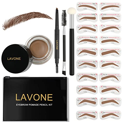
[Eyebrow stamp stencil kit]: LAVONE eyebrow kit instantly outlines, defines & fills in your brows no matter how much (or little) eyebrow hair you have. 1 minute to create flawless, symmetrical brow! It’s long-lasting, smudge-proof, and waterproof. Your brows will stay in place all day long.
Makeup Tools That Matter
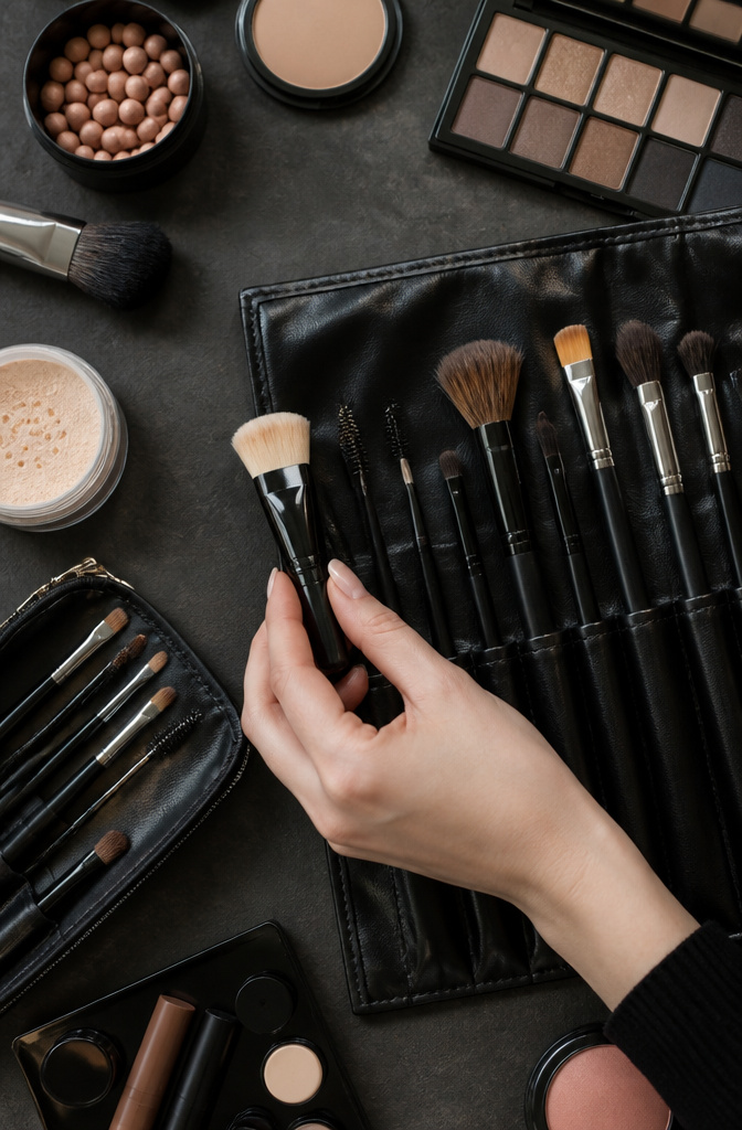
A flat-topped buffing brush was the first tool that ever made foundation feel like skin rather than paint sitting on top of it. Sponges get most of the attention now, but brushes still win for laying down color with real control, and the difference between a $6 synthetic and a $30 hand-tied set shows up in how much product gets drunk by the bristles. I replace my sponges every two months, brushes every three to four years unless the ferrule loosens, which happens faster on budget lines where glue replaces crimped metal. Quality means the head keeps its shape after washing, not the price tag itself; some $14 options from the drugstore outperform prestige lines that charge for packaging. Eyeshadow blending brushes are where I spend more, since a scratchy one leaves stripes that no amount of patting fixes.
Color Theory for Makeup
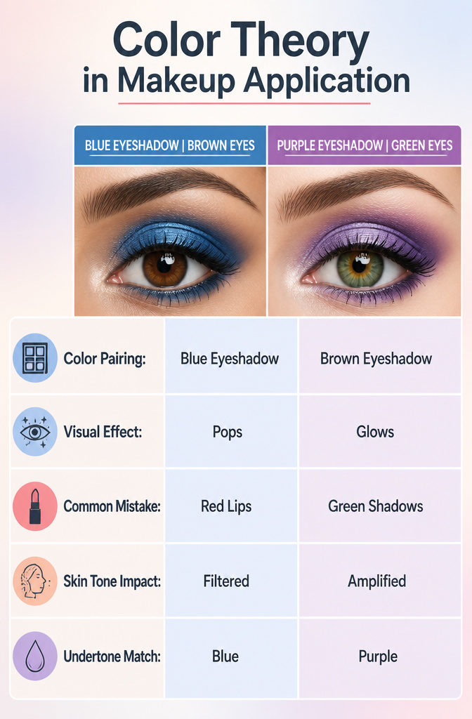
Blue eyeshadow can make brown eyes glow, and purples look stunning on green eyes, but the logic behind these pairings works differently on a face than it does on a canvas. In painting, complementary colors sit opposite each other on the wheel to create visual tension, but makeup has to account for skin tone acting as a filter between pigment and observer. A blue shadow that pops against warm brown eyes can turn ashy on a fair undertone, making the eye look bruised rather than brightened.
The most common mistake is pairing red-based lips with green-toned shadows. On paper, red and green are complements. On a face, the combination reads as holiday kitsch or, worse, irritation, because both colors compete at the same saturation level. The sources that rank for this advice consistently pair blue with brown and purple with green because those matches let one color dominate while the other supports. Brown eyes already contain gold and amber; blue shadow amplifies what is already there rather than fighting it.
Green eyes carry yellow undertones that purple, as a blue-red mix, plays against cleanly. What fails in practice is treating the face like a flat plane. The curvature of the lid, the blood flow at the lash line, and the natural shadows of the socket all shift how color registers. A matte green crease with a red lip flattens the eye backward; the face collapses into its center. Better to keep one element warm and the other cool, letting temperature do the separation that hue wheel proximity cannot.
Skin Type and Product Choice
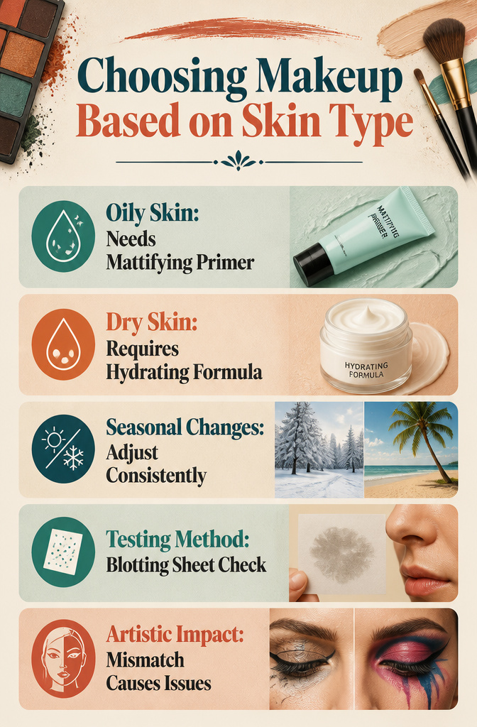
The right base for artistic make up only holds if the product matches the skin underneath. Oily skin turns a hydrating primer into a slip-and-slide within the hour, while dry skin drinks up matte foundation and leaves a patchy finish that no amount of blending fixes. Matching primer to skin type means mattifying formulas for oil, hydrating ones for dryness; the wrong choice shows faster under bold pigments and heavy layering than it ever does with a no-makeup look.
Seasons shift the calculation. A complexion that drinks up moisturizer in January might need blotting papers by July, and hormonal changes or medication can recalibrate everything overnight. The signs are simple: tightness and flaking point toward dryness, persistent shine and enlarged pores toward oil, combinations of both toward the middle category that earns the irritating label. Testing is free; press a clean blotting sheet to the nose at midday and check the residue.
Artistic application punishes mismatch harder than everyday wear. Pigments pool on dry patches, crease in oil, or shift color when the base chemistry rebels. The time spent mapping a graphic liner design is wasted if the canvas changes behavior halfway through.
Frequently Asked Questions
What are the essential tools for makeup application?
Brushes, sponges, and quality products form the core kit. A flat-topped buffing brush lays foundation like skin rather than paint on top of it, while sponges work best for pressing and blending. Replace sponges every two months and brushes every three to four years, or sooner if the ferrule loosens.
How do I choose the right foundation for my skin type?
Match your primer to your skin type first: mattifying formulas for oily skin, hydrating ones for dry skin. Oily skin turns a hydrating primer into a slip-and-slide within the hour, while dry skin drinks up matte foundation and leaves a patchy finish no amount of blending fixes. Test by pressing a clean blotting sheet to your nose at midday and checking the residue.
What techniques can I use to create a dramatic eye look?
Build toward intentional contrast rather than harmony. Start with a neutral base on the lid, then layer thin washes of bold pigment rather than swiping heavy color. Complementary pairs amplify what is already there: blue shadow against brown eyes, purple against green. Let each layer set before adding the next, and press shimmer on last with a fingertip so it sits on top rather than mixing in.