Cool makeup designs in 2026 run from a four-product morning face to full sugar skull paint, and the single variable that sorts them is how much time you have to layer and wait. The ocean eyes look alone needs three or four attempts before the liquid shadow stops streaking, because working wet-into-wet means one eye at a time with no pause between layers. That patience threshold is what makes the difference between a design that reads as intentional and one that collapses into costume.
1. Ocean Eyes
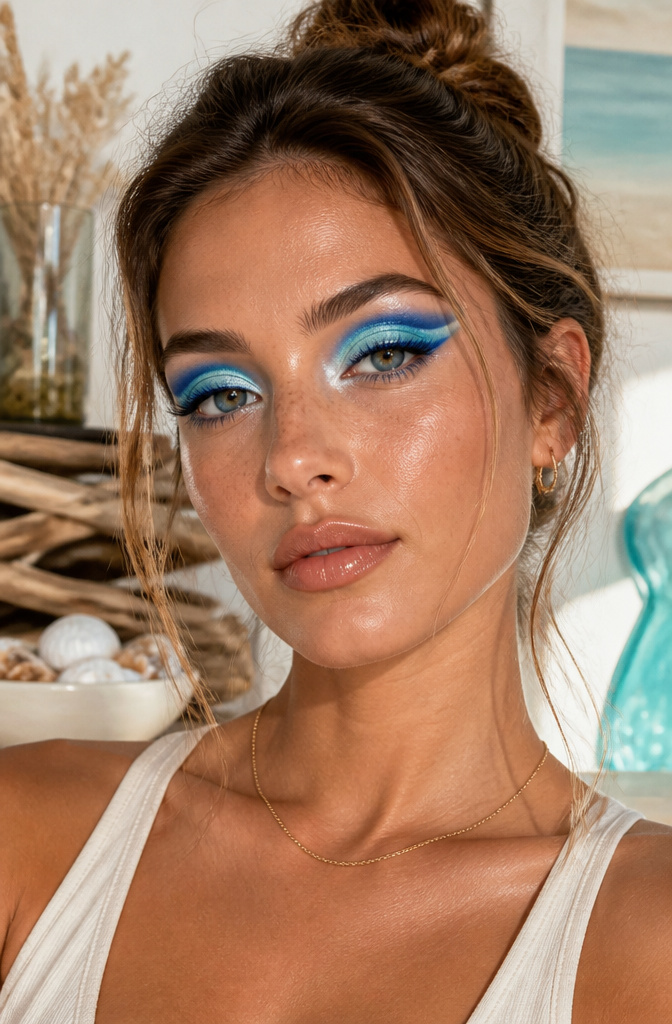
L’Oréal Paris Brilliant Eyes Shimmer Liquid Eye Shadow in String of Pearls sits right at the upper lash line, mimicking the foam a wave leaves behind. Cobalt blue liquid shadow carries the water itself, swept through the crease in a shape that breaks like surf. The two shades layer best when the blue goes down first and the white taps over still-damp edges.
Liquid shadow takes patience. The first few tries the blend stayed patchy on me until I stopped treating it like pressed pigment. Working wet-into-wet is the move: one eye at a time, no waiting between layers. The shimmer in String of Pearls catches light the way actual droplets would, which is the detail that makes this read as ocean rather than just blue.
Practice matters more than product here. Three or four attempts with any liquid formula trains the timing enough that the transition stays smooth instead of streaking.

【Feature】When viewed head on there only appears to be one color, however, color shifts become visible when viewed at different angles on a rounded surface and in different lighting.

HIGH-SHINE METALLIC EYESHADOW: Get an amped up eye look with this formula packed full of pearls for a high shine, reflective, one-swipe metallic coverage.

HIGH-IMPACT COLOR: Liquid eyeshadow delivers color-true, glitter-finish payoff in one swipe, buildable from a soft wash to bold, saturated eye color that lasts all day.
2. Watermelon Makeup
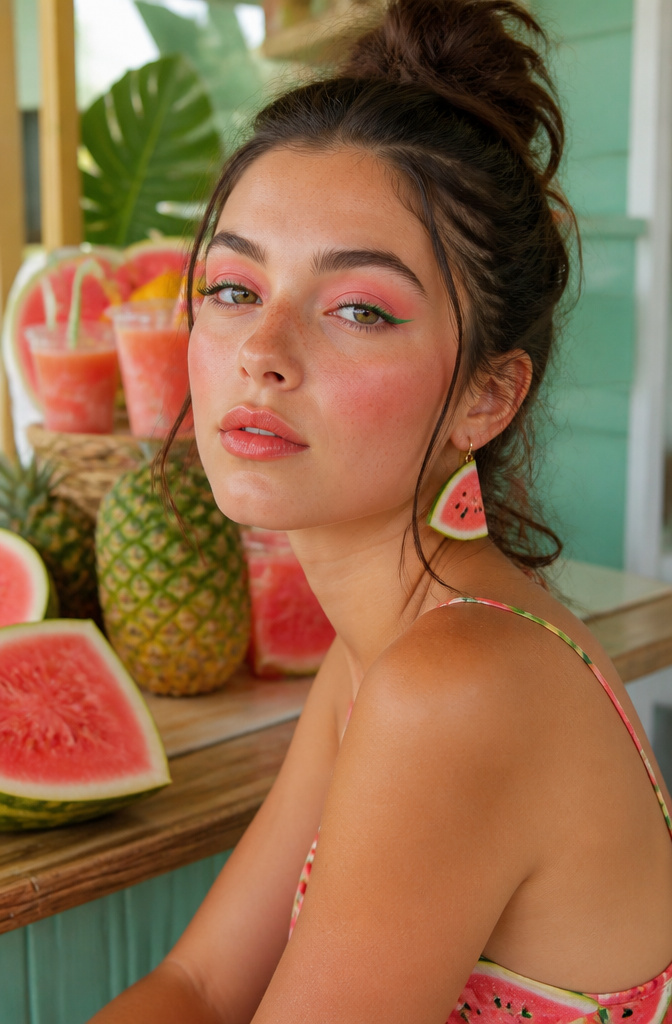
The watermelon makeup trend lands somewhere between a juice-bar crush and actual wearable color, and the difference is almost entirely in how hard you press. A soft, diffused edge on every pink-red-green shape keeps the fruity reference readable but not costume. I saw this split last summer: the looks that worked read as flushed and fresh, while the ones that didn’t had crisp lines that turned the whole face into a graphic illustration.
Eyes get the pink-red wash blended through the crease, with a flick of green liner at the lash line for the rind effect. Lips carry the deeper red-pink center, feathered outward so there’s no hard border. The palette is inherently loud, but keeping every transition hazy is what makes it leave the house.
What convinced me, swatching this out, was how much the green placement matters. Too much and you look seasick; a thin stroke at the inner corner or lower lash line does the reference without the overwhelm. The L’Oréal Paris guides treat watermelon lips as its own sub-trend, which tracks, since a blurred red-pink mouth is easier to wear at 9 AM than full eye color. Either way, the move is the same: build the color, then go back with a clean brush and erase every sharp edge until it melts into skin.

【High Pigment & Shimmer Finish】This liquid eyeshadow has ocean blue shimmer. Each shade is pigmented for simple glowing eye makeup.

Ultimate Shimmer and Glow: Brightening liquid eye color in one shot. Our new innovative liquid eyeshadow is a lightweight, buildable make up formula with no flaking, no fallout, no glitter only long-lasting shimmer

HIGH-SHINE METALLIC EYESHADOW: Get an amped up eye look with this formula packed full of pearls for a high shine, reflective, one-swipe metallic coverage.
3. Cloud Blush
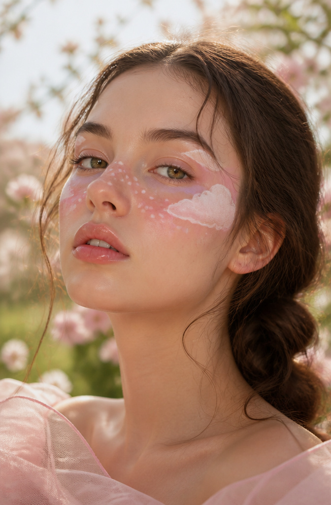
Cloud blush reads as a full landscape on the face: little puffs of white liner floating over streaks of color, the sort of thing that looks complicated until you see the actual order of operations. The smudges come first. Dot and blend your blush shade across the cheeks and over the bridge of the nose so each blot stands alone with breathing room around it. Cream liner, not pencil, holds the curved edges of each cloud without skipping or fading; the wax in most pencils drags against blush and the line turns jagged inside an hour. I use a small round brush to sketch the cloud shapes directly over each smudge, leaving the color peeking out at the edges so the pink or coral reads as sky behind the white. The L’Oréal Paris Age Perfect Makeup Radiant Satin Blush with Camellia Oil in Marigold works well here because the satin finish does not fight the matte opacity of a good cream liner.

With the beloved classic roller-ball design, this lip gloss gives off a cooling sensation and lets you glide on great shine and flavor!

❤【Birthday Set/Nice Gift】6 pcs popular matte colors,With a perfect package, Perfect as a gift sends to Lover, Family and Friends when Valentine's Day, Birthday ,Mother's Day and other Festival!

High quality crystals and durable metal make up the chain. This beautiful charm will make sure that everyone's eyes are on you.
4. Neon Cut Crease
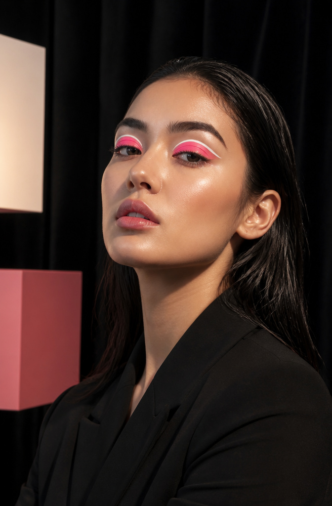
A neon cut crease lives or dies on the line you draw before any color touches the lid. White liquid liner maps the crease shape first: that pale stripe is what tricks light into reading your hot pink or bright green as actually glowing, because the neon sits against it instead of disappearing into skin tone. The flat brush wins over fluffy here, since a dense, straight edge stamps the pigment right up to that white boundary without feathering. I watched three tutorials where people reached for their usual blending brush and the edge went soft instantly, so the whole thing read as a smear. Keep the neon packed on the lid, the line knife-sharp above it, and the white running thin through the center. That trio is the whole look.

Sweet baby ducklings resting on soft pink clouds create a gentle and dreamy sky scene full of warmth, comfort, and charm.

Sweet baby ducklings resting on soft pink clouds create a gentle and dreamy sky scene full of warmth, comfort, and charm.

Sweet baby ducklings resting on soft pink clouds create a gentle and dreamy sky scene full of warmth, comfort, and charm.
5. Flame Under-Eyes
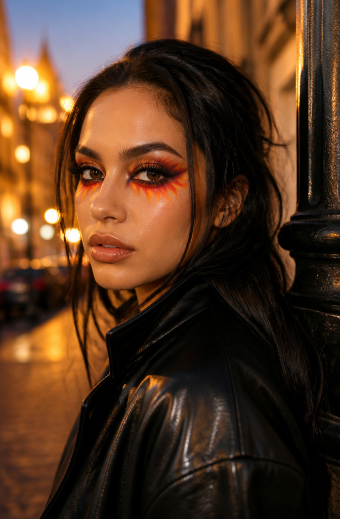
Red lower lash liner first made me pause when I saw Nick Barose’s work on Lupita Nyong’o at the 2024 Governors Awards: a thin stripe of shimmery red along the lower lash line, set inside a bronzy smoky eye. The placement was so precise it read as deliberate heat rather than irritation.
The flame under-eye look builds on that same restraint. A burgundy or red liquid liner sketches the flame shape, then you fill inward with orange and yellow eyeshadow working up from the lash line. Keeping the flame tips narrow and the color concentrated near the lower lash line is what separates a graphic fire motif from the appearance of swollen skin. When the yellow creeps too far down the cheek or the edges feather outward, the whole effect collapses into redness.
Barose’s principle holds here: red around the eye works in small, controlled doses. The drama comes from the shape you draw, not the area you cover. Let the brighter pigments — the yellow and orange — do the expanding, while the red stays tight to your drawn outline.
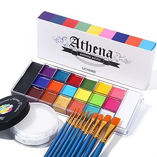
UCANBE Full Makeup Kit - This 3-piece set of oil face and body paint comes with a 20-color palette, a 30-gram box of setting powder and 10 makeup brushes. (The brushes come in the same box as the face paint palette and you have to take the box apart to see the brushes.) Ideal as a gift for your family, friends and yourself to create a fabulous face body makeup look.

Black and white paint can be used directly or used to mix with other colors to create different colors you like, this BOBISUKA's 2.46 oz LARGE CAPACITY black and white oil paint set can satisfy all your needs.
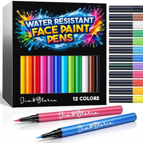
FACE PAINT & BODY MARKER - Express yourself with washable skin markers. Each Face Painting kit has 12 rainbow colors: yellow, orange, red, pink, purple, blue, light blue, light green, green, brown, black and white. Enjoy intense pigment color that dries quickly and stays vibrant, whether you're dancing the night away or facing a busy bright day. No fading, no stickiness, and no sliding.
6. Floral Makeup
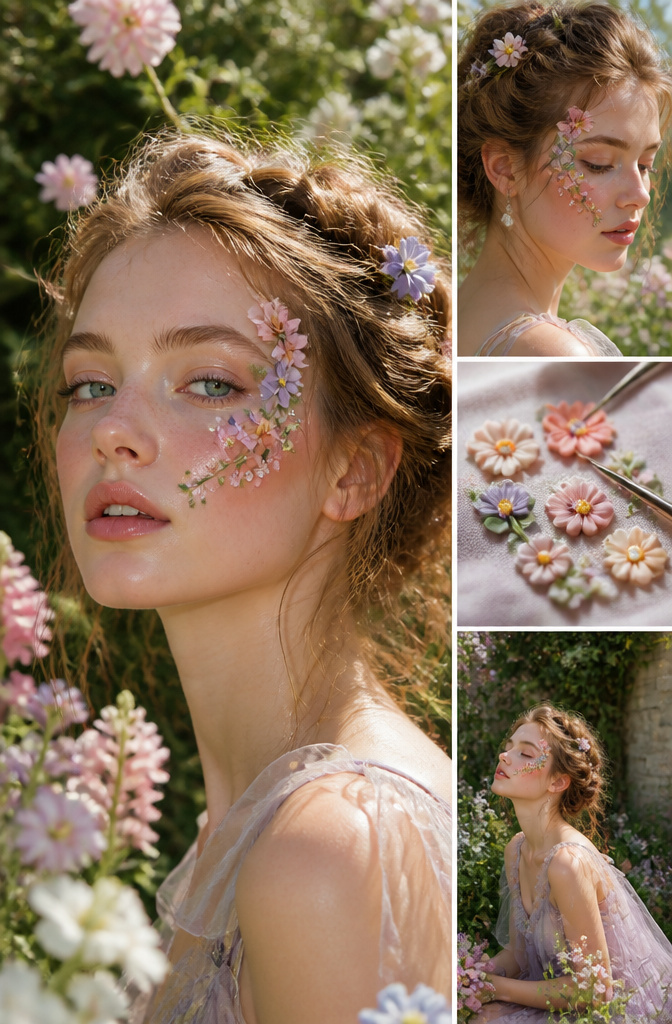
Tiny Fimo blossoms pressed into lash glue open up placement options that flat stickers never could. Temple placement frames the eye without competing with it, a single petal tucked at the inner corner reads as an accidental grace note, and a trailing line along the cheekbone turns an ordinary contour into something garden-adjacent. The trick is letting the glue go slightly tacky before the flower touches skin; wet adhesive lets the piece slide until you have a crooked mess, but a thirty-second wait locks it where you set it. For nights that stretch past midnight, the same latex-free formula meant for strip lashes outperforms spirit gum or cream adhesives, which crack or melt with body heat. Remove by pressing a soaked cotton pad over the spot until the bond softens, never tug.

Baby Blue & Long-Lasting: The baby blue eyeshadow adds a touch of freshness to your look, making you stand out in the most subtle yet charming way. Its one-swipe coverage and long-lasting formula ensures you can save time to makeup and be shimmer all day, so you can focus on your tasks without touch-ups

Glitter-Eyeshadows: Formulated with premium ingredients, this liquid shadow has a fine texture and easy to color. This sparkling-gloss eye shadow will bring you beautiful eyes.

💙Richly Pigmented Color: Our deep blue shimmer liquid eyeshadow (#10 Blue) wows with its intense and vivid charming blue shade, more like a bright luscious blue with a hint of ocean blue. The pigment is so concentrated that a single swipe unleashes a rich, head-turning color, perfect for creating showstopping looks whether it's a high-energy party or a casual brunch with friends.
7. Sugar Skull Makeup
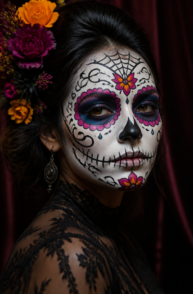
A sugar skull design starts with a flat white base that reads opaque from three feet back, which means full coverage foundation mixed with a white cream pigment, not a single swipe of Halloween paint. The bone structure needs black linework to hold its shape: hollowed eye sockets drawn as circles first, then petal shapes radiating outward like a chrysanthemum, plus the spiderweb on the forehead and the nose cavity reduced to a simple upside-down heart. Gel liner beats liquid every time for the fine scrollwork on the chin and the filigree along the jaw, because it sets slowly enough to correct a wavering line but stays put once it dries. Liquid liner drags through cream bases and skips on the underlying texture, so the petals end up broken or doubled. The color comes last: watercolor pigments or sheer cream shadows tapped over the white in bands of magenta, cobalt, and marigold, always leaving the black lines clean. Skip the sequins and stick-on gems unless you are photographing the look; they lift off within two hours of talking or eating, and nothing ruins the symmetry faster than a missing rhinestone.

AMPED UP EYE LOOK: Get an amped up eye look with e.l.f. Liquid Metallic Eyeshadow! This liquid eyeshadow delivers a high-impact, metallic finish through multi-dimensional metallic pearls. The shade Comet is rose gold with cool silver shimmer.

AMPED UP EYE LOOK: Get an amped up eye look with e.l.f. Liquid Metallic Eyeshadow! This liquid eyeshadow delivers a high-impact, metallic finish through multi-dimensional metallic pearls. The shade Meteor is bronze with golden bronze shimmer.

Ultimate Shimmer and Glow: Brightening liquid eye color in one shot. Our new innovative liquid eyeshadow is a lightweight, buildable make up formula with no flaking, no fallout, no glitter only long-lasting shimmer
8. 80’s Makeup
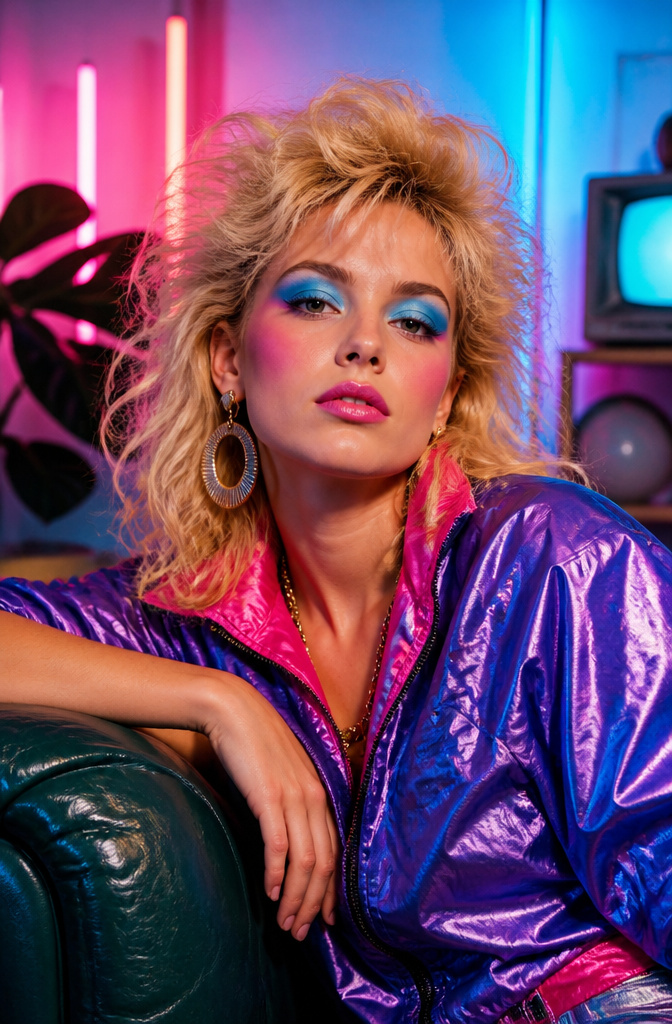
Electric hues of eyeshadow, the neon pinks and blues and greens that practically hummed under club lights, were the signature of 1980s makeup. Blush went heavy too, swept right across the apples of the cheeks in shades that matched the intensity rather than the skin tone. The women who pulled it off treated the face as one loud canvas.
Recreating it now without looking like costume requires picking one feature to go loud on, not all five at once. The modern route might mean a saturated blue lid with bare cheeks and a nude lip, or that generous blush placement with everything else barely there. Cream blushes hold up best under this kind of intensity if the formula is specifically built for layering. The Tower28 Beach Please tints and Sisley Le Phyto Blush both survive being built to full pigment without turning patchy, which is where cheaper creams usually break down and grab unevenly.

6 Colors SOUTHERN BELLE Gel Polish Set (6*7.5ml /0.25oz *6): Trend-researched shades to showcase your style. This color set beauty gift sets includes watermelon red, pastel pink, mint, palace green, light blue and silver shimmer. These versatile candy color gels can be layered with the shimmer nail polish in the set to create a variety of nail art styles, sweet and personalized. Shade Numbers: 707-708-709-710-711-712. It's also a great gift for women.

BOUNCE BACK: This innovative, water-based gel primer delivers instant freshness with its cooling, pink texture and watermelon scent.

VIBRANT CANDY COLOR PALETTE: Brighten your routine with these joyful, candy-inspired colors! Choose from Peach Pink, Watermelon Red, Cyan Blue, or Avocado Green. Select a standard set or upgrade to the version with a matching bag for the ultimate colorful, coordinated kit.
9. Gothic Makeup
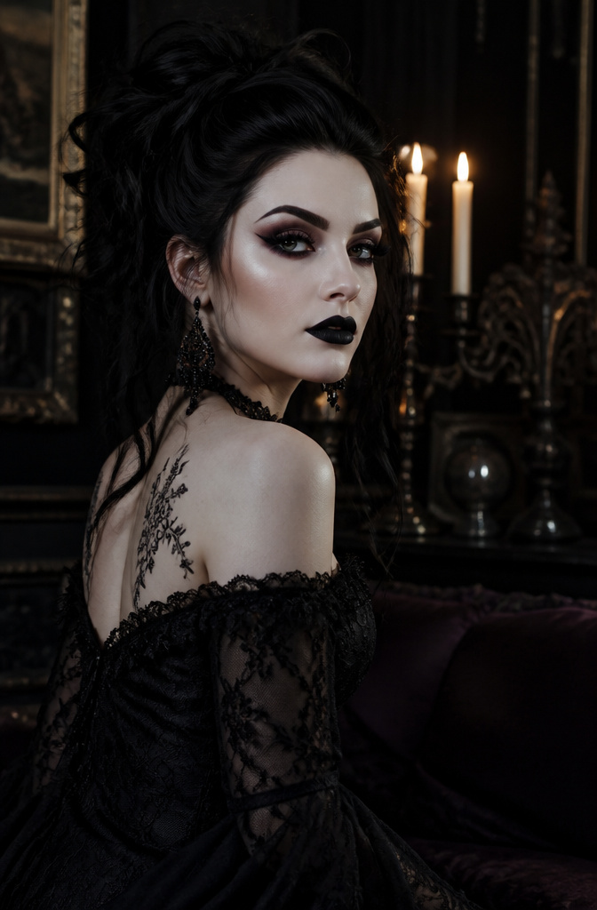
Gothic makeup builds its drama on contrast, which means the dark elements have to stay exactly where you put them. A deep lip in black, burgundy, or deep plum will migrate without a precise lip line drawn first; a clear pencil border gives the pigment a fence to press against instead of a vague field to bleed into. Matte black lipstick reads as the classic choice, though a glossy finish shifts the same palette toward something more current.
The eye asks for the same discipline. Thick, fluttery lashes and a sharply defined brow frame the face, but gel pencil liner drawn heavily without a transition shadow leaves two stark black stripes that look pasted on rather than built. A gray-brown shadow blended through the crease performs the same function that contour does on the cheekbones: it creates depth and hollowing without announcing its own edges. Pale foundation and translucent powder keep the base flat enough that the dark features read as intentional rather than heavy. Black or opaque lenses complete the look if you want the full effect, though the architecture of the makeup does most of the work without them.
Sweet baby ducklings resting on soft pink clouds create a gentle and dreamy sky scene full of warmth, comfort, and charm.

Sweet baby ducklings resting on soft pink clouds create a gentle and dreamy sky scene full of warmth, comfort, and charm.

Sweet baby ducklings resting on soft pink clouds create a gentle and dreamy sky scene full of warmth, comfort, and charm.
10. Avant-Garde Makeup
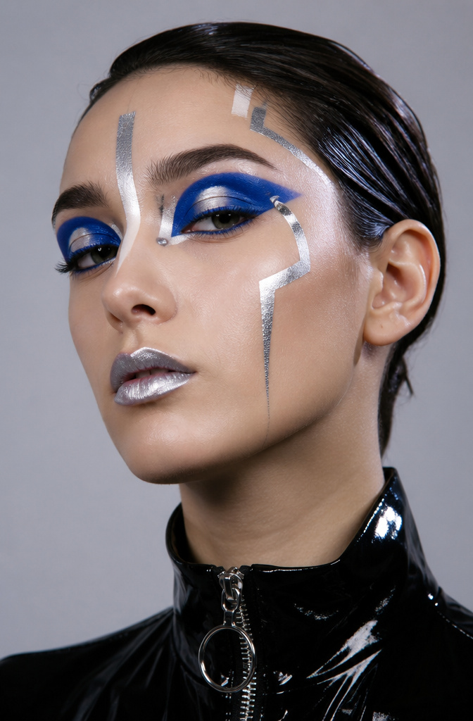
Avant-garde makeup is where the face becomes a canvas for graphic shapes and colors you’ll never wear to the grocery store. Bold liners, metallic accents in silver or chrome, and unconventional placements are the whole point. The source passages mention extending shadow slightly beyond the crease for that specific futuristic edge, paired with matte, pale foundation and lipstick so the eyes command full attention.
Sketch the design on paper first; twenty minutes with a pencil saves forty with a cotton swab. Face paint formulas differ from standard cosmetic pigments in one way that matters for these looks: opacity. Stage and body paints are built to deliver solid, flat color without the transparency of typical makeup, which is why a cobalt lid reads as graphic rather than bruise-tinged. The chrome and silver accents that amplify the drama need that same flat opacity to catch light instead of sinking into skin tone. Grey contact lenses add the striking contrast, but the structural work of the design happens before any product touches the face.

Ten Times The Fun: Our sugar skull makeup kit contains ten sheets of face tattoos of different personalized elements. Each day of the dead skull face temporary tattoo can be cut out individually, with simple base makeup, you will create unknown horror atmosphere. Matched the tattoos with different dia de Los Muertos costumes, and you will get more Halloween role-playing fun. With these days of the dead face paintings, you will transform into the ambient highlight of a Halloween party above.

【Day of the Dead Face Tattoos】You will get 2pcs sugar skull face tattoo, 1pcs sparkling colorful face gems, 1pcs black face gems. Dia de los muertos face tattoos are perfect for enhance your Day of the Dead make up look or any Halloween outfit with a hauntingly glamorous flair. Adorned with day of the dead face jewels, adding a distinctive touch to your dia de los muertos makeup accessories.

△ PRO FACE BODY FAINT SET - Black and white painting stick is grease cream with waterproof texture. Blendable, buildable with brush, sponge or fingers. This kit also contained translucent setting powder gives matte finish without ruin your looks. More importantly, it will help your artistic looks to lasts longer and avoid transferring and smudging.
11. Vintage Makeup
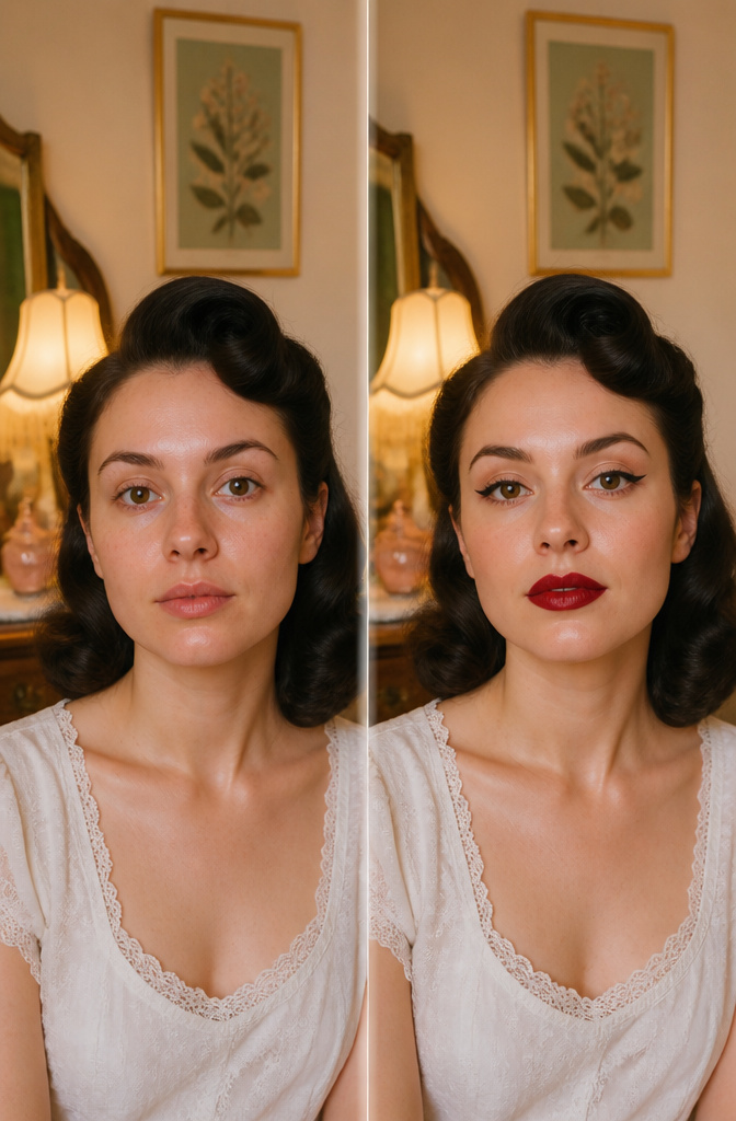
The 1920s bow lip reads instantly on a face, that deep red pressed into a perfect heart shape with a flat upper edge and a rounded, pout-heavy lower. I spent weeks trying to replicate it with modern bullets before I understood the finish was the problem. Vintage pan-cake lipsticks dried down almost matte and stayed put through Champagne and cigarette smoke, while most of today’s satin formulas bleed at that sharp Cupid’s bow. A modern liquid lip in a transfer-proof formula gets closer, though you will need to carve the shape with a brush and set the center with translucent powder to kill the last bit of shine.
The 1950s cat eye depends on a specific wing geometry that many tutorials get backward. The line should lift from the outer corner at a forty-five degree angle, not curve with the eye’s natural downward slope, and it must end in a sharp point that tapers to nothing rather than a blunt stamp. A felt-tip liquid liner with a flexible brush tip, not a foam stamp, gives enough control to draw that taper. I went through six drugstore pens before one held enough pigment to draw opaque black over itself without layering, which is what ruins the edge.
The 1970s bronze wash is the most forgiving revival because the shape is so soft, a dusty terra cotta blown from lash line to crease and outward toward the temple with no hard stop. The original formulations were cream-based and creased within hours on anyone over twenty-five. A modern matte bronzer in a warm, slightly orange undertone mimics the tone without the migration, especially if you set it with a matching powder shadow. The key is keeping it below the brow bone entirely, which reads as intentional sun-kissed skin rather than a muddy lid.
12. Soft Glam
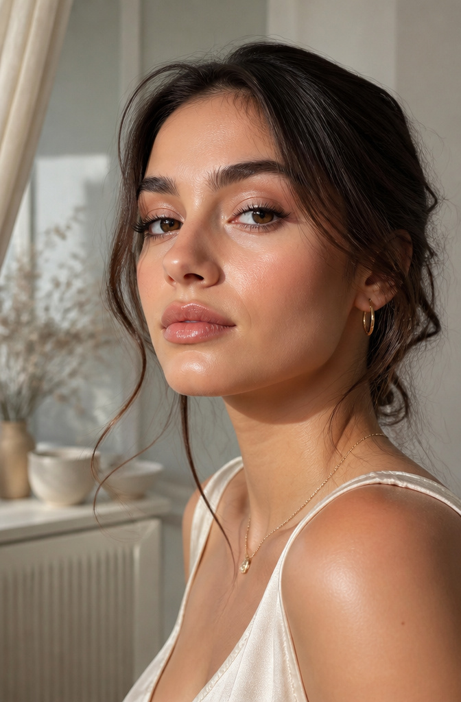
Satin finishes catch light the way actual skin does: diffused, not directional. I learned the difference the hard way after layering a high-shimmer shadow under office fluorescents and spending the day looking like a disco ball in a staff meeting. Satin sits in that middle space between matte and glitter, reflecting just enough to give dimension without announcing itself as makeup. For soft glam, this matters especially on the cheeks and eyelids, where you want the lift without the sparkle.
The lower lash line is where this look lives or dies. Skip mascara on the bottom lashes entirely. Darkening them draws the eye downward and collapses the subtle upward pull you’re building with the satin sheen on the brow bone and upper lid. What convinced me, watching maybe thirty tutorials to find the pattern, was noticing how the looks that read "expensive" versus "trying" came down almost entirely to this one omission. A tight line of brown pencil on the upper waterline gives definition without weight, and keeping the lower lashes bare lets the satin finish do the work of opening the eye instead.
13. Smokey Eye
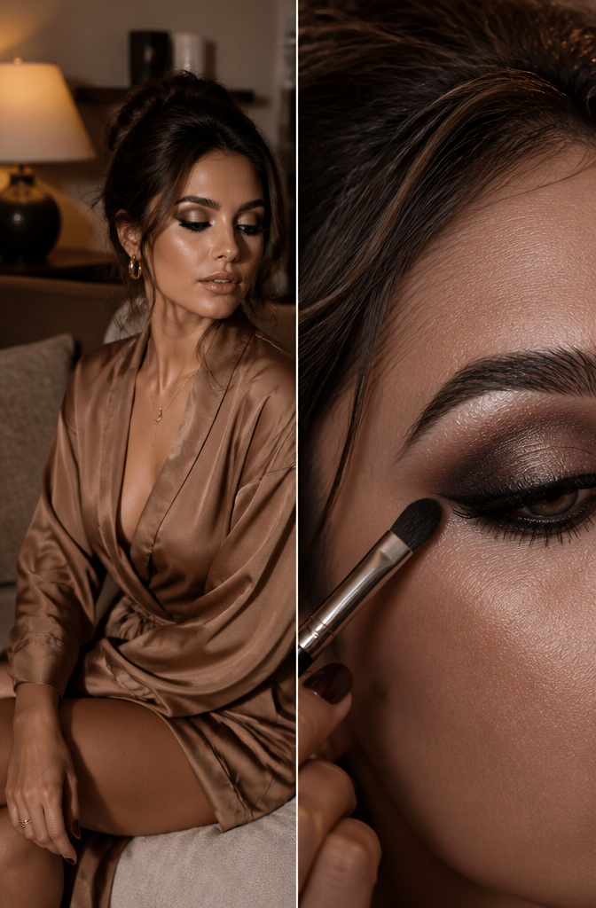
A smokey eye survives every trend cycle because the technique is geometry, not color. Start with brown or gray, not black. Work the medium shade through the crease and outer corner with a windshield-wiper motion, then dot the darkest tone along the lash line and pull upward with a small, dense brush until no hard edge remains. Black applied first eats the gradient entirely; the lighter shades have nothing to grip, and the whole socket flattens into one bruised mass.
The brow highlight splits a good smokey eye from a muddy one. Use a clean, shaped brush that’s never touched the darker tones, tap a matte cream or soft champagne just under the arch, and blend only downward toward the lid, never upward into the shadow. That clean strip of light recreates the bone structure the dark colors intentionally collapsed. Skip this step and the eye reads as a single dark oval, which defeats the point of the shape.
14. Natural Makeup
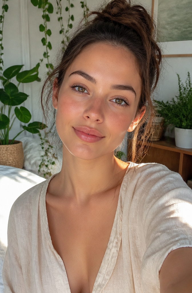
The best natural makeup starts with a decision most people skip: where the color actually lives. Sheer foundation evens things out, but match it to your neck, not your jawline, or you end up with a floating mask effect that no amount of blending fixes. I learned this the hard way after months of wondering why my face looked fine in the mirror and off in photos.
Nude lips only read as your-lips-but-better if the undertone is right. A fleshy nude about two shades lighter than your skin tone works as the baseline, with a brownish liner one shade lighter to keep the mouth from flattening out. On darker skin, deeper nudes with real brown in them avoid the concealer-lip look that washes so many people out. The trick is treating the lip as part of the face, not a separate feature to paint on.
15. Formal Makeup
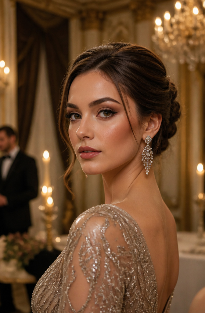
A polished, elegant face reads well in candlelight but falls apart under flash photography, where every contour line and dark shadow turns harsh. The safe depth most of us use for day or evening is suddenly too much; the camera flattens dimension and exaggerates contrast. A cream base under powder shadow fixes both problems at once. The cream gives the powder something to grip, so mid-tone neutrals stay put through hours of greeting-line hugs and late-night dancing without creasing or fading. I learned this the slow way, re-applying in hotel bathroom fluorescent light between the ceremony and the reception. The classic eye shape wins here: soft brown or taupe swept upward at the outer corner, a thin dark liner hugging the lash line, nothing winged or graphic that competes with the rest of the formal look. Skip shimmer on the brow bone if photographers will be close; it reflects light into a white stripe.
16. Everyday Makeup
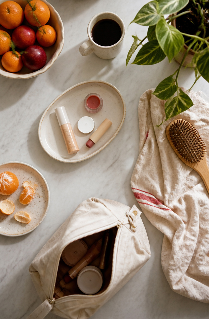
The morning that actually survives a late night is built on four products: BB cream, a single swipe of mascara, tinted lip color, and the cream product that carries the whole look if the bag gets lighter. Tower28 Beach Please or Sisley Le Phyto Blush both work here. Dab the same tint across eyelids, the high point of cheeks, and over balm on the lips; the unity reads as intention even when the clock reads six minutes. Placement matters more than layering: start at the outer corner of the eye and sweep inward, so the color pools where light would hit naturally.
The fifteen-step routine left behind still taught something. All-over cream blush on eyes, cheeks, and lips pulls together faster than separate products ever could, and the finish stays coherent through coffee runs and back-to-back calls. Skip the mascara if the eyes need more rest than definition; the lip-and-cheek match does enough.
Makeup Techniques That Carry Across Looks
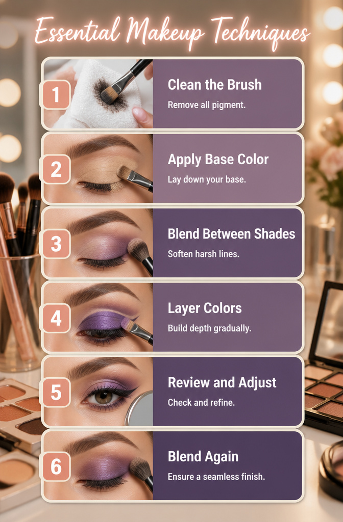
A flat brush that sets a cut crease at noon can line a formal eye by six, but only if the color between washes is gone. The same bristles that carry a precise line of liquid gel liner will muddy into a sneaky pop of purple if any previous pigment remains. I learned this the hard way on a Saturday when a warm brown eyeshadow ghosted through what was supposed to be a sharp black wing.
Blending between shades matters more than the shades themselves. A fluffy brush working between colors erases the harsh lines that turn an artistic geometric shape into a smudge. For floating crease lines or extended wings, the transition zone is where the look lives or dies.
Practice makes the difference in all of this, not product. The first attempt at negative space liner or a neon cut crease will probably look like geometry homework. The fifth usually starts to move like makeup. What separates a passable design from a cool makeup design is rarely the palette; it is the patience to layer, wait, blend again, and clean the flat brush before switching jobs.
Color Theory for Face Paint
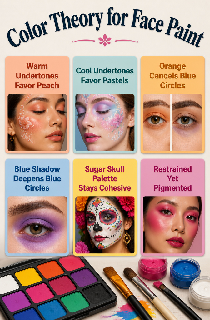
Warm undertones take to peachy shades the way cool undertones take to pastels; the pairing flatters because it echoes the skin rather than fighting it. Orange shadow cancels blue circles because orange sits opposite blue on the color wheel, and that opposition neutralizes the tone. Blue shadow on the same circles would deepen them, not hide them, which is why understanding this relationship saves a look from going muddy.
The sugar skull palette stays coherent because it anchors its brights to a single family: all saturated, all matte, all balanced by the same stark white base. Without that shared DNA, a face of competing neons would read as costume rather than design. Monochrome heat wins over scattered color every time; the same blush across eyes, cheeks, and mouth gives the eye a place to rest.
Patrick Ta builds his flush looks with pigmented creams on shared tools, letting one shade do the work of three. The result pops precisely because it is restrained.
Seasonal Shifts in Bold Makeup
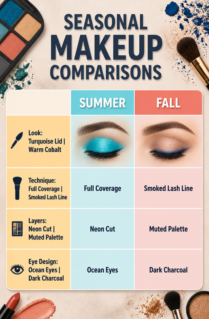
Seasonal shifts in bold makeup are where a single well-chosen shadow pan earns its keep. Last summer I wore a turquoise lid wash nearly weekly; come October, the same pan sat untouched because the tone read pool party against a wool coat. A warm cobalt becomes a cold-weather piece when you sheer it to a smoked lash line instead of building it to full lid coverage, and that distinction is what separates the flexible designs from the one-season wonders.
Some looks lock hard to their temperature. Neon cut crease and watermelon flush both lean tropical by nature; their saturation fights the muted palette of late-year clothing, and no amount of blending fixes the clash. Ocean eyes, on the other hand, shifts cleanly with a depth swap. The original aquatic shimmer works for June. Swap the teal for a deep petrol or charcoal base in the crease and it becomes a January eye without changing the shape or placement at all.
The gothic and flame under-eye designs both demand darkness to read correctly, so they slot naturally into fall through early spring. Trying either in high July tends to look costumey unless the event runs after dark. My personal rule: if the outfit underneath involves bare shoulders or linen, reach for one of the light-responsive designs instead.
Product Recommendations by Look
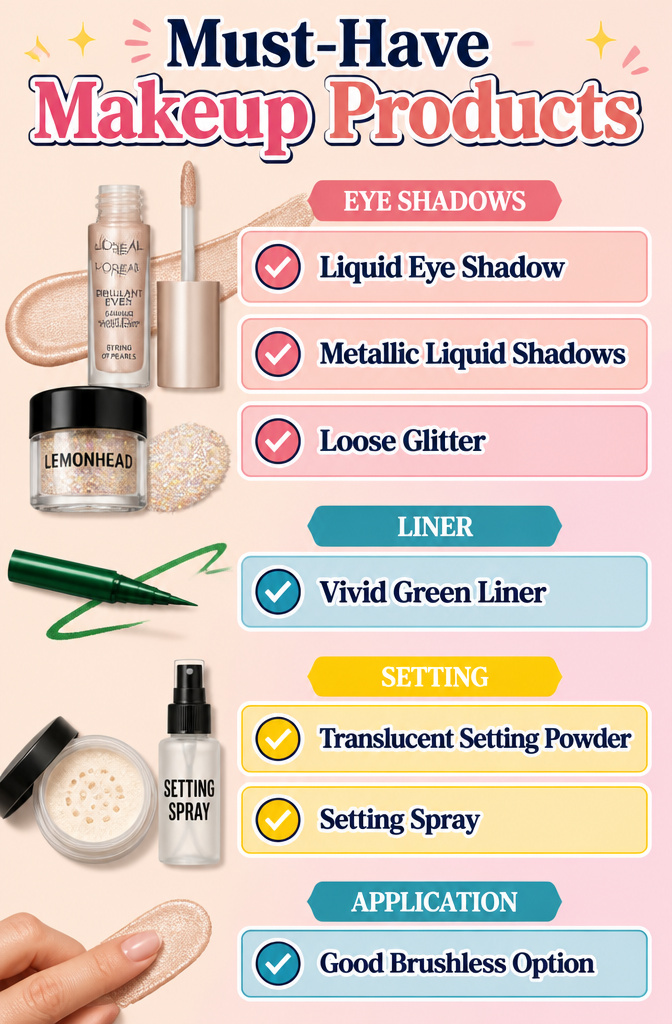
For anyone trying to keep these cool makeup designs scannable, organizing the shelf by function beats scrolling back through sixteen separate tutorials. These are the products and categories that keep coming up across the looks.
- L’Oréal Paris Brilliant Eyes Shimmer Liquid Eye Shadow in String of Pearls works as the foam highlight on an Ocean Eyes lid or as a standalone brightener tapped into the inner corner. The liquid formula sets fast, so blend in sections rather than sweeping across the whole eye at once.
- Huda Beauty’s Matte & Metallic liquid eye shadows give the metallic end for finger-applied twinkle without hauling out brushes. Emily Cheng’s method, pressing onto the center of the lid with a fingertip, takes about twenty seconds and reads as intentional rather than rushed.
- Lemonhead glitters layer over that base when the occasion calls for full sparkle rather than subtle twinkle. The texture difference between a metallic cream and loose glitter is what gives the dimension that reads as "cool makeup designs" in photos rather than flat color.
- A vivid green liner, swapped for standard black, makes a cat eye that photographs without requiring complex shape work. Sketch the wing first with a soft light-brown shadow to get the angle right, then trace over it with the colored liner.
- Translucent setting powder plus a mist of setting spray locks colored liner in place. The powder goes on after the spray has dried slightly, not while the face is still wet, or the color pills.
- A good brushless option matters more than you’d think. Several of these looks rely on finger application for speed, so textures that blend cleanly with a fingertip, like the liquid shimmers mentioned above, earn their spot over powder pans that streak without a brush.
Frequently Asked Questions
What types of makeup looks are there?
Makeup looks span from barely-there natural styles to full artistic designs like sugar skulls, avant-garde face art, and neon cut creases. The article covers sixteen specific cool makeup designs for 2026, ranging from wearable trends like soft glam and cloud blush to bold statements including flame under-eyes and 80s revival looks.
How do I know my makeup style?
Your makeup style depends on your comfort level, your features, and where you are headed. Try one loud feature at a time instead of stacking drama everywhere; a saturated blue lid with bare cheeks reads modern, while heavy blush with neutral eyes feels fresh. Pick colors that flatter your undertones: warm skin takes to peachy shades, cool skin to pastels.
What is the most common type of makeup?
Natural makeup is the most common style because it enhances without announcing itself. The key is matching foundation to your neck, not your jawline, and choosing a nude lip with undertones that keep it from flattening into concealer territory. Sheer coverage, soft definition, and unified color across eyes, cheeks, and lips make it work for daily wear and professional settings.