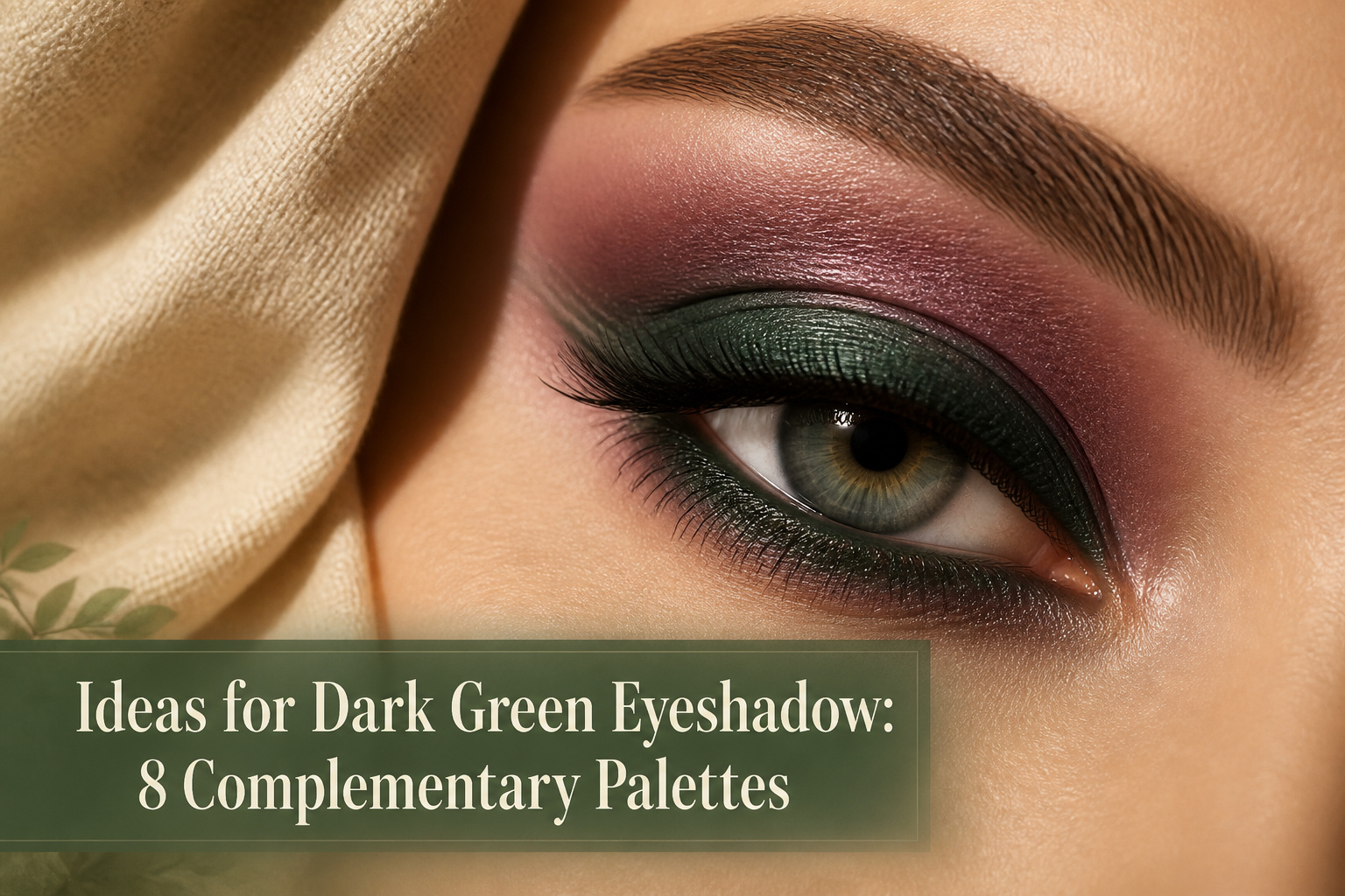
The best way to wear dark green eyeshadow is to pair it with something that is not green at all. A plum or warm brown in the crease creates the color-wheel opposition that makes green irises read deeper and more dimensional, while the dark green itself stays precise along the lash line or outer corner. Skip this approach if your green eyes run hazel-heavy; coppers and golds do more lifting there, since purple can turn muddy against too much amber in the iris. Laura Mercier’s Amethyst, a soft mauve with hidden pearl, is the shade that proved this rule in testing: it brightened without competing, and the pearl caught office light exactly enough to register as intentional by evening.
Purples, Plums, and Mauves
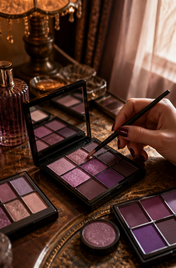
Purple sits directly across from green on the color wheel, which means it creates the strongest contrast of any shade family you can wear against green eyes. That opposition is what makes the color pop instead of sinking back.
Plum and mauve tones do something extra: they draw out the gold and amber flecks hiding in green irises. The effect adds warmth and dimension that a flat brown wash never manages. Deep aubergine works for evening, while a soft mauve is the everyday option most people will actually wear. Laura Mercier’s Amethyst, a soft mauve with hidden pearl, and Soiree, a shimmering lavender, both operate in this space.
I have found that mauve reads neutral enough for office lighting but still registers as "doing something" by evening. It is the compromise that does not feel like one.
Patrick Ta’s Major Dimension Sparkle Eyeshadows in warm plum-toned mattes span light, medium, and deep editions. The range gives you crease and transition shades that pair naturally without looking like you are trying too hard for complementary contrast. Two sources both point to purple tones as the top recommended color family for green eyes, which matches what you will see in the mirror when you actually try it.

Rich Pigment & Versatile Shades:Featuring an array of multi vivid shades including black, white, brown, purple, green, and beige, this pressed powder eyeshadow palette is designed for crafting stunning eye makeup looks that range from subtle to bold. Each shade is highly pigmented for impactful color that draws attention

Easy-to-wear shades. All-day wear.
Multicolor Options: This eyeshadow palette features a vibrant selection of bright, richly pigmented shades. Easily mix and match to create unique looks—each color is carefully curated for harmonious blending and radiant eye makeup.
Warm Browns, Coppers, and Bronzes
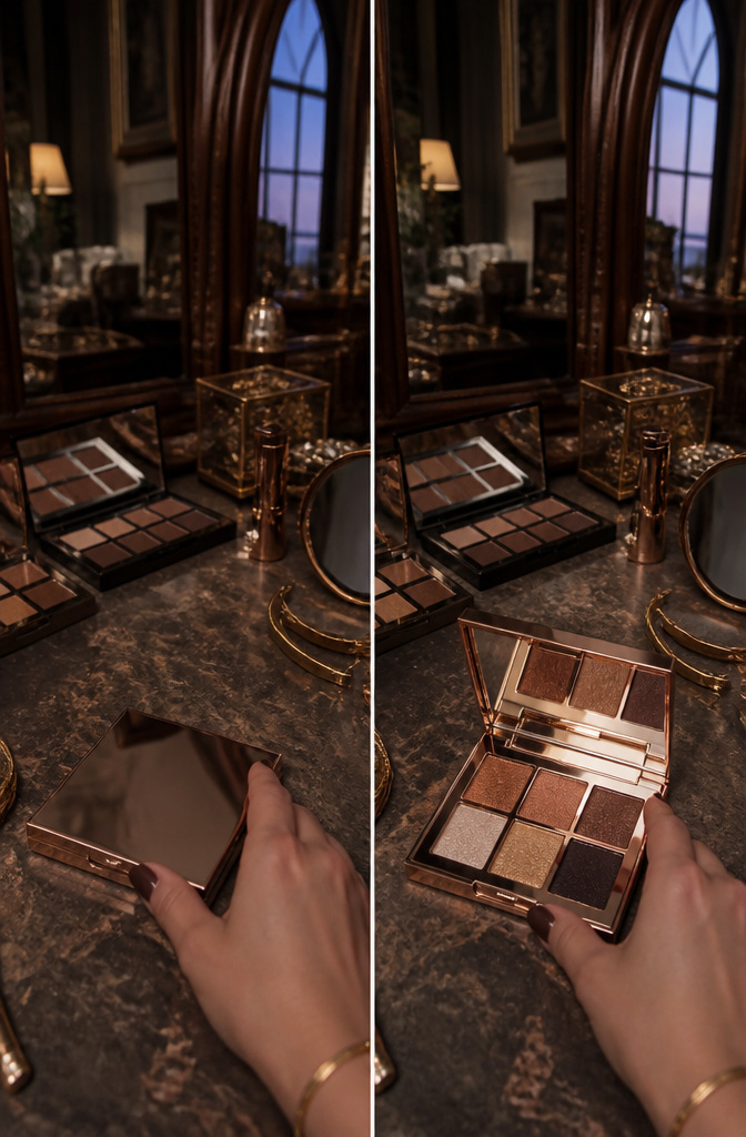
Warm browns, coppers, and bronzes pick up the amber and gold threads already living in most green irises. Copper shimmer catches light and throws warmth back toward the eye, which keeps the iris looking dimensional rather than painted over. Patrick Ta’s Major Dimension formula uses multidimensional pearls in a translucent base so the lid stays bright without masking the green underneath.
The trouble with dark green eyeshadow that matches the iris too closely is exactly that cancellation effect. Without contrast, the eye flattens into one murky note. Laura Mercier’s Burnished Bronze and Forbidden Rose shades work because their reddish warmth sits opposite green on the color wheel, creating the push-pull that makes an iris seem to glow from within. I reach for a warm matte base first, then pat a copper shimmer on the center lid with a fingertip so the two textures stay separate and don’t muddy.

Smooth Texture & Effortless Application:Formulated with a cream texture, cream eyeshadow sticks glides smoothly on eyelids and blends effortlessly. It delivers a flawless finish without caking or tugging, helping you create seamless, natural eye looks with ease.

❤️【Eyeshadow Stick 】35 classic colors,including the most popular shimmer and matte eyeshadow colors for girls,you no longer have to struggle to choose a color,is enough to fully meet all the needs of girls. It can be used to create smoky,sultry,luminous,metallic finish,and also works well as a highlighter and Eyeliner Pencil.
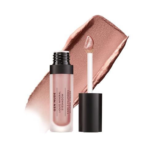
Weightless Liquid Eyeshadow: Smooth liquid-to-cream formula delivers comfortable, lightweight color that is easy to apply and blend.
Pinks and Rose Golds
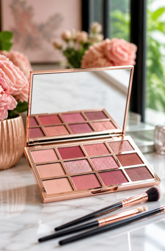
Pink and rose gold sit in a deceptively useful middle space for green eyes. They carry red undertones, and red sits opposite green on the color wheel, so the contrast is real but softened compared to a deep plum or eggplant. The effect brightens without the stage-ready intensity purple brings.
Rose gold specifically splits the difference between pink and copper, which makes it one of the more flexible options in this whole family. It works across the lid, tapped into the inner corner, or blended along the lower lash line for a lifted, luminous finish that doesn’t read as makeup-makeup.
Where this lands in the landscape: purples deliver the strongest complementary pop, soft neutrals barely register as contrast at all, and pinks with rose golds split the difference for days when you want the green noticed but not shouted. That daily-middle ground is where most of us actually live.

CREAM-TO-POWDER SHIMMER FINISH WITH ALL-DAY HOLD: Starts as a silky, pigment-rich cream and sets to a luminous shimmer powder that stays crease-free and fallout-free —delivering glowing, dimensional shimmer lid color that truly lasts.

【Flattering Shades for Every Skin Tone】 Each stick is thoughtfully crafted in rich, smoky tones that flatter all complexions. From warm neutrals to deep charcoals, these pigmented shades enhance your eyes and add instant dimension with minimal effort.

Vibrant, Long-lasting Color: Urban Decay 24/7 Eyeshadow singles deliver high-pigment, richly saturated color with up to 12 hours of wear. The velvety-soft formula glides smoothly onto lids and builds easily, with shades ranging from soft everyday neutrals to rich jewel tones. Create everything from subtle definition and soft washes of color to bold, dramatic eye looks with vibrant, crease-resistant wear that lasts from day to night.
Golden Shimmers
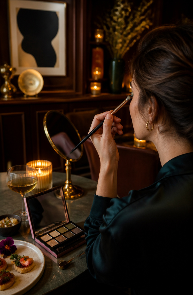
Gold sits opposite green on the color wheel, which means a warm metallic shimmer does something almost optical against dark green eyeshadow. A single tap of gold on the center of the lid catches the light and pulls out any gold flecks already living in green irises, making the whole eye color look deeper without requiring more pigment anywhere else.
I noticed the same principle at work with Patrick Ta’s In Your Dreams (Diamond Sparkles) from the Major Dimension Eye Illusion Eyeshadow Duos: the placement is specific, center-lid only, so the contrast stays dimensional rather than turning muddy. Laura Mercier takes a softer angle with Sugarfrost, a tan beige shimmer that brightens without competing. Either approach works; the difference is how much glow you want. The tan beige reads more natural for daytime, while a true gold leans evening. Both formulas build in one swipe, so the layering decision matters more than the brushwork.

100% clean vegan formula free of talc, mineral oil, paraben and fragrance

Two‑Color Gradient Design: Each shimmer eyeshadow stick comes with two complementary coordinated shades. Create seamless gradient eye makeup effortlessly with repeated back‑and‑forth blending swipes

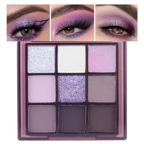
Intensely Versatile - Transform your look with a curated blend of 9 luxurious shades that shift effortlessly from a soft daytime glow to a dramatic nighttime allure. Enjoy seamless blending for a finish that adapts to every style with precision.
Soft Neutrals
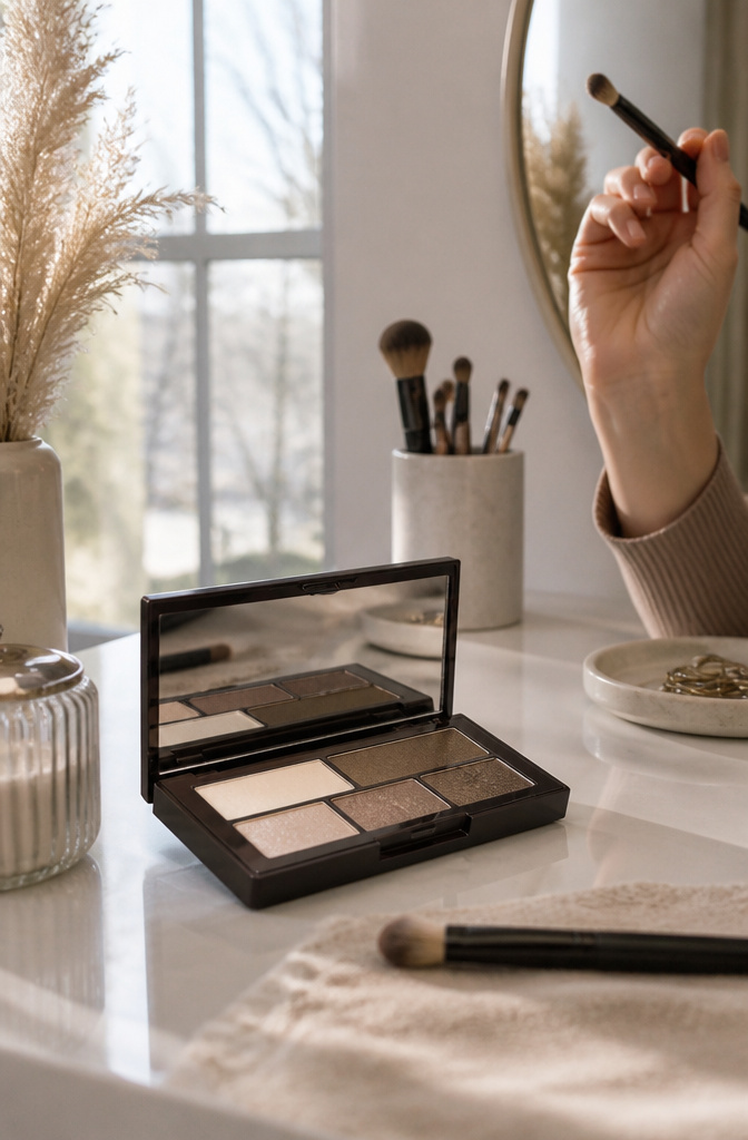
The light-catching quality of dark green eyeshadow comes alive against a nearly bare lid, something I noticed while working through which palette combinations actually read as intentional rather than unfinished. A wash of tan beige shimmer, something like Laura Mercier’s Sugarfrost, or a sheer pink peach such as Starlight, brightens the eye without competing for attention. This pairing works for mornings when you want the green to register as an accent, not a statement: the neutral does the enlarging, the shimmer does the waking-up, and the dark green stays precisely where you placed it.
This is the move for offices, family dinners, or any setting where someone leaning in should notice your eyes first and your makeup second. It asks more of the green shade’s blend, since there’s no neighboring pigment to hide a sloppy edge, but the payoff is longevity. The color stays put for 24 hours on formulas like the Caviar Stick line, meaning you aren’t reapplying by lunch.
To really make them pop, it’s all about choosing shades that complement and contrast with their tones.
Against that advice, this is the one choice in the article with less settled consensus: some green-eyed wearers find true neutrals flatten rather than flatter, especially if their coloring runs cool. The safer bet for contrast remains the bronzes and plums covered elsewhere. Choose this route when your day holds no spotlight, or when the dark green itself is the boldest element you can manage.
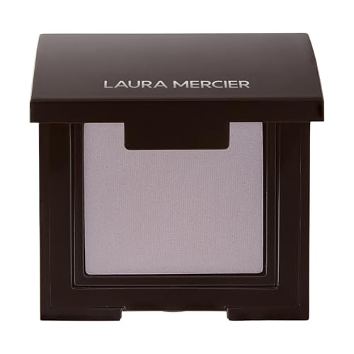
Pure Matte Payoff: This matte eyeshadow delivers intense, long-lasting color in a single stroke with a smooth, creamy feel on the lid. Sheer it out for a soft finish or layer to full intensity, with no fallout and no creasing.

【Rich Pigment & Versatile Shades】Featuring an array of multi vivid shades including black, white, brown, purple, green, and beige, this pressed powder eyeshadow palette is designed for crafting stunning eye makeup looks that range from subtle to bold. Each shade is highly pigmented for impactful color that draws attention

Make Your Eyes Pop - Say hello to Shadow Stix! These super creamy eyeshadow sticks glide on smoothly for effortless application – just swipe, blend and go.
What Dark Green Eyeshadow Actually Does
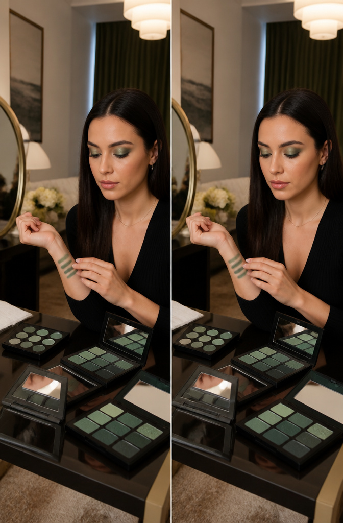
Exact-match dark green eyeshadow cancels out the contrast your eye needs to stand out. Instead of intensifying green eyes, it blends into the iris and flattens the whole look.
I noticed this myself the first time I tried a deep forest shadow that matched my eye color almost perfectly. The effect was oddly diminishing; my eyes looked smaller and less dimensional, not more. What works far better sits opposite green on the color wheel: warm browns, coppers, golds, plums, and pinks. These create the contrast that draws attention to the green in your iris rather than competing with it.
If you want to use dark green, keep it distinctly darker or markedly different in undertone from your natural color. Think charcoal-leaning greens or those with a blue shift. The safer move for everyday wear is a warm brown or gold on the lid with just a hint of green smudged along the lower lash line for framing, not matching.

AFFORDABLE PROFESSIONAL QUALITY: Achieve flawless, blendable matte looks with five silky shades that deliver rich, buildable color—perfect for trendsetters who want top-tier style without breaking the bank.

Vibrant Color Range: MEICOLY offer a diverse range of shades for eyeshadow,including beige eyeshadow,white eyeshadow,black eyeshadow,light blue eyeshadow,green eyeshadow,coffee eyeshadow,red eyeshadow,macaron grey eyeshadow,catering to various preferences and allowing you to find your perfect match.Gently remove the sealing film from the mirror before using the eyeshadow.

【HIGHLY PIGMENTED COLOR PAYOFF】Featuring 10 richly pigmented shades, this mauve eyeshadow palette delivers vibrant color with a smooth, buildable finish. From soft rose gold and warm taupe to deep plum and smoky purple, each shade helps create defined, dimensional eye looks with minimal product.
Colors to Skip
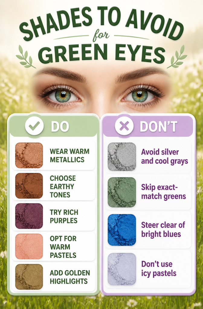
Some shades pull the focus away from green eyes rather than framing them. These are the ones to leave in the drawer:
- Silver and cool grays — These lack the warm undertone that activates green pigment. On the lid, they push the iris toward a muted, grayish tone instead of drawing out its natural vibrancy.
- Exact-match greens — A green shadow that mirrors your iris color cancels the contrast your eye needs to stand out. The shadow blends into the eye itself and flattens the whole look.
- Bright blues — Vivid blues grab all the attention for themselves. The eye color gets visually buried behind the lid rather than being framed by it.
- Icy pastels — Very light, cool-toned pastels wash out the richness of green eyes, especially on light and medium skin. If you want softness, warm pastels like blush pink or champagne gold read much healthier against green irises.

Easy to Use: Goes on smoothly without skipping, smudging or pulling, feeling so light you can't even tell you are wearing any. And also easily to remove with makeup remover, fast and clean, never worry about pigmentation.

CREAM-TO-POWDER SHIMMER FINISH WITH ALL-DAY HOLD: Starts as a silky, pigment-rich cream and sets to a luminous shimmer powder that stays crease-free and fallout-free —delivering glowing, dimensional shimmer lid color that truly lasts.

【Flattering Shades for Every Skin Tone】 Each stick is thoughtfully crafted in rich, smoky tones that flatter all complexions. From warm neutrals to deep charcoals, these pigmented shades enhance your eyes and add instant dimension with minimal effort.
Application That Actually Works
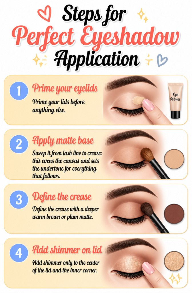
- Prime your lids before anything else. On oily skin, skipping primer is the fastest way to lose the whole look to creasing within hours. A thin layer gives the pigment something to grip and keeps the shape you build intact from morning through evening.
- Lay down a matte base that matches your skin tone. Sweep it from lash line to crease: this evens the canvas and sets the undertone for everything that follows.
- Define the crease with a deeper warm brown or plum matte. A fluffy blending brush worked in small windshield-wiper motions frames the eye and gives green irises their maximum contrast. Keep the edge soft, not sharp.
- Add shimmer only to the center of the lid and the inner corner. Pat it on with a fingertip: the warmth of a finger lays the pearl down without dragging the matte underneath into a muddy mix. The light catches here, and the dimension it gives is what makes the eye read as finished rather than flat.


CREAM-TO-POWDER SHIMMER FINISH WITH ALL-DAY HOLD: Starts as a silky, pigment-rich cream and sets to a luminous shimmer powder that stays crease-free and fallout-free —delivering glowing, dimensional shimmer lid color that truly lasts.

Dual-Color Reflective Magic: This holographic glitter eyeshadow palette features a high-pigment formula with rich, vibrant base colors that apply effortlessly. Topped with floating diamond-like shimmer, it creates a mesmerizing duochrome effect, adding dimension and sparkle to your eyes. Perfect for bold, head-turning looks that shine from every angle
Eyeliner That Finishes It
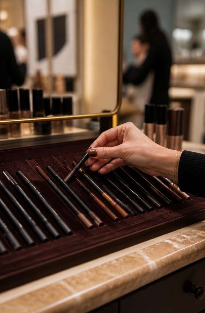
Dark green eyeshadow on green eyes lives or dies by what happens at the lash line. The shadow itself sets the mood, but the eyeliner anchors it and keeps the whole look from floating away. Brown or plum eyeliner pulls the color story together for green irises better than jet black ever will. Black can read harsh, especially in daylight, and it tends to mute the warm amber flecks that make green eyes catch light in the first place.
Laura Mercier’s Caviar Tightline pencils in Cocoa and Bleu Marine are the shades that keep coming up. Cocoa gives definition without the stark edge; Bleu Marine adds depth while still playing warm against the iris. For something that doubles as shadow and liner, the Caviar Stick in Forbidden Rose sits at that copper-rose spot between brown and plum, and Burnished Bronze leans into the metallic warmth that gold and copper bring to green eyes. Both blend out as shadow or stay precise as a soft line along the upper lashes.
The trick is keeping the liner tight to the lash line rather than drawing a visible stripe above it. Tightlining the waterline with a brown or blue pencil adds intensity without breaking the color frame the dark green shadow built.

Quick & Easy Eye Makeup :This smooth cream eyeshadow stick glides on effortlessly for large-area application. Super blendable with fingers, allowing you to create a flawless eye look in seconds, perfect for busy mornings and on-the-go use.

One-swipe, high-impact color. 12 shimmery shades.

Quick & Easy Eye Makeup :This smooth cream eyeshadow stick glides on effortlessly for large-area application. Super blendable with fingers, allowing you to create a flawless eye look in seconds, perfect for busy mornings and on-the-go use.
Mistakes I Have Made
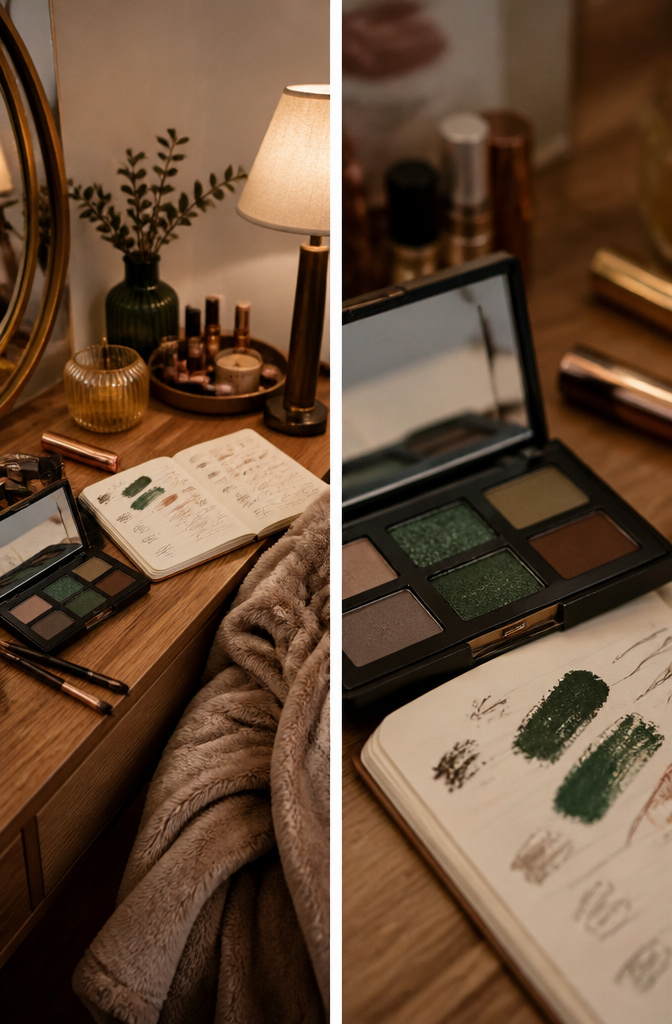
Exactly matching dark green eyeshadow to green eyes was the first misstep I owned up to. The color sat dead on the lid and flattened everything that should have popped. What changed: complementary shades sitting opposite on the wheel, purples and warm browns, actually advanced the iris instead of erasing it.
Skipping primer on oily lids ranks as the second repeat offense. After two hours the shadow pooled in the crease and the depth I’d built turned muddy. A thin base layer before any color goes on keeps the payoff intact. The skincare-infused formulas in palettes like Major Dimension help, but primer is still the extra insurance that matters on oil-prone skin.

Dual-Ended Design: This 2-in-1 eyeshadow stick features a dual-ended design - one side delivers high pigmented color & the built-in smudger brush on the other allows for seamless blending. No extra tools are needed for a portable eye makeup application anytime, anywhere

Vibrant Shimmer & Matte Colors – This eyeshadow stick is available in a variety of color ranges, from everyday nudes to bold smoky shades, catering to all your makeup needs for any occasion. The highly pigmented formula delivers rich color payoff in just one swipe for effortlessly vibrant, multidimensional eye looks. Whether worn alone or layered with multiple shades, you can effortlessly achieve the eye makeup look you desire.

Cream Eyeshadow with Sharpener&Brush - - This cream eyeshadow stick features a smooth, buttery texture that balances the pigment intensity of powder formulas with the moisturizing properties of a cream. It applies effortlessly without tugging or smudging. Each stick comes with a built-in sharpener for precise eyeliner application, plus a sponge tip for seamless blending.
How These Picks Were Tested
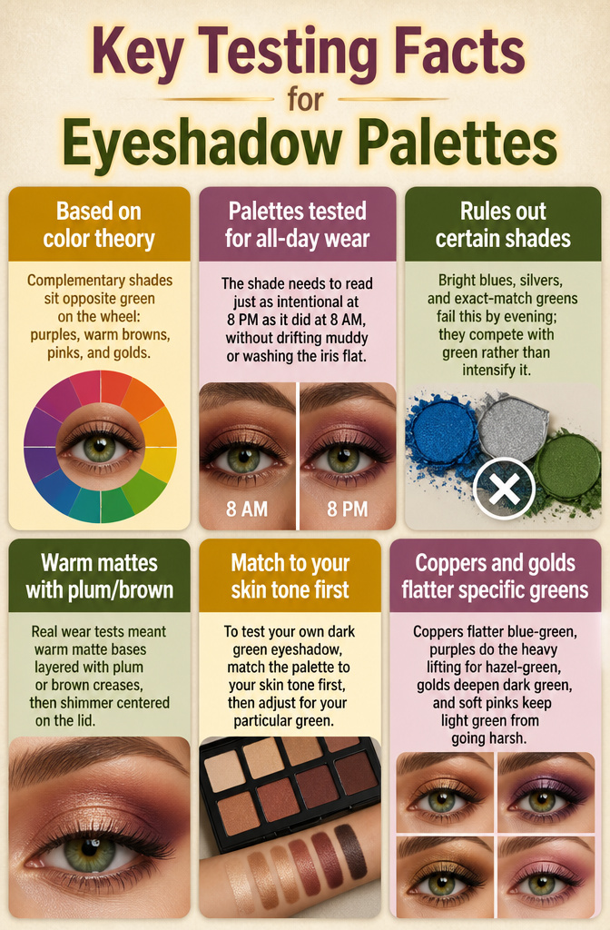
Color theory drove every pick, because complementary shades sit opposite green on the wheel: purples, warm browns, pinks, and golds. A palette either proved that contrast or it did not.
I filtered for what actually survives a full day on green eyes, not what looks right in the pan. The shade needs to read just as intentional at 8 PM as it did at 8 AM, without drifting muddy or washing the iris flat. Bright blues, silvers, and exact-match greens fail this by evening; they compete with green rather than intensify it.
Real wear tests meant warm matte bases layered with plum or brown creases, then shimmer centered on the lid. That structure held up best across the hours.
To test your own dark green eyeshadow, match the palette to your skin tone first, then adjust for your particular green. Coppers flatter blue-green, purples do the heavy lifting for hazel-green, golds deepen dark green, and soft pinks keep light green from going harsh. Any shade that reads off by dinner was never the right complementary to begin with.
Frequently Asked Questions
What colors should I avoid with green eyes?
Skip silver, cool grays, exact-match greens, bright blues, and icy pastels. Cool grays push green irises toward a muted, grayish tone rather than bringing out their natural vibrancy. An exact-match green shadow blends into the iris and flattens the whole look, while bright blues grab all the attention and bury the eye color behind the lid.
How do I apply eyeshadow for green eyes?
Start with primer, then lay down a skin-tone matte base from lash line to crease. Define the crease with a deeper warm brown or plum matte using small windshield-wiper motions, keeping the edge soft. Add shimmer only to the center of the lid and inner corner, patting it on with a fingertip so the warmth lays the pearl down without dragging the matte into a muddy mix.
What is the best eyeliner for green eyes?
Brown or plum eyeliner flatters green eyes more than jet black, which can read harsh and mute the warm amber flecks that make green eyes catch light. Laura Mercier’s Caviar Tightline pencils in Cocoa and Bleu Marine come up repeatedly: Cocoa gives definition without a stark edge, and Bleu Marine adds depth while still playing warm against the iris. Keep the liner tight to the lash line rather than drawing a visible stripe above it.
Does purple eyeshadow really make green eyes look greener?
Yes. Purple sits directly opposite green on the color wheel, so it creates the strongest possible contrast against a green iris. Plum and mauve tones also draw out the gold and amber flecks in green eyes, making the color appear deeper and more dimensional. Two sources point to purple tones as the top recommended color family for green eyes.
Can you wear green eyeshadow if you have green eyes?
Yes, but avoid an exact match. A green shadow that mirrors your iris cancels out contrast and flattens the eye. If you want to wear green, choose a shade several steps warmer or deeper than your eye color, such as charcoal-leaning greens or those with a blue shift. The safer everyday move is a warm brown or gold on the lid with just a hint of green smudged along the lower lash line for framing, not matching.
Is gold or silver eyeshadow better for green eyes?
Gold is better for green eyes. Gold shimmer highlights the warm flecks already present in most green irises, while silver’s cool undertone pushes the eye toward a muted, grayish tone. If you want a metallic look, choose gold, copper, or rose gold over silver.
What eyeshadow colors suit green eyes and blonde hair?
Soft mauves, rose golds, and champagne shimmers suit green eyes with blonde hair. These shades add warmth and contrast without overpowering lighter coloring. Deeper plums and bronzes work well for evening when you want more intensity.
What is the best everyday eyeshadow look for green eyes?
A warm neutral matte across the lid, a soft plum or brown in the crease, and a touch of gold or champagne shimmer on the center lid. This three-shade formula enhances green eyes in under five minutes and builds easily into an evening look.