
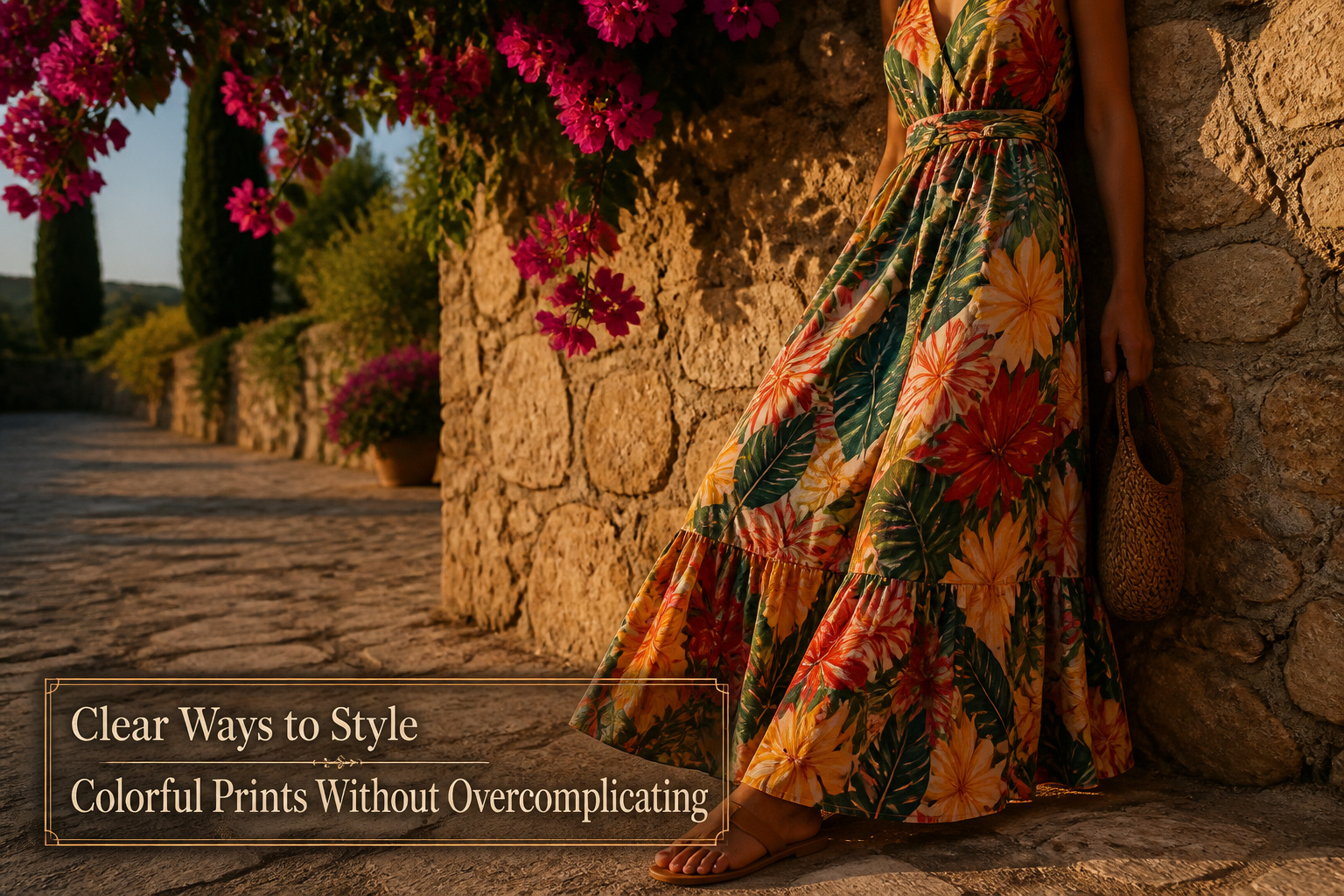
The simplest way to style colorful prints without overcomplicating an outfit is to wear one statement piece and let everything else recede. The catch is that most of us reach for a second print or a "matching" accessory before the first pattern feels finished, and close-but-not-exact color matches read as mistakes rather than choices. A JAMS World tropical dress carried every summer event one year with only solid sandals and a plain bag; the print itself was the whole outfit, no layering decisions required.
1. One Statement Piece

A printed blouse with a full skirt pattern taught me this lesson the hard way. I paired it with a floral scarf, thinking the colors matched close enough, and spent the whole morning feeling slightly off in every mirror I passed. One statement piece per outfit is the safer rule, and the one I now follow without exception.
The logic is straightforward. Neutrals recede; a single bold print advances. That contrast creates focus without demanding extra planning. A patterned skirt with a white tee and denim jacket looks intentional. The same skirt with a striped top and a second color pull looks like you tried to solve a puzzle and lost.
My workhorse was a JAMS World dress with a vivid tropical print. It carried every summer event that year because the dress itself was the whole outfit. Simple sandals, a solid bag, and I was done. No layering decisions, no competing visual weight. When I wanted more, I had to earn it by wearing the one-print default until it felt automatic, like breathing. Only then did printed accessories or color pulling from the pattern itself make sense as the next step.
2. Balance Prints with Solid Colors

A printed skirt or top already carries every color cue you need. The move is to pull one shade straight from the print itself and repeat it in a solid piece elsewhere in the outfit. A red floral blouse, for instance, pairs cleanly with solid red accessories or a solid red bottom. The eye registers the echo without registering effort, which is exactly what keeps the look from tipping into busy.
I learned this the hard way after trying to "match" a printed piece with something in the same color family but not the same actual color. Close is worse than wrong here; it reads as a mistake rather than a choice. The print gives you the precise shade, so use it precisely.
Neutrals from the print work too. Black pulled from a graphic pattern, cream from an animal print, tan from a leaf detail. The same rule applies either way: one color from the print, repeated in solid form, and the rest of the outfit stays quiet. Small pops in shoes or a bag count, but the solid piece can also carry the whole look if you want the print to stay the single focal point.
3. A Cohesive Color Palette

Colorful prints already carry an entire palette inside them, which is where most of us lose our footing. The outfit becomes a competition between what the print wants to do and what the rest of the wardrobe tries to add.
Two or three coordinating shades total is the working limit, and that count includes the print’s own colors. A red floral top pulling from two main hues needs only one of those hues repeated elsewhere, or a neutral that steps back entirely. Last spring I counted four competing shades in a single outfit, convinced the common red thread tied it together, and the mirror showed otherwise; the eye had nowhere to settle.
Color-pulling works best when you choose deliberately from the print itself. A minor accent color from the pattern, carried into shoes or a belt, creates cohesion without doubling the visual weight. I have used this with neutrals pulled from prints too, not just the bold ones.
The rule bends slightly when the print is itself restrained, a two-tone graphic rather than a full garden. Then a third shade, carefully chosen, can add interest without overload. The print’s complexity sets the ceiling, and most of us forget to factor that in.
4. Mix Prints Strategically
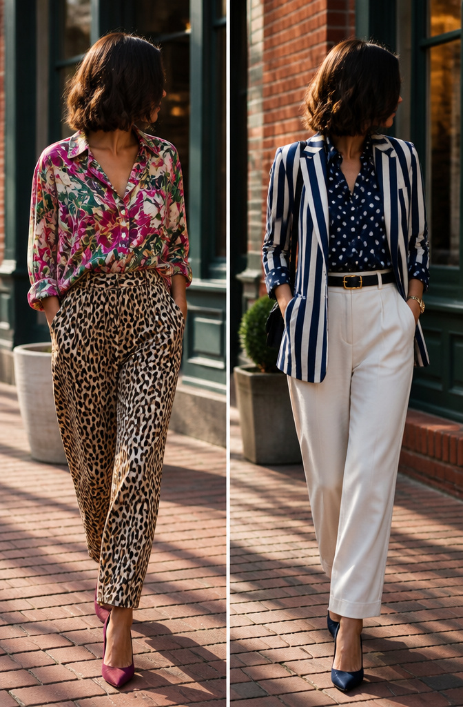
Mixing two prints only works when one is clearly larger than the other. A small polka-dot blouse under a wide-striped blazer reads as intentional; two florals in similar scale just look like you got dressed in the dark. The shared color does the actual holding together. Last spring I tried a floral skirt with a thin-stripe tee, both pulled from navy and cream, and the stripes acted almost like a neutral against the bigger pattern. Start small: one print as the main piece, the second limited to shoes, a scarf, or a belt. That keeps the experiment from announcing itself before you do. Polka dots with plaid can work the same way if the palette repeats, but two large geometrics will compete rather than complement. Confidence builds faster when the mix is subtle enough that someone might not clock it as mixed at all.
5. The Right Silhouette

A structured silhouette grounds a bold print before the eye even registers the pattern. I learned this the hard way with a boxy cropped jacket in oversized hibiscus, the kind of piece that looked editorial on the rack and like a costume on me. The cut had no waist, no shoulder definition, nothing to contain the print’s energy, and the whole thing wore me instead of the other way around. A clean, fitted cut lets a loud pattern read as intentional rather than overpowering.
Flowing fabrics work the opposite way, softening busy patterns that might otherwise feel rigid or severe. A well-fitting printed dress or a flowy top can be incredibly flattering, especially when the print itself is dense or high-contrast. The movement of the fabric breaks the pattern into moments rather than a continuous shout.
Occasion matters as much as body shape here. A structured sheath in a bold print carries a meeting; the same print in a draped caftan reads vacation-only. For my own wardrobe, structure wins on workdays when I need the print to signal confidence, not creativity. Flowing cuts stay reserved for weekends, when the softer line keeps the pattern from competing with whatever I’m actually doing.
6. Accessorize with Restraint

A printed dress already carries the full conversation, so jewelry and bags should listen more than they talk. That means one metallic tone, kept consistent: gold with gold, silver with silver, rose gold with rose gold. A thin pendant, small hoops, or a clean watch will anchor the eye without starting a second argument.
The competing pieces are easy to spot once you know the rule. Chunky necklaces, oversized earrings, or a bag in a second busy pattern all demand their own share of attention. Shoes and bags in a neutral finish keep the spotlight where it belongs.
Last spring I layered a bold floral midi with a beaded statement necklace and a crossbody in contrasting leopard. Three steps into the office and the mirror by the elevator told the whole story: circus, not chic. The fix took ninety seconds in the bathroom — off came the necklace, the leopard bag went into my drawer, and I finished the day with just small gold hoops and a tan leather tote I keep at my desk for exactly these mornings.
Neutrals That Actually Work

Navy and gray do the heavy lifting most women forget to assign. A cobalt floral skirt against charcoal read as deliberate at a client lunch last spring; the same skirt with white denim and tan mules turned into Saturday without changing anything else. Gray makes a print look chosen, not rescued. Black flattens color into a single plane, while navy lets each hue in the pattern keep its weight. Denim functions the same way, which is why a chambray shirt under a leopard blouse works: the wash acts as a neutral without the severity of a blazer.
Beige and cream sit at the opposite end of the register. They soften a print rather than sharpening it, which can read serene or simply washed-out depending on the print’s own saturation. The apricot tones in a summer floral legging come forward against cream; against stark white they recede and the print goes muddy. White itself is not neutral in the way sources often claim. It competes with color rather than supporting it, and it shows every tonal shift in the print that black would absorb.
The practical limit is two neutrals per outfit, and one of them should have texture. A cashmere gray crewneck under a patterned dress does more than a flat gray tee. The eye needs somewhere to rest that still registers as a decision.
Texture as Quiet Print Mixing

Texture functions like a print without the registration risk. Last spring I laid out a floral midi skirt and a striped button-down, stepped back, and saw the fight happening before I even walked out the door. The stripes weren’t wrong, exactly, but they asked the skirt to compete on the same terms. I swapped the shirt for a ribbed cotton tank in a solid pulled from the skirt’s palette, added a nubby tweed blazer I had dry-cleaned after a winter of barely wearing it, and the outfit landed where I wanted it: visually layered, narratively simple.
A smooth leather belt or bag does similar work. The surface reads as deliberate variation, not afterthought, and it keeps the eye moving across one print rather than dividing its attention between two. Texture mixing builds depth the way pattern mixing promises to, but the failure mode is a quiet fade instead of a clash. The same tweed jacket over that striped shirt would still have read office, not experiment; with the floral skirt, it gave me permission to skip the second print entirely.
Seasonal Adjustments

A watercolor peony blouse I bought in May looked borrowed from someone else’s closet by January, and the problem wasn’t the sleeve length. Summer florals read as off-season because their saturation fights the muted light of winter afternoons. Earth tones and jewel shades feel native to fall and winter because the lower sun already paints everything amber; brights and pastels belong to spring and summer when the light is white and high. The mistake most of us make is treating prints as temperature-neutral. Layering that peony blouse under a camel cardigan only highlighted the clash, the way a forced bloom looks wrong against frost. Prints with deeper backgrounds, smaller repeats, or denser patterning shift naturally into cooler months without any layering gymnastics. I keep a hard rule now: if the print’s dominant color would look garish against bare branches, it stays in storage until the trees fill out again.
Print Pairings That Survived Real Days

Leopard mules with a multi-color summer dress sounds like a risk until you wear it. The animal print reads as a neutral against busy color, not a second print fighting for attention. I tried this pairing for a July outdoor wedding that started at 3 p.m. in 82-degree heat and dropped to 67 by the exit. The around-the-knee length kept sitting comfortable through the ceremony, and the mules held up for standing cocktails better than strappy heels would have. For a pear-shaped frame, the dress silhouette needed to skim the hip rather than cling; the leopard at the foot drew the eye downward and balanced the volume.
A denim jacket over patterned leggings with a plain white tee underneath works for the days that move from brunch to errands to a last-minute school pickup. The layer handles temperature swings and gives structure to softer leggings without adding another competing print. The jacket acts as a neutral buffer so the print underneath does not feel like a costume by hour four.
When a print is dramatic enough to be the single focal point, everything else steps back. A solid black long-sleeve top and black boots underneath let the print carry the outfit through a full day of meetings and an evening dinner without looking like you changed or gave up.
Frequently Asked Questions
How do I wear bold prints without looking overwhelming?
Start with one statement piece per outfit and let everything else stay solid. A single bold print against neutrals creates natural focus without extra planning, so the eye has one place to land instead of competing for attention across multiple patterns.
Can I mix different prints together?
Yes, but only when one print is clearly larger than the other and they share at least one common color. A small polka-dot with wide stripes works; two florals in similar scale look accidental. Keep the second print limited to shoes, a scarf, or a belt until the pairing feels automatic.
What colors should I pair with prints?
Pull one precise shade straight from the print itself and repeat it in a solid piece elsewhere, or use a neutral that steps back entirely. Close-but-not-exact color matching reads as a mistake; the print gives you the exact shade, so use it exactly. Navy, gray, and denim do the heaviest lifting as neutral partners.