The single most useful thing about styling monochrome outfits in bold colors is that texture variation matters more than the exact shade you choose. A flat all-black outfit looks like an afterthought; silk against wool or leather against cotton twill gives the color somewhere to go visually. I saw this done well only twice in a month of people-watching, and both times it involved at least two fabrics that read differently under office light. The condition that changes everything: tailoring is not optional. An ill-fitting suit, even in the right color, breaks the monochrome spell before you reach your desk.
1. Black Monochrome Outfits

Black never left, but a flat all-black outfit can look like an afterthought instead of a choice. The difference is texture. A silk blouse under a wool blazer, or leather against cotton twill, gives the color somewhere to go visually. Last fall I saw this done well only twice in a month of people-watching; both times it involved at least two fabrics that read differently under office light.
For a commanding office look, a black tailored suit with sleek pointed-toe heels still sets the standard. The cut matters more than the label. An ill-fitting suit, even in the right color, breaks the monochrome spell entirely. Tailoring is not optional here; a waist that gaps or sleeves that pool will undo the effect before you reach your desk.
Metallic accessories read as punctuation against black. Silver or gold at the earlobe or wrist adds light without competing. What doesn’t work: piled-on pieces that fight each other. One or two metallic notes finish the look; more than that, and the outfit starts to look like a jewelry display with clothes underneath.
2. Navy Monochrome Outfits

Navy reads as neutral in most offices but still registers as a choice, which is the whole point of going monochrome with it. The safest formal version I have found pulls from three distinct blues rather than one flat shade: a navy blazer over a royal blue button-down, slim-fit navy trousers, and polished loafers. The royal blue lifts the shirt to a lighter value so the jacket and pants do not melt together into a uniform blob.
Skin tone matters with this much blue stacked at once. Cooler complexions handle the crisp royal blue without looking sallow; warmer or olive skin usually wants the navy dominant and the secondary shade dropped closer to midnight so the contrast works with rather than against the undertone.
Texture does the real work when color range is narrow. A wool or structured cotton blazer, crisp poplin or a fine broadcloth shirt, and trousers with enough weave to catch light differently, all keep the eye moving. Without that variation, navy monochrome flattens to corporate camouflage fast. For casual hours, switching those same navy trousers to dark denim changes the register entirely, though the layering rule still holds: different shade up top, different texture below, and the loafers stay polished so the look does not read as accidental.
3. Brown Monochrome Outfits

Brown carries a warmth that feels baked-in rather than shouted, which makes it one of the bolder monochrome moves you can make without looking like you’re trying. A brown knit sweater with high-waisted trousers in a slightly lighter shade gives you that built-in dimension without needing pattern or jewelry to break it up. The gap between the two browns does the work.
Texture mixing is what keeps this from reading as a uniform. Pair the knit against a woven trouser; the contrast between soft and structured keeps the eye moving even when the color stays flat. A camel trench or suede boots in a matching tone adds another layer without leaving the family.
Autumn is the obvious season for this, and heavier wools and ribbed knits own it. Come spring, the same palette works in lighter fabrics: a cotton-linen weave for the trousers, a finer-gauge sweater that breathes. The color stays, the materials shift.
4. Green Monochrome Outfits

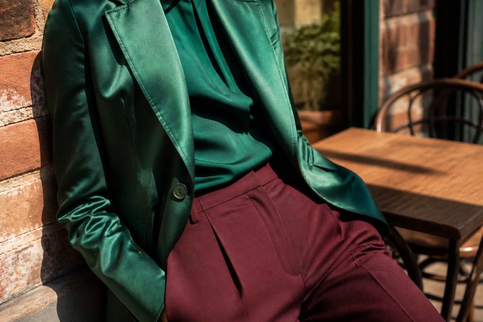
A tailored green blazer with flat-front pants or chinos is the easiest entry point I have found for forest and emerald monochrome, and the combination reads as intentional rather than costume in ways that matching sets often don’t. Choosing the right shade for your skin tone is what makes this work: olive green flatters warmer complexions because it picks up yellow undertones without amplifying them, while mint and cooler emerald tones sit better on cooler skin. If you are uncertain which camp you fall into, hold the fabric near your jaw in natural light and watch whether the color lifts your face or drags it slightly yellow, a test that takes thirty seconds and saves a morning of second-guessing.
Layering technique matters more with green than with neutrals because the eye reads a single bold shade as flat fast. Mix a wool or tweed blazer with cotton chinos, or add a knit layer underneath to break the surface, variation in texture adding depth that variation in color would normally provide. The same principle applies in reverse for formal occasions, where a silk blouse under a tailored wool pant and jacket keeps the look from reading as a single block. I would avoid wearing the exact same shade head to toe; overlapping forest and emerald, or deep olive with a lighter sage, builds the soft contrast that flatters without demanding constant attention.
5. Pink Monochrome Outfits

Pink runs from soft to loud in a way few other colors manage. A blush pink midi dress with rose-toned flats and a baby pink crossbody bag is the safest entry point; the shades stay close enough to read as intentional but far enough apart to keep the eye moving. The mistake I see most is treating monochrome as permission to match everything exactly. Sources disagree on whether shoes and accessories should stay in the same color family at all. One camp says similar tones keep the look unified; the other argues that very bold pinks read as too much sameness and benefit from a neutral shoe. My read: blush and rose tones can handle full coordination because they are muted, but fuchsia and bubblegum need the break.
For visual interest, vary silhouettes deliberately. A fitted top with a flowy skirt, or a cropped piece against high-waisted bottoms, stops monochrome from flattening into a single block. Layering a bubblegum pink blouse with a pale rose skirt works precisely because the proportions and the shade shift offset each other. The color radiates warmth, but the shape variation does the actual work of making it wearable.
6. Yellow Monochrome Outfits

Yellow monochrome works best in spring and summer, when the daylight actually lets it read as intentional rather than lost. Marigold yellow carries enough orange in it to flatter most warm undertones, and a marigold jumpsuit with matching heels is the kind of bold statement that needs nothing else, not even a competing bag color.
The trick with yellow this saturated is that fit becomes non-negotiable. Every seam pulls focus in a color this visible, so tailoring costs less than looking like you’re wearing someone else’s clothes. Neglecting fit is the most common mistake with a single-color outfit this bright; the eye goes straight to where the fabric strains.
Buttery yellow knits shift the same palette into fall, and a sunflower coat over the top reads cheerful rather than costume-y if the undertone stays consistent. Lay the pieces out in natural light before committing, since even close shades of yellow can clash where they meet. Gold accessories play better here than silver, warm with warm.
7. Beige and Cream Monochrome Outfits

Beige and cream read as safe until you try wearing them head to toe and realize texture is what keeps you from looking like a blank wall. A cream flared skirt with a matching turtleneck works because the skirt’s structure gives shape while the knit hugs closer, two surfaces catching light differently even in the same shade. I would layer a tailored beige blazer over that pair for an office or dinner where you want the calm of neutral without the boredom.
The real mistake with these tones is stopping at two pieces and matching them too perfectly. Sources that pull this off well add a third layer at a different depth (oatmeal against cream, camel against beige) or swap in bouclé, velvet, or a matte cotton that shadows differently under room light. Metallic accessories do the finishing here: a gold chain or bronze belt catches against all that softness and gives the eye a place to land. Subtle contrast works too, like pastel blue gloves against sand beige if you want to push past quiet into interesting. The rule for neutrals is the same as for brights: one tone is a start, two or three plus mixed surfaces make it an outfit.
8. Blue Monochrome Outfits

Blue lands as the safest bold color because the same tone reads corporate at one shade and relaxed at another. A light blue shirt paired with navy pants and dark blue shoes gives you clean gradation without clashing, and the eye reads the range as intentional rather than mismatched.
For a stricter office setting, I would keep the navy toward the bottom, the light blue on top, the darkest tone at the foot. In daylight settings, those rules loosen. Varying texture matters more here than with black or beige, since blue in flat light can flatten into one muddy plane. A crisp cotton shirt against washed wool trousers and matte leather gives the eye three places to rest, all within the same family.
The real choice is whether to anchor the outfit in the deepest navy or the palest sky tone. Deep navy reads authority; it wants structure in the cut. A lighter anchor reads breezy, but it also shows every wrinkle and shows dirt faster, so the fabric quality has to hold up. Sources split on which reads more expensive, and I think that comes down to setting: the navy suit at a client dinner, the pale head-to-toe at a weekend gallery opening, each carrying more polish than mixed colors would.
Mixing Textures

A single-color outfit dies fast when every piece is the same fabric head to toe. The eye has nowhere to land, and what reads as "polished" in a magazine pulls as "pajama set" in daylight. Texture variation is what keeps monochrome from flattening into a costume.
I learned this the expensive way with a burgundy wool suit that looked editorial in my closet and like a flight attendant uniform the moment I stepped outside. Adding a silk cami underneath and swapping the matching trousers for leather changed the register entirely: matte against gloss, weave against skin. The color stayed the same; the mood flipped.
The sources all land on the same combinations for good reason. Pair silk with wool for a contrast that reads as money without reading as costume. Mix denim with cotton when you want the weekend version of the look. Leather with knit gives edge plus softness, structure plus give. What hangs in your closet already probably covers three of these categories without a new purchase.
The interplay is between matte and glossy, structured and soft, smooth and ribbed. A flat cotton shirt asks for tweed or angora somewhere else in the outfit. A leather pant needs a textured cardigan to keep it from looking like you are heading to a motorcycle rally. Laying the full outfit out in natural light before you commit shows whether the textures are doing their job or just creating noise in the same color family.
Accessorizing Without Breaking the Look

Metallics work as a quiet break in a bold monochrome outfit without starting a color war. Gold or silver jewelry, a thin belt buckle, or hardware on a structured bag catches light differently than the fabric beneath it, which adds dimension without adding a second color. The flatness that makes monochrome look like a paper cutout, especially in saturated reds or cobalt blues, is exactly what this solves.
I learned this the hard way with a fuchsia suit that photographed like a solid wall of construction paper. A silver anklet and the brushed nickel clasp on my bag were the only things that kept the shape from disappearing into itself. Subtle differences in tone, a shade darker shoe or a lighter scarf, do some of the same work, but texture changes read faster from a distance.
Neutrals for shoes and bags balance a loud single color rather than competing with it. Matching accessories to the outfit exactly pushes into costume territory; the eye needs somewhere to rest. A camel belt on a rust outfit, bone leather against burnt orange, grounds the look without abandoning the point. Minimalist jewelry wins here because statement pieces in a second bold hue turn monochrome into something else entirely.
Layering and Shade Variation

A monochrome outfit built from one flat shade reads like a paper doll: technically unified, but dead on arrival. The fix is layering lighter and darker tones of the same color family so the eye travels across the body instead of landing on a single block.
Placement matters more than matching. Darker shades settle where you want receding space, lighter ones where you want lift. Ice blue trousers with a navy knit, or berry tones graded from rose to pale pink, give that depth without abandoning the single-color promise. This is tonal dressing, and it runs parallel to texture mixing rather than replacing it. Matte jersey against satin already does one job; adding a tonal step between them does a separate one. The two tricks stack, but confuse them and you end up with texture doing all the work while the color still falls flat. A striped skirt or tonal print within the same family breaks the solid planes just enough, though full pattern is optional. What is not optional is the shift in value. Without it, even expensive fabric looks like a uniform.
Common Mistakes to Avoid

Solid blocks of cobalt or pillar-box red feel commanding for about ten minutes, then the eye gets tired. Relieve a single bold shade with a second piece in a lighter or deeper tone of the same color, like a crimson shell under a burgundy coat, so the outfit reads as intentional rather than accidental.
Fit becomes non-negotiable when color is already doing so much talking. A monochrome look in electric blue will not hide a waistband that gaps or a shoulder seam that droops; the color draws light to every line. The same cut in black might pass, but bold color exposes it. Tailoring costs the same whether the garment is navy or tangerine, and the return is higher on the brighter piece.
Texture is where the look earns its depth. Head-to-toe matte cotton in one shade flattens even a great shape. Silk against suede, or a knit cardigan over tailored wool trousers, breaks the surface and keeps the color alive. The variation reads as complexity rather than clutter, which is the whole argument for wearing one color in the first place.
Choosing Color for Skin Tone and Occasion

Olive green sat on my skin like a bad flu for years before I understood why. Warm undertones pull that shade forward; cooler complexions need mint or emerald instead. The wrong match turns your face yellowish, which I learned from too many dressing room mirrors and not enough patience.
Cooler tones like gray, navy, and mint blue read corporate and deliberate, while rust, olive, and marigold yellow signal something looser and more bohemian. A green monochrome dress with heels and a clutch works for formal settings; the same color in a top and skirt with flat sandals belongs to daytime only. Context and fabric both decide where the look lands.
Black and white suit every skin tone and almost every room you walk into. Navy replaces black when you want power without severity. Purple in lavender or deep plum, pink in lighter shades, camel and tan for transitional weather: each carries a clear mood that either matches your setting or fights it.
When you are unsure, hold the fabric to your jaw in daylight. Yellow cast means keep looking. The mirror tells the truth faster than any color theory chart.
Frequently Asked Questions
What is a monochrome outfit?
A monochrome outfit builds a look around one color or different shades of that same hue from head to toe, such as a blush pink dress with rose-toned shoes and bag. The approach keeps the look cohesive and can visually elongate your frame. Bold colors like green, purple, and red have joined the classic black and white options.
How do you dress monochrome?
Pick one color family and assemble pieces in different shades, textures, and layers within that hue. A charcoal trouser with a silver turtleneck and mid-tone gray coat shows how tone variation adds interest without leaving the family. Texture mixing, like silk against wool or knit against leather, keeps the eye moving so the color does not flatten into a single block.
What colors work best for monochrome styling?
Classic neutrals like black, white, beige, and navy always work, but bold options like emerald green, fuchsia, marigold yellow, and electric blue make strong statements. Choose based on your skin tone and the setting; olive and marigold flatter warm undertones, while mint and emerald suit cooler complexions. Hold fabric to your jaw in natural light to test before committing.
How can I keep a monochrome outfit from looking boring?
Vary textures deliberately, since head-to-toe matte cotton in one shade flattens even a good silhouette. Add metallic accessories like gold or silver jewelry to catch light differently than fabric, which adds dimension without introducing a second color. Shift between lighter and darker tones of the same color, such as ice blue trousers with a navy knit, so the eye travels across the body instead of landing on a solid block.