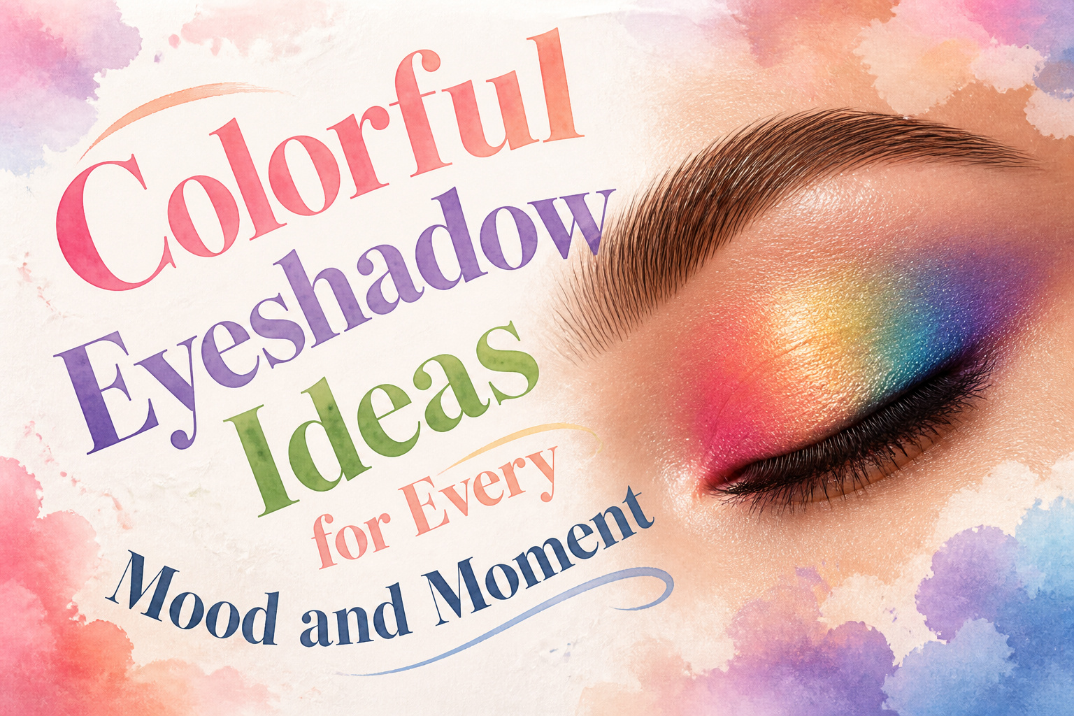
Colorful eyeshadow in 2026 runs from a ninety-second pink cloud wash to a half-hour rainbow stripe job, and the deciding factor is not skill but patience with edges.
The difference between editorial and costume is almost always whether you grounded the color with a thin brown liner at the lash line or let it float.
Even a fuchsia halo, which reads theatrical by default, survives daylight if you press the center pigment flat rather than sweeping it.
1. Bold Green Lids
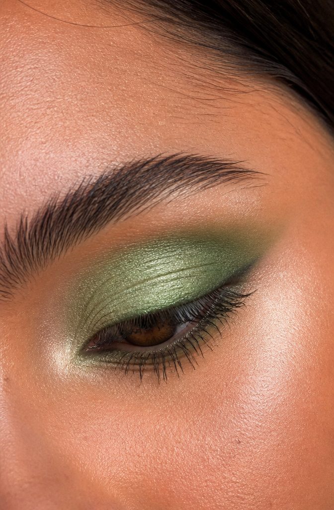
Green eyeshadow used to read costume party to me until I saw it done with restraint.
The Urban Decay Wild Greens Palette changed the math: Prickly, that mint green, across the lid with Stash, the deeper earthy green, worked into the crease.
The move that saves it from looking like stage makeup is the dab-and-blend technique. Pat color on with a flat brush first, then switch to a clean fluffy one and soften every edge before you think you’re done.
What makes this genuinely wearable is what you pair it with. Gold on the inner corner pulls the green toward warm and lived-in.
A brown liner along the lash line keeps it grounded for daylight. I’ve watched this combination survive a full day at the office without getting a single double take for the wrong reasons.

❤. This UCANBE forest green eye palette is mixture of 15 stunning green hue shades that velvety & go on smoothly texture with matte satin finishes to create next level looks to unleash your artistry. Each blendable, buildable and long-lasting, created to suit every skin tone and eye color.

👾💜 INTENSE COLOR PAYOFF - Chrome green eyeshadows are formulated to deliver rich, opaque color in just one swipe. From bright neon yellow to forest green, emerald dark green shades, usually for a bold, saturated hue green eyes makeup.

16 Highly Pigmented Shades: The eyeshadow palettes are available in peach, blue and green shades, with a rich gradient of shades. Whether you want an understated, natural everyday eye look or a bold, edgy smoky eye look, it's easy to achieve.
2. Vivid Yellow
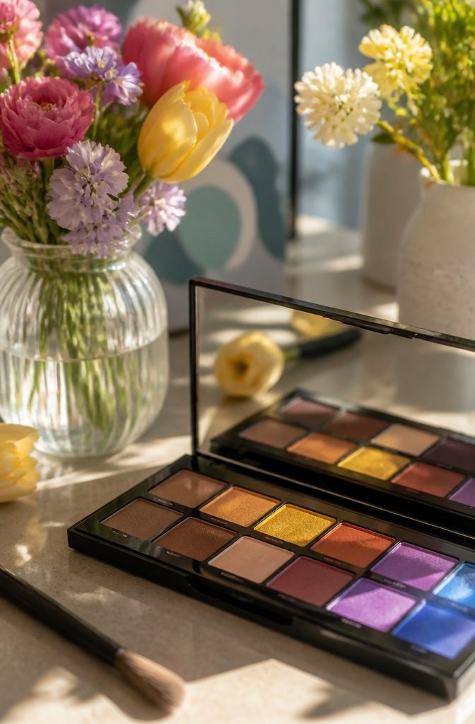
Yellow eyeshadow is the first shade people reach for when they want color that reads cheerful instead of costume, but the undertone makes or breaks it.
A clear lemon reads fresh and awake on most skin tones, while anything drifting toward mustard or olive can pull sallow fast.
The Make Up For Ever 12 Flash Color Case anchors the look if you want real saturation rather than a wash of shimmer, and in my experience the yellow pans press opaque enough to cover a dark lid without primer drama.
Application matters more than you’d think.
Patting the color on with a finger deposits about twice the pigment you’d get sweeping with a brush, something I noticed after wasting half a pot trying to build it with a fluffy shadow brush first.
The warmth of your fingertip melts the formula into the skin too, which keeps the finish from floating on top.
For placement, keeping yellow strictly to the center of the lid and blending it into a neutral brown at the crease stops the whole thing from looking like an allergy attack.
Save the inner-corner pop for a lighter gold if you want lift without the full solar effect.

【Yellow Gemstone Shadow Palette】The Yellow Gemstone Palette by Docolor is versatile and wearable in equal measure. Delivering infinite possibilities, this unexpected palette encourages you to experiment, empower and express yourself however you please, Let your eyes have a Yellow gem-like luster
![MARBLERS Fluorescent Pigment [Neon Yellow] 0.11oz (3g) | Matte Pigment | Non-Toxic | Vegan | Cruelty-Free | Nail Polish, Nail Art, Soap, Craft | Festival, Rave & Party Makeup](https://m.media-amazon.com/images/I/31gmBvU-csL._SL500_.jpg)
Super Vivid Neon Pigment Powder: Let your face and body vividly shine with our glamorous neon powder without any worries. Unlike other harmful chemical-based colorant, our neon powder is cosmetic grade safe to be used in skin products, but not directly on lip or eyes. For lips and eyes, please check our [Lip-Safe] Series.

Handmade Eyeshadow: The yellow matte eyeshadow is handmade one by one, high pigmented and natural bright, Each pod contains 1.8 grams of loose mineral eyeshadow powder, enough for multi-looks with each color
3. Rainbow Zebra Stripes
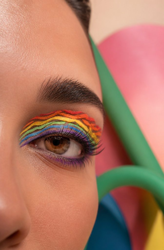
Graphic liner done in rainbow parallel lines, what some call rainbow zebra stripes, lands somewhere between abstract art and optical illusion.
Multiple vivid shades run in tight, even strips across the lid, and the spacing between them matters as much as the colors you choose.
Too narrow, and they blur together into mud; too wide, and the graphic effect flattens into blocks.
Precision is what separates this from looking like a carnival mistake. The NYX Professional Makeup Epic Wear Liner Sticks deliver the clean edges this style demands, with shades that layer without dragging through the line below.
I reach for them when I want pigment that stays put through humidity and long evenings, no primer tricks needed.
Budget roughly 20–30 minutes if you have a steady hand and a small flat brush for cleanup.
The skill level sits at intermediate. One wobble in a stripe throws off the whole rhythm, so working from the outer corner inward helps anchor the spacing before you commit to the full lid.

❤【8 PCS Eyeshadow Stick Set】8 classic colors,including Desert,Pink,Light Purple,Sky Blue,Dazzling Blue,Greenish Cyan,Mocha Beige and Beige Gold can be used to create...
4. Pink Clouds
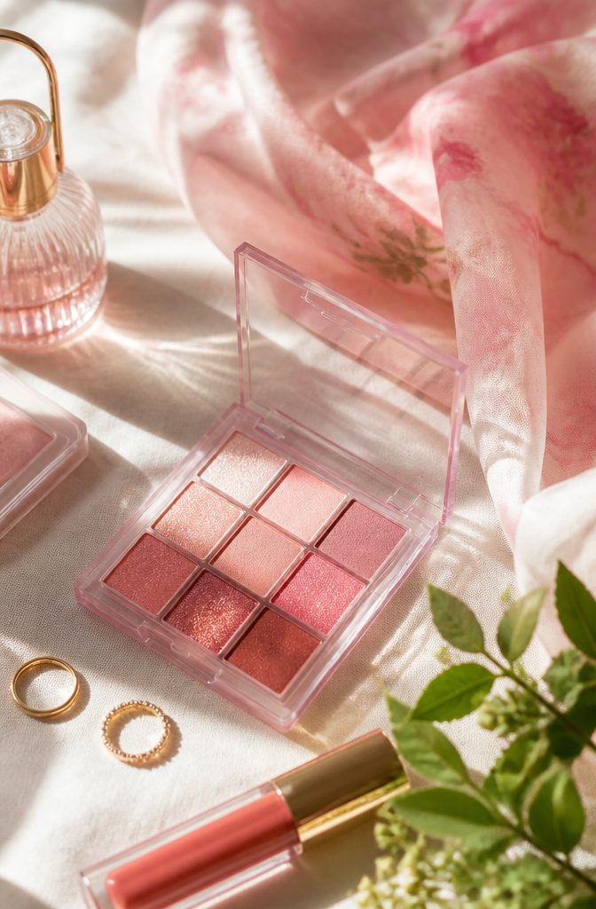
The soft pink wash that sits high enough to catch the brow bone is the move for spring mornings when you want color without commitment.
L’Oréal Paris Brilliant Eyes Shimmer Liquid Eye Shadow in a pink shade, Radiant Ruby being the closest match, blends out with a finger into something almost cloud-like.
The finish stays sheer rather than opaque, which keeps it from reading as costume even under office light. Spring runways have been pushing this placement higher, letting the shimmer catch when you raise your eyebrows or laugh.
The liquid formula sets fast enough that you won’t find it pooled in creases by lunch, though working one eye at a time is the safer play.

Bold Romance in a Palette - Deep rosewood and vivid fuchsia create a high-drama, high-impact duo perfect for date nights, parties, or anytime you want eyes that seduce....
5. Sunset Eye Makeup
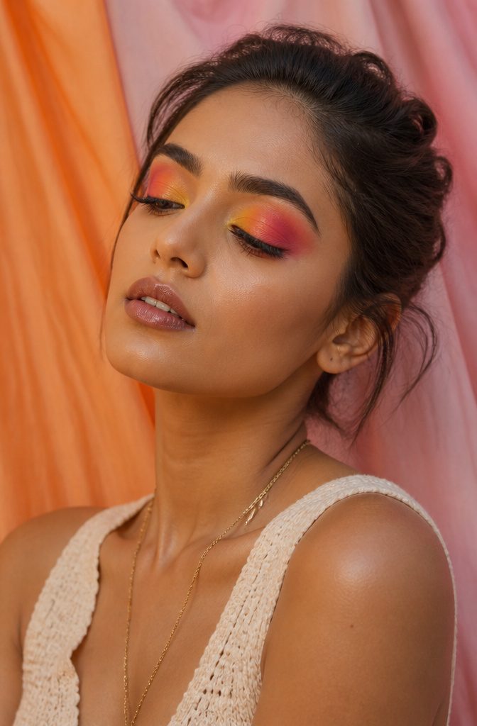
Yellow at the inner corner, melting through orange and coral to a pink-purple outer edge: that is the gradient that reads as sunset on the lid.
The logic is warm-to-cool, light-to-deep, mirroring how the sky actually behaves as the sun drops.
Start the yellow sheer and build opacity only where you want the eye to catch, because full saturation across the whole lid can read costume instead of atmospheric.
This combination does heavy lifting from late August through October. The yellow keeps enough summer brightness to feel current; the coral and purple bring in the deeper register that works once temperatures drop.
It is one of the few colorful looks that does not demand a tan or a beach backdrop to make sense.
Taking makeup inspiration from the setting sun is a no-brainer; made up of hues of red, coral, purple, and gold, this warm, colorful makeup look will let you rock vivid hues while being totally wearable for day and night.
What that wearability means in practice: you can keep the shimmer restrained to the center lid, matte in the crease, and skip glitter entirely. The color does the work; the finish should stay flat enough for daylight.
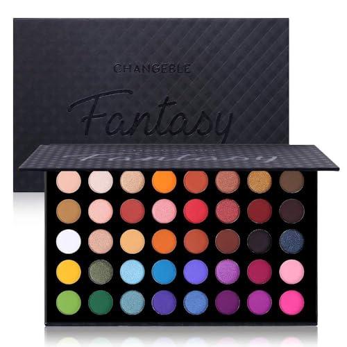
A magically iridescent eyeshadow palette contains professional cool and warm-toned pigments and shades. With different textures: soft smooth mattes, shimmery pressed pearl and dazzling metallic glitters. This richly toned palette features versatile shades that can be blended and layered to create endless amounts of looks.

✦ 54 Gorgeous Bright color create the most fascinating looks.✦ 27 vibrant matte + 21 creamy shimmer + 6 bling glitter make your pop eyes, cut-crease, smokey eyes.

UCANBE 40 Color Eyeshadow Palette have all the colors you like. Featuring 18 matte and 22 shimmer shades to create unique and beautiful eye makeup looks from natural looking makeup to smokey eyes looks in one swipe.
6. Colorful Winged Eyeshadow
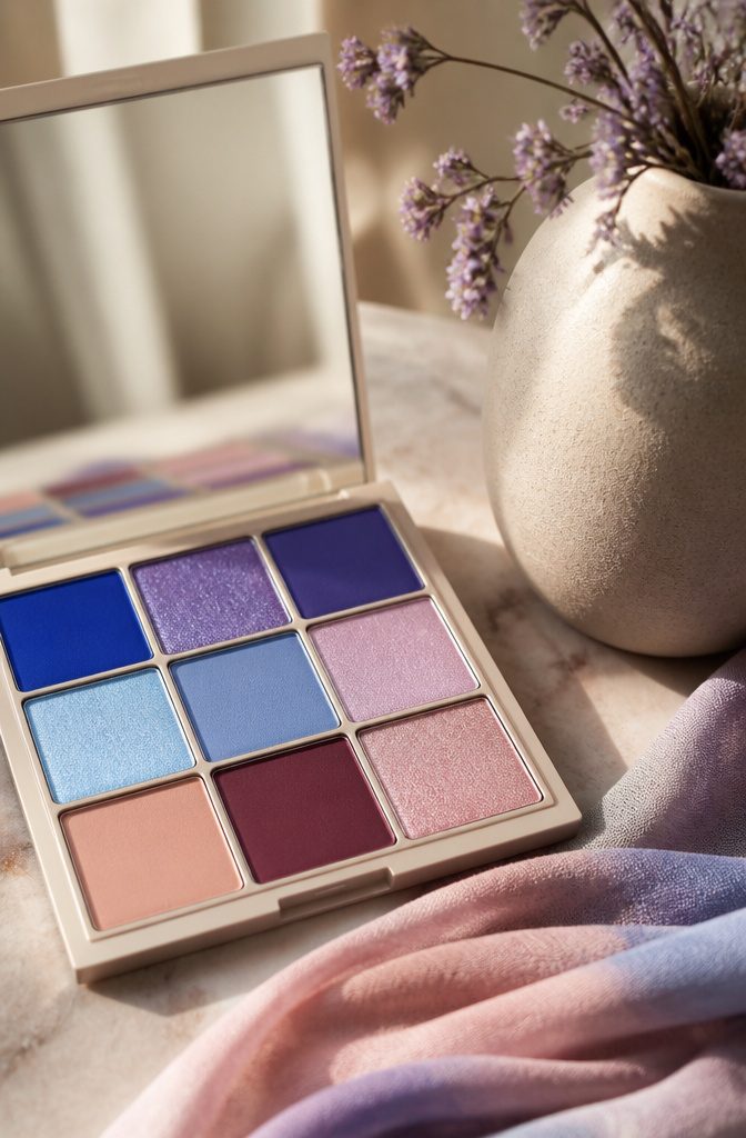
A winged shadow pulls color past the outer corner in a flicked shape, but the edge stays soft and diffused instead of the crisp ink line a standard cat-eye liner demands.
The sources treat this as the gentler sibling to graphic liner, and that softness is exactly what makes it workable for anyone whose hand shakes at the thought of drawing a perfect flick.
Brushes earn their keep here. A small paddle brush laid flat against the skin deposits the outer point, then turned on its side to sweep the color inward so the density fades toward the inner eye.
A finger will blur the edges where the wing meets the lid, but the initial placement wants something narrower than a fingertip or the shape spreads past where you meant it to go.
L’Oréal Paris pitches their Brilliant Eyes Shimmer Liquid formula as a swipe-and-blend option, and the same liquid shadow texture that responds to a fingertip for a soft lid wash still needs a brush when you are drawing an edge that has to land in one spot.
This is the difference worth remembering: cat-eye liner is a line that ends, winged shadow is a color field that stretches.
You are building the silhouette with pigment load, not with a stroke. That means the saturation at the outer point does the visual work, and the weight of shadow there matters more than the sharpness of the contour.

Twilight Dusk palette - features 18 shades, including 10 smooth, highly pigmented mattes in vibrant purples and ochres,along with soft sandy nudes. It has 7 pressed shimmers in plum, bronze and rose for easy layering and 1 bold gold metallic glitter.

☘️HIGH PIGMENTATION: The duochrome green eyeshadow multichrome palette with intense color payoff. Different tones and texture complement each other, like metallic, matte, shimmer, duochrome glitter ect. Multi-chrome holographic green eye shadow suit different skin colors. One Swipe coverage, allowing you to effortlessly create bold wicked and edgy looks.

☘️Ultra-Pigmented Eyeshadow: Our high quality black green naked eyeshadow palette has intense color payoff, velvety and silky feeling, easy to apply and blend. You'll get intense, flared, visual effects. Perfect for green/hazel eyes. The delicate 3D snake pattern makes this eyeshadow palette even more charming and suitable mother's day gifts for mom!
7. Pastel Eyeshadow
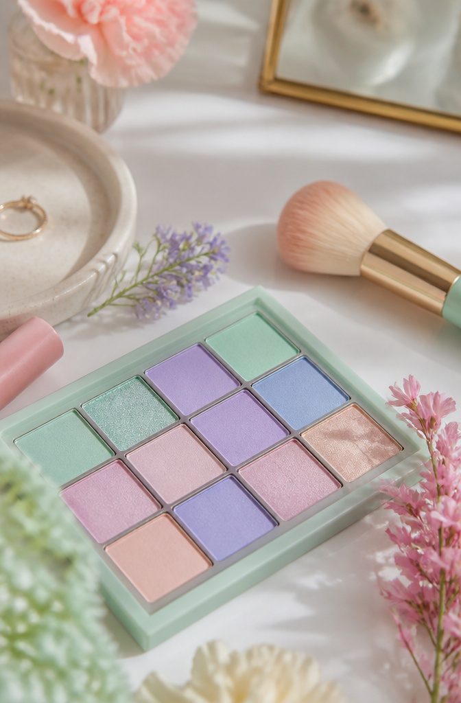
Pastels hit different in spring, but the color payoff is where they fight back.
Lighter shades fade into skin faster than you expect, so the work is in building the opacity. Huda Beauty Matte Minted Liquid Shadow handles this better than most cream formulas because it layers without cracking.
One swipe reads sheer and slightly chalky, which is exactly the problem, but a second or third pass sets into something that actually shows up in daylight.
The matte finish helps here: shimmer catches light and forgives patchiness, but a flat pastel demands even coverage or it looks like residue, not intention.
Build in thin coats and let each one set before the next. The goal is stacking translucency until it reads as color, not packing it wet like a bold pigment would allow.
If the lid still reads uneven after three layers, a matching nude pencil underneath gives the shadow something to grip without shifting the tone.

🌟🌟 METALLIC GLITTER FINISH: Stunning gold yellow metallic eyeshadow with diamond-like sparkle and intense color payoff for a bold, glamorous look

【INTENSE BOLD ORANGE EYESHADOW】 Inspired by sunset, 9 delectable shades such as Pumpkin to give your cheeks that extra touch of sweetness! Each palette includes 9 SUPER rich, smooth, blendable colors in a range of matte, shimmer, sparkling metallic glitter finishes with a soft-to-the-touch texture that smoothly glides on your lids and stays put.

💛Light Yellow Resin Pigment Paste: If you want an opaque color effect for your resin, this epoxy color pigment is your best choice. Premium epoxy dye has excellent coverage to help your project create a bright opaque, smooth finish and no mess. Each white epoxy pigment is 3.5oz/100g and can be used in a large capacity for a variety of DIY resin crafts projects.
8. Watercolor Eye Makeup
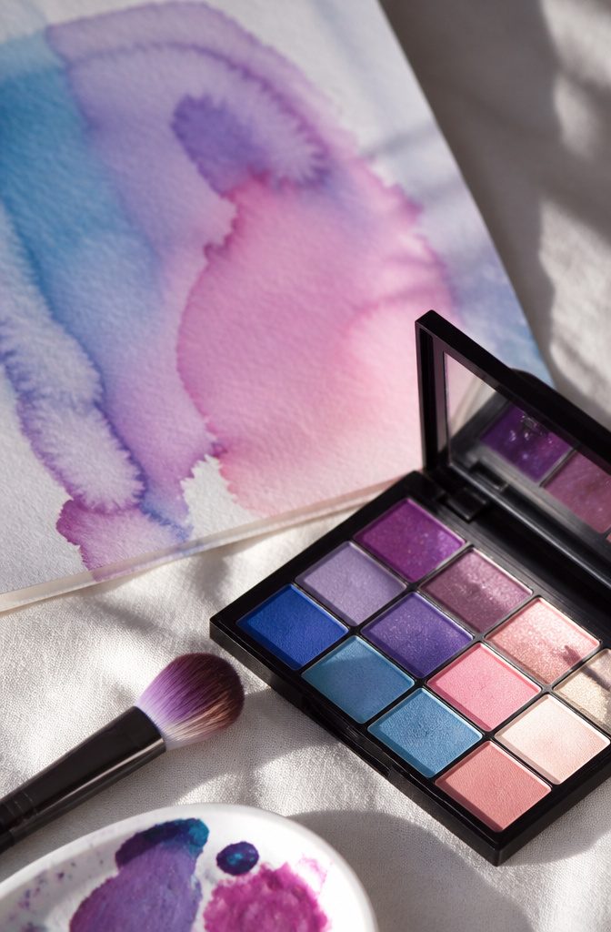
The watercolor eye makeup technique lives up to its name: sheer washes of color that melt into one another with soft, undefined edges, the way pigment bleeds on wet paper. Cream and liquid formulas are the only real choice here.
Powder sits on top of the skin and holds its shape, which defeats the whole point. Creams, especially those that melt into the skin almost like cream concealers, let you blend the edges until they disappear.
The Make Up For Ever 12 Flash Color Case in Artistic works particularly well for this because the colors are forgiving rather than pure pigment, so the result stays dreamy instead of turning into a hard block of color.
The finished look should feel low-contrast and romantic, with no liner to anchor it.
A heavy dose of mascara is what keeps it from looking unfinished. Creasing is part of the deal with creams, and honestly it reads as lived-in rather than messy.
If it bothers you, tap a finger over the crease to re-deposit color. Fingers work better than brushes for the initial application anyway; the warmth and slight imperfection make the wash look organic, not painted on.
9. Halo Accents
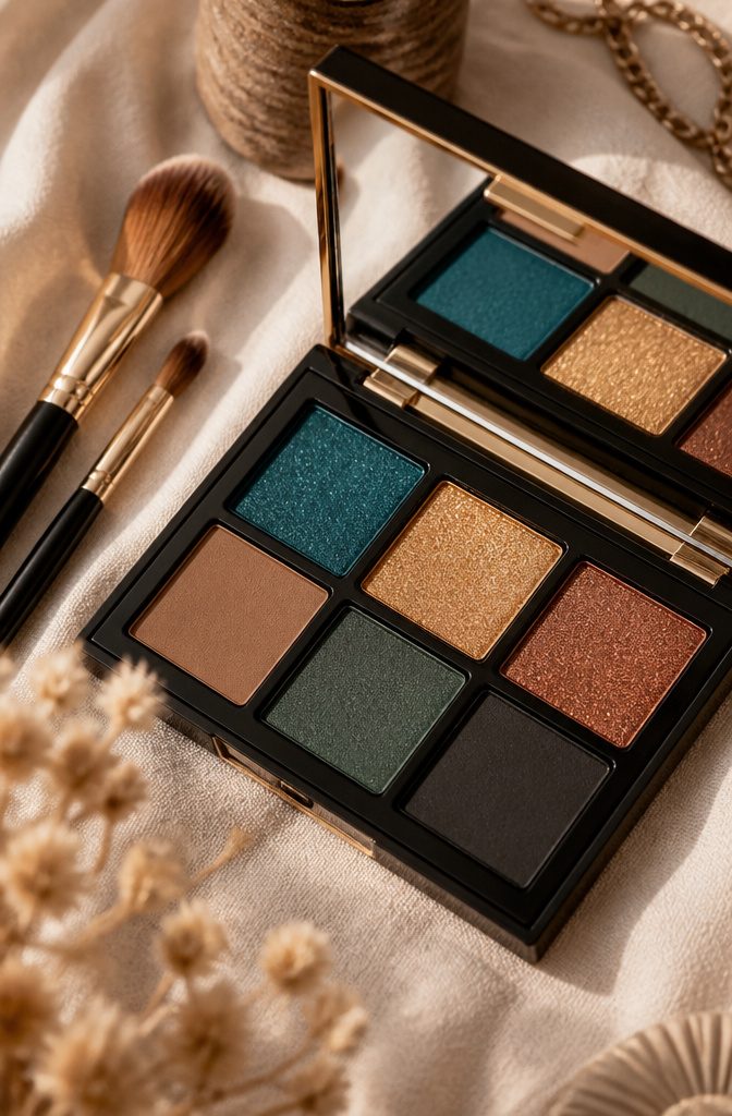
Color concentrated on the inner and outer lid, with the center left bright, opens the eye in a way that all-over shadow never quite manages.
The first time I tried this, I laid the darker tones too close together and ended up with muddy thirds instead of a true halo; the gap in the center needs real estate, at least a third of the lid, or the light shade has nowhere to land.
Blend the edges softly where the colors meet, or keep them sharp for a colorblocked effect, either path works.
What convinced me, reading through tutorials and failing a few myself, is that this structure flatters with any family: hot pink and orange, berry and fuchsia, cobalt with violet, even sea foam with silver.
The limitation is not the color but the placement.
A clean shadow brush and a fingertip for sheering out the center are the only tools that matter; skip the fifteen-step eye-makeup kits. Mascara finishes it, top and bottom if you want the drama.
10. Rainbow Waves
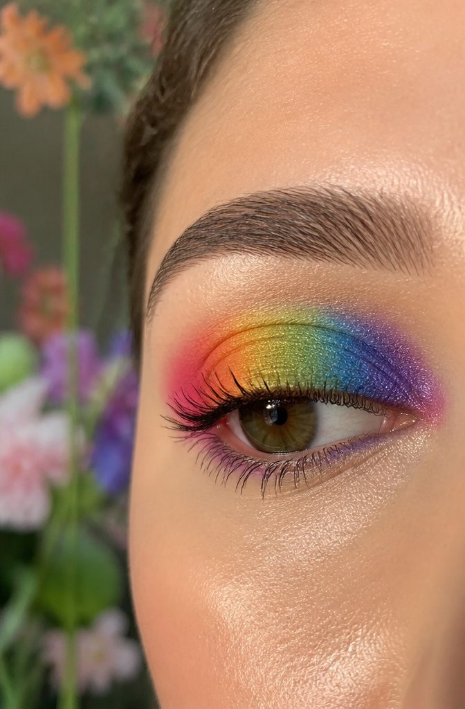
Curved bands of color across the lid read softer than the zebra stripe trend because each arc gets diffused at the edge into the next.
The transition matters most: a clean border between ROYGBIV bands turns the look costumey, but letting the orange soften into yellow before the yellow meets green keeps it wearable for daytime.
A sharp white cut crease underneath gives the whole shape structure without fighting the softness above it.
Blending outward rather than packing pigment straight across the lid is what lets the eye read the arc as a wave instead of stacked bars.
I start with the lightest color highest and work darker toward the lash line so gravity doesn’t pull the drama downward by noon.
Cream formulas melt into each other more forgivingly than pure pigment here, though you’ll trade some of that vinyl brightness for the blend.
For someone who wants the rainbow without the circus, this is the version that survives a coffee run and an office meeting.
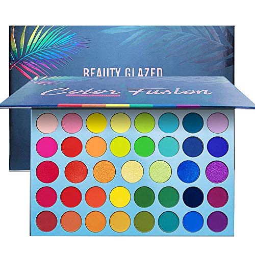
✦39 SHADES WITH RAINBOW COLORS: Create endless looks with 32 Rainbow +7 metallic, cool and stunning pigmented vibrant colors. Perfect for day and night,festivals,party,club,appointment,wedding,Christmas,Halloween makeups.

Eyeshadow Palette: This professional level makeup palette features 16 vegan, pigmented shadows that glide onto lids and make eyes pop with color; Use with NYX Professional Makeup eyeshadow primer for bolder, longer lasting color
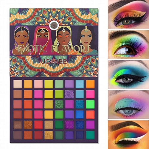
EXOTIC FLAVORS Eye Shadow Plattet:The base color of the packing is matte pale rose gold, embossed with feathers of peacocks,with 4 stylish Indian lady are beautiful combination of exoticism.There’s 48 colors in this makeup kit, It contains 28 matte shades which the most eye-catching is neon color, 11 shimmer shades, 4 satin shades and 5 glitter shades. A lot of different variants in this palette so you can get everything you need.
11. Fuchsia Halo
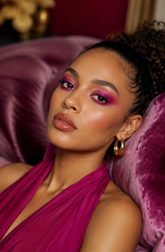
A halo eye done in fuchsia lands differently than the usual taupe-and-champagne version.
The shape stays the same: deeper color at the inner and outer corners, brightest point at the center of the lid, blended so the light seems to hit from inside.
Swap the neutrals for berry red in the crease and a true fuchsia on the lid’s center, and the whole effect reads as intentional, even theatrical.
Berry red builds the depth. It sits in the fold and diffuses upward toward the brow bone, but pulled back from the actual brow so it does not look bruised.
Fuchsia, the opaque kind, goes on the center with a flat brush and gets pressed rather than swept in, which keeps the pigment dense instead of muddy.
The step that makes it wearable: a thin anchor of brown or black liner tight to the lash line.
Without that grounding edge, the pink can float. I have seen this read as costume on some and as editorial on others; the difference is almost always whether the skin tone between color and lash gets acknowledged or ignored.
Line the waterline in a matching berry pencil, not black, and the sphere effect holds together.
For anyone who has done a neutral halo and found it pretty but forgettable, this is the same geometry with the volume turned up.
12. Abstract Expression
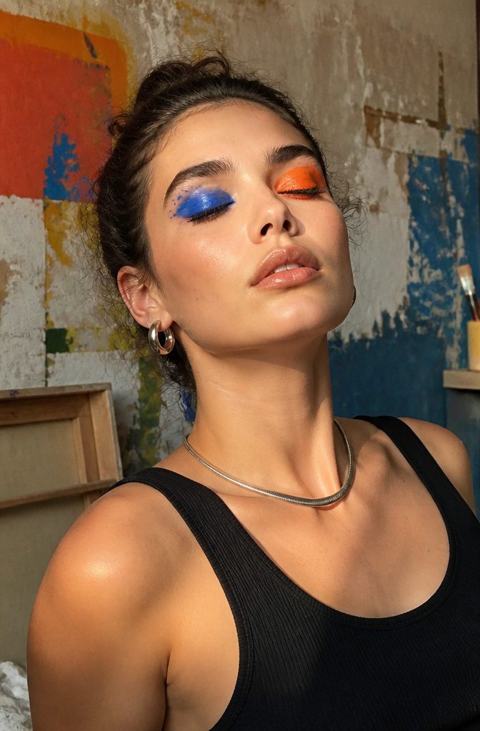
Abstract shapes on the eyes ask more of you than a neat wing or a soft blend.
You are drawing something that is not supposed to match from left to right, which means every stroke has to look deliberate or it reads as a mistake.
A visible gap between color fields keeps the shape from collapsing into muddy chaos, so I build in negative space on purpose rather than letting it happen by accident.
The freedom is real.
One eye can carry a cobalt block that stops nowhere near the crease while the other gets a slash of tangerine dragged toward the temple. No mirror image, no balance, no rules about where color belongs.
But that same freedom means there is no template to hide behind. A smudge looks like a smudge, not like soft blending.
What convinced me, studying how artists actually wear this, is that skin prep matters more than pigment quality.
The edges sit on a dry, even base or they feather and prove you did not mean it. Set your primer with powder before any color touches the lid, and the shape holds its authority all day.
13. Teal Appeal
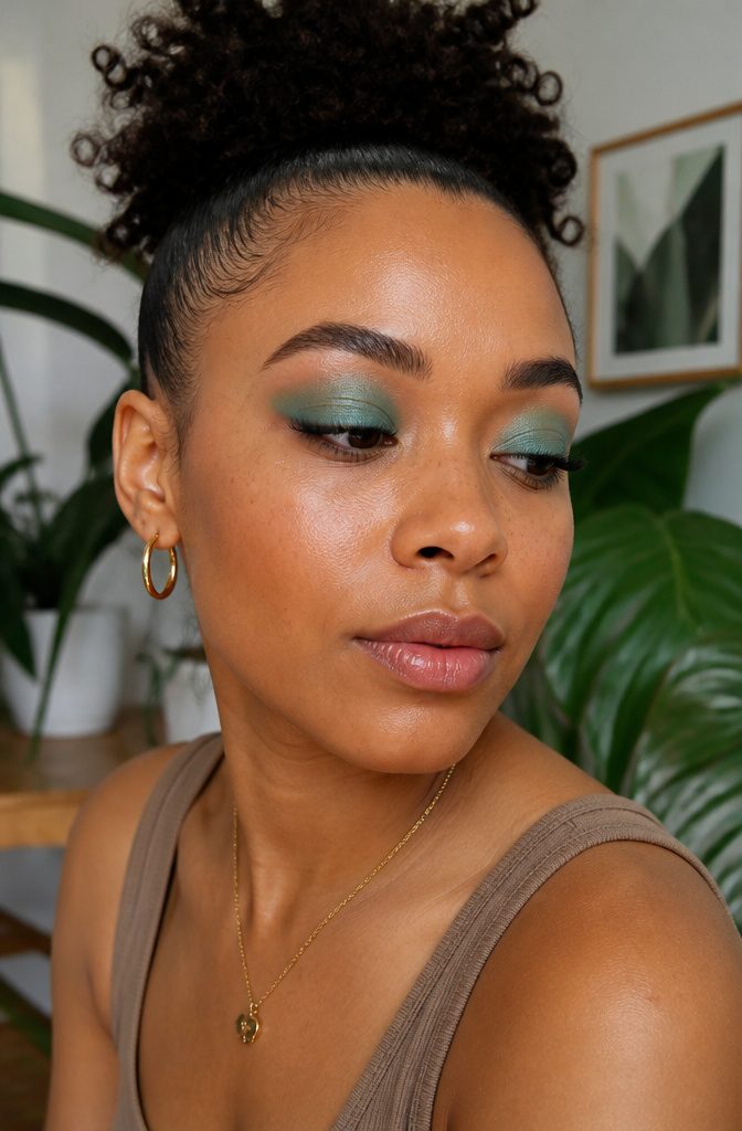
Teal sits exactly where blue and green meet, and that liminal quality is what makes it so forgiving on brown eyes.
The warm base in most brown irises pulls the green forward from a teal pigment, while the blue keeps the color from reading muddy or flat against the skin.
I have watched this play out on friends with medium and deep brown eyes alike: a wash of teal across the lid, blended softly into the crease, registers as deliberate rather than costume.
The Make Up For Ever 12 Flash Color Case carries a true teal in its palette, the kind that reads balanced under store lights and stays balanced once you step outside.
What convinced me, reading through a dozen product breakdowns, is that this formula was built for stage and screen, which means pigmentation takes priority over shimmer filler.
A cream or hybrid texture at this intensity also lets you sheer it down with a translucent powder if the full punch feels too much for a Tuesday.
Placement matters more than pigment load here. Teal across the whole lid can flatten the eye shape; keeping it to the outer third and smoking it inward with a clean brush preserves dimension.
Brown eyes already hold their own depth. Teal’s job is to echo it, not compete.
14. Purple Reign
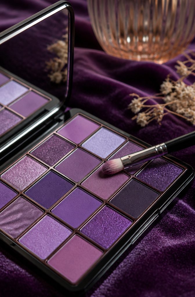
Purple adapts to almost any light.
A wash of lavender across the lid reads fresh and awake for morning meetings; the same tone shifts to evening when you press a deeper violet into the outer corner and sweep a thin shimmer line just above the lash.
The trick is stopping the dark shade at the crease fold so the shape stays clean, not bruised.
I find purple forgiving because it plays warm or cool depending on what sits next to it. Pair lavender with a soft bronze cheek and it leans sunlit; add a gray contour and it goes moody and midnight.
The deeper eggplant shades reward a flat brush packed on rather than blended out, especially if you want intensity that still photographs as color instead of shadow.
For daytime sheen, a fingertip tap of pale lilac glitter on the center of the lid catches window light without reading costume.
One misstep: applying shimmer to the entire lid when the base shade is already dark. The texture competes, and by noon both have migrated to the crease.
Matte purple defines; shimmer reopens the eye. Use one or the other to carry the weight.
15. Neon Brows
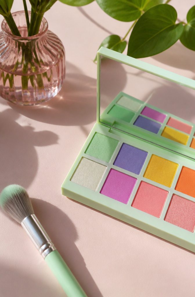
Color on the lid is only half the story. The brow bone and the brow hairs themselves are the frame, and leaving them neutral while the lid goes neon reads as unfinished rather than bold.
What shifted for me was watching a makeup artist layer that same mint green from a Princess Jasmine look up through the brow bone, then drag a whisper of it through the tail of the brow with Anastasia Beverly Hills Brow Wiz so the color had somewhere to land.
The Brow Wiz pencil is thin enough to draw individual hair strokes without waxy buildup, which matters when you’re working with pigment that isn’t your natural ash or taupe.
The routine takes an extra ninety seconds, but the commitment is in the maintenance: colored brow hairs fade faster than lid shadow from oil and face wash, and the brow bone shade needs blending refresh every few days if you’re not redoing full eye makeup daily.
Most people who try neon brows quit not because the look fails but because they expected it to stay put like a tattoo rather than behave like hair dye.
16. Glitter Glam
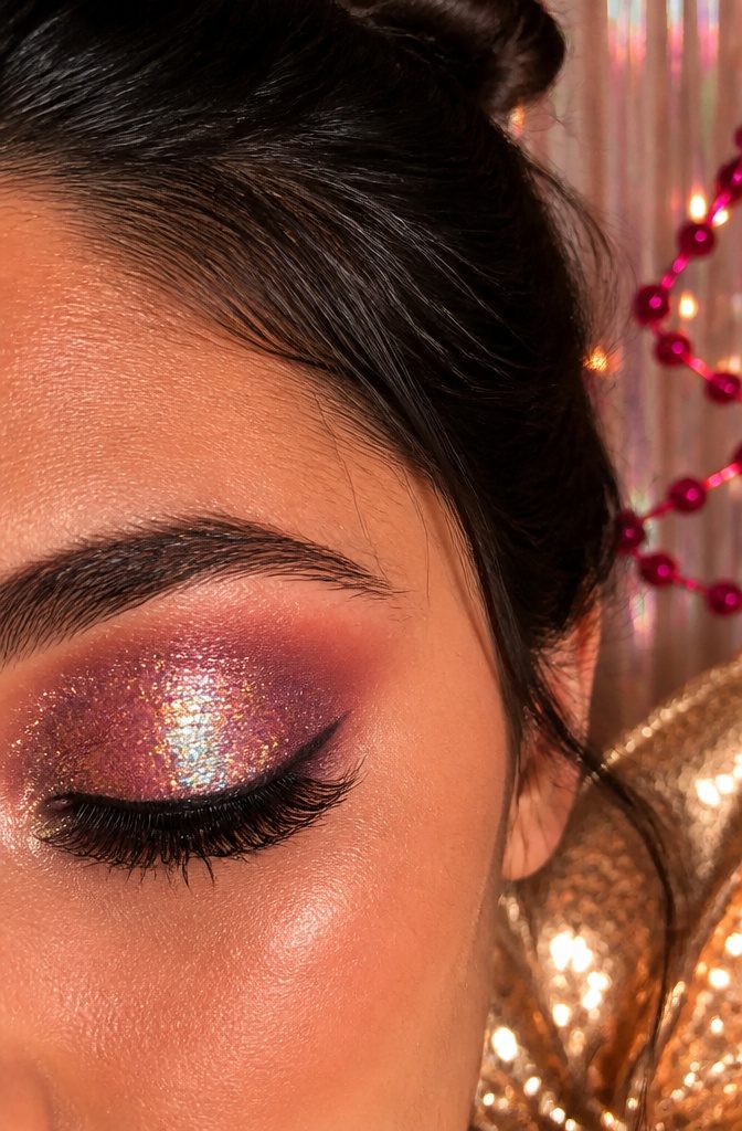
Pressed glitter catches light in a way matte pigment never will, turning a simple wash of color into something that actually moves when you blink.
The tradeoff is maintenance. Glitter without a proper adhesive deposits more on your cheekbones than your lids within an hour, so a dedicated glitter glue or a tacky concealer base is non-negotiable here, not optional.
Fallout prevention starts before you open the pot. Do your eyes first, then foundation, so any stray particles get wiped away during cleanup rather than ground into already-finished skin.
Tap the brush before you lift it to your face, and consider using a silicone applicator instead; fingers transfer oils that break down the binding agent faster.
This is not a desk look. Between the catching light and the occasional rogue sparkle on a collarbone, pressed glitter reads celebration: birthdays, New Year’s, weddings, the nights when being a little extra is the whole point.
Save it for those, and it stays special rather than becoming Tuesday’s tired routine.
17. Inner Corner Wings
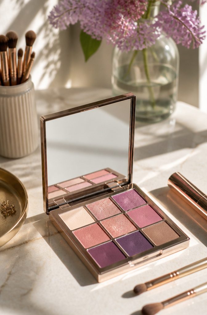
Most winged liner pulls the eye back toward the temple, but drawing color upward from the inner corner does the opposite.
It widens the eye by drawing attention toward the bridge of the nose, which sounds wrong until you see it.
I kept seeing this in editorial work and assumed it would read as costume; on a regular Tuesday with a mauve pencil and a small brush, it just looked awake.
The trick is keeping the mark short and soft. A hard line that climbs more than a quarter inch past the inner corner looks like a troubleshooting diagram, not makeup.
Powder shadow with a damp angle brush gives more control than liquid liner here, and the color can fade into nothing as it travels upward rather than ending in a sharp point.
Wearers with close-set eyes get the most from this. Standard outer wings narrow the face further inward; this redirects balance without the geometry of a full cut crease.
I eventually defaulted to a pale gold or shell-pink that catches light, since the inner corner is where the eye naturally pools shadow anyway.
Something about framing that existing brightness makes the whole face look less effortful, which is the rare colorful move that actually simplifies a morning.
18. Layered Lipstick
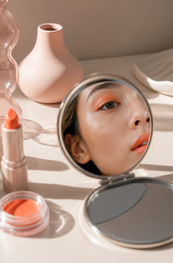
Lipstick as cream shadow is the kind of trick that starts either in a hotel bathroom with a forgotten eye palette or in front of a vanity with a lip color too perfect to limit to the mouth.
The texture is the first thing that announces itself: lipstick is denser and more emollient than shadow formulated for lids, which means the color sits up on the skin rather than sinking into it.
That difference reads as richness for the first hour and as a crease waiting to happen after that.
The fix is setting, and setting aggressively. A translucent powder pressed over the top with a fingertip flat, not a brush that might redistribute the pigment, locks the cream in place.
Some formulas cooperate better than others; a thin, satin lipstick blends and stays far more willingly than a thick matte bullet.
The match between lip and lid can look intentional in a way separate products rarely do, a single note carried across the face, but the experiment needs checking in a mirror after two hours.
Creasing around the fold of the lid is the tell, and when it shows, the whole effect slides from artful to slept-in faster than most corrections allow.
19. Color-Blocked Eyeliner
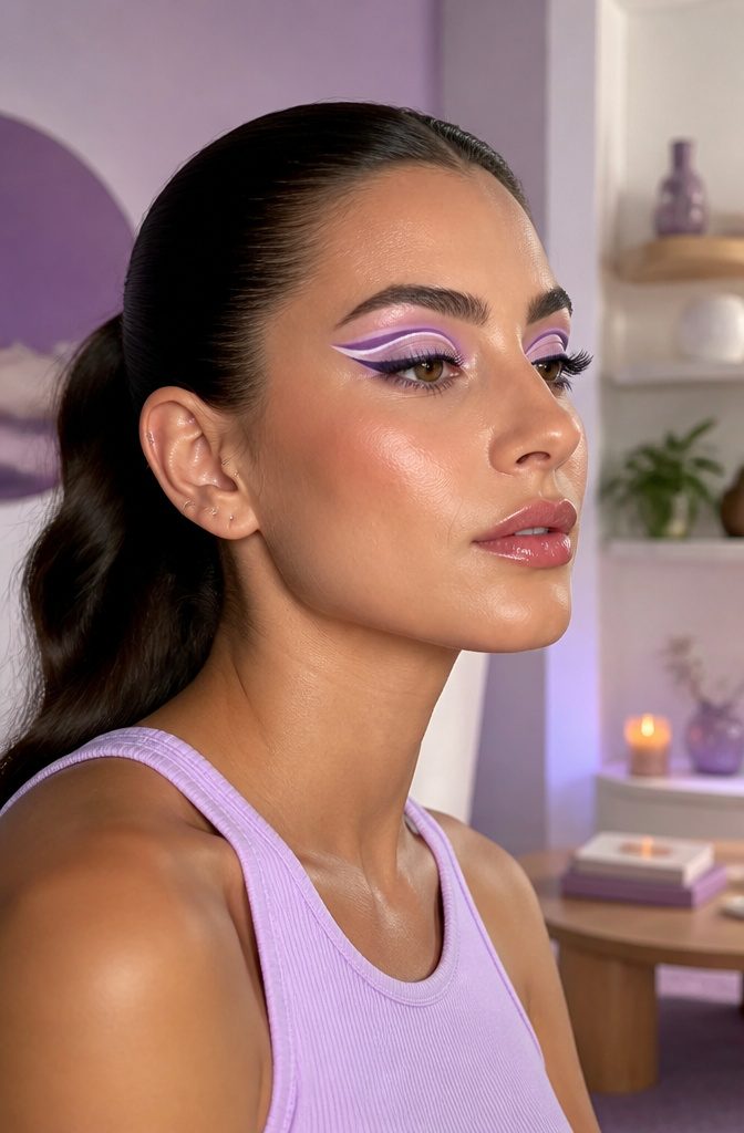
Color-blocked liner gives the graphic punch of colorful shadow without diffusing anything across the lid.
Two solid bands, clean edges, no blending required. The NYX Professional Makeup Epic Wear Liner Sticks land in shades like Graphic Purple and Pure White, which is exactly the pairing you’d want for this.
One color anchors the outer flick, the second runs parallel along the inner lid or lower lash line, and the gap between them stays bare skin or a whisper of skin-tone shadow.
The trick is letting each segment dry fully before setting down the next; these pencils set fast but smear if you rush the overlap.
Precision matters more than with a single-color wing because the eye reads the contrast line as the shape. A shaky edge in purple against crisp white reads as a mistake, not an artistic choice.
Standard black liner underneath, pulled thin and tight to the lashes, acts as the grounding rail that lets the brighter colors behave like accessories rather than costume.
20. Smoky Pastels
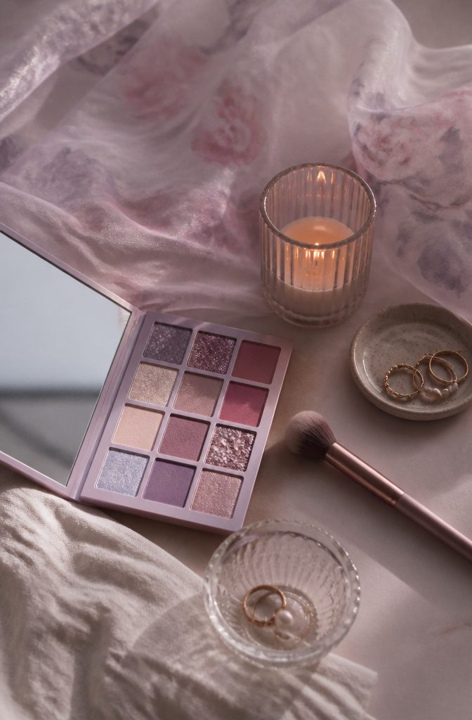
Lilac and rose-mauve pastels melt into something entirely different once you smoke the edges out instead of keeping them crisp.
Sharp pastel lines can read costume-ish, but the diffused version sits on the eye like watercolor on wet paper, still colorful but softened at every border.
The trick is letting the darker tone sit low, not drawn with precision, just buffed into the outer third and dragged lightly under the lower lash line so the color pools rather than stripes.
The result reads romantic rather than editorial, closer to a cotton-candy haze than a graphic shape.
Pair it with a matching wash on the cheeks and a glossy lip in the same family so the softness carries through, or keep the face bare and let the eyes hold all the atmosphere.
Either way, the smoke has to stay imperfect to work, a little slept-in, a little blurred. Clean edges kill the mood entirely.
Frequently Asked Questions
What are some colorful eyeshadow looks?
Sunset eyes with yellow melting through orange and coral to pink-purple, rainbow zebra stripes with vivid parallel lines, and watercolor washes with soft undefined edges are all strong options.
The article also covers pink clouds blended high toward the brow bone, fuchsia halo eyes, and abstract expression shapes that do not match from left to right. Each style is ranked by skill level and wearability for different settings.
How do I apply colorful eyeshadow?
Pat color on with a flat brush first, then switch to a clean fluffy brush to soften every edge before you think you are done.
For yellow specifically, a fingertip deposits about twice the pigment of a brush and the warmth melts the formula into skin.
Cream and liquid formulas respond best to fingers; edges that need precision want a small paddle brush or damp angle brush instead.
What colors go well together for eyeshadow?
Pink and blue are a classic contrasting pair, with bright blue on the lid and popping pink in the crease. Green pairs with gold on the inner corner and brown liner to stay grounded.
Teal flatters brown eyes because the warm base pulls the green forward while the blue keeps it from reading muddy. Purple plays warm or cool depending on what sits next to it: soft bronze for sunlit, gray contour for moody.