
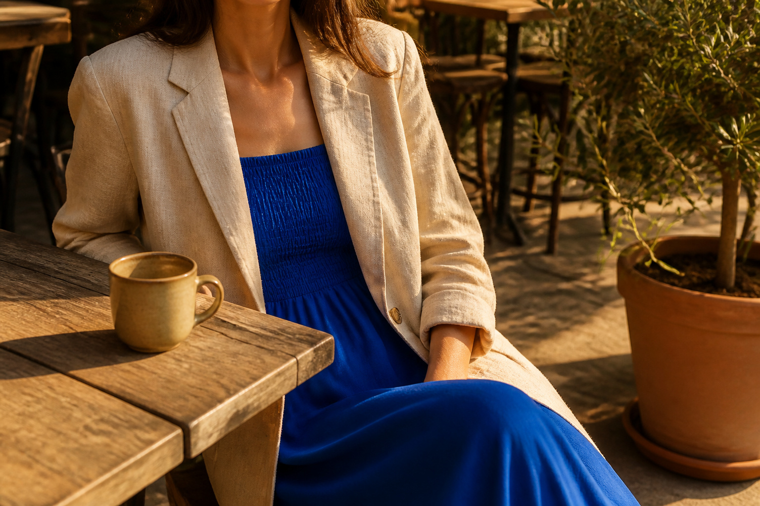
Wearing neutrals with bright colors only works when the neutral half has enough weight to hold its own. Most people treat beige or cream as a blank wall and wonder why the cobalt or coral looks dropped in randomly. The fix is texture: silk catching light beside wool’s matte surface, or denim’s casual nap against clean leather. One bright piece against a textured neutral base reads intentional; against a flat single finish, it reads like an afterthought.
1. Mix Different Textures
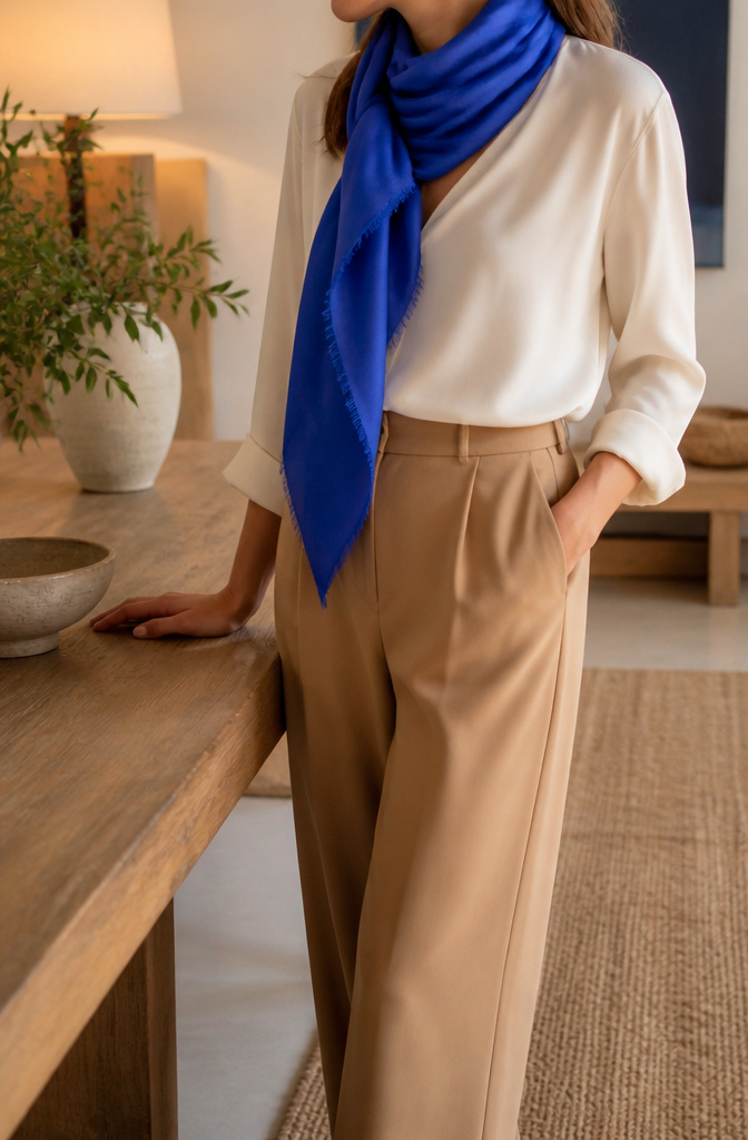
Same-finish neutrals read as one flat surface, and the minute you add a bright, it starts looking like an afterthought rather than a conversation. Texture is what gives the neutral half of the outfit enough weight to hold its own against a saturated color.
Silk beside wool is the combination I keep returning to. The liquid catch of silk light against wool’s matte surface creates two zones even in one tone, so a cobalt scarf reads as intentional against an ivory silk blouse and camel wool trouser rather than dropped in randomly. Denim against leather works the same way: the casual nap of indigo against a clean leather finish gives the eye something to travel across.
A head-to-toe cream outfit suffers from this most. A cream knit sweatsuit on its own looks like loungewear, but swap in a linen jacket and a suede bag and the same palette suddenly operates as styled. Leather with linen, cashmere with denim, suede against crisp cotton: each pairing builds dimension before color even enters.
When brights finally show up, that established texture variation gives them a scaffold. The bright sits against a neutral field that already has depth, not against a blank wall.
2. Use Statement Accessories

A cream top and trousers on their own reads as unfinished, like you left the house before the final decision. What fixes it is one piece that refuses to be background: a wide leather belt with an sculptural buckle, or a pair of shoes in soft pink suede that catch light differently than your basic nude pump.
The same single item can anchor a bright color choice instead of fighting it. A neon cross-body bag against all-beige reads intentional; the bag becomes the reason the outfit exists. An oversized airy scarf in turquoise does the same work for winter wool, the proportions doing the heavy lifting so the color does not shout.
Jewelry follows the same rule. One sculptural piece, a bracelet or earrings in a finish that does not match your metal exactly, keeps the eye moving. Lisa Kudrow and Isabella Rossellini have both worn this trick on the red carpet: the accessory is not an afterthought, it is the punctuation.
Where this goes wrong is quantity. Two bright pieces start competing; three and you have redecorated the room. The belt or the shoe or the bag, one of them carries the whole sentence.
3. Play with Patterns

A patterned piece that already carries both neutral and bright tones does half the styling work for you. Leopard and cheetah prints lean warm by nature, pairing black and brown neutrals with enough visual energy that the "bright" reads as attitude instead of color clash. Snakeskin, zebra, and giraffe prints do something similar, lifting beige or cream bases without demanding you add a competing bold shade.
The mistake I used to make was treating pattern as the outfit’s main event and then adding a bright bag or shoe on top. Two separate patterns in different scales—say, a chunky knit against a smaller plaid—already create that layered interest. When the pattern itself is the bridge between your neutral base and your bright accent, you need less of both to look intentional.
Scale is the control here. Pair a larger print with a smaller one so the eye rests somewhere. Two prints at equal weight fight each other; mixing scales lets a single patterned item carry multiple tones without chaos. Animal prints in the animal’s natural colors are the easiest entry point because the neutral palette is built in.
4. Mix Neutral Tones

Most confusion around neutrals comes from undertone rather than color itself. Two pieces can both read as beige until you hold them together and one pulls warm with yellow or orange influence while the other leans cool with blue or green. Matching undertones is what keeps a neutral mix from looking like you dressed in the dark.
Warm neutrals, cream, camel, mocha, sand, and taupe carry that yellow, orange, or pink base. Cool neutrals such as slate, dove gray, charcoal, and stone run toward blue, green, or violet. I used to layer camel over gray constantly and wondered why the combination felt off, the undertones were fighting while the saturation looked fine.
Pick one dominant neutral first, then echo its warmth or coolness with everything else you add. A camel coat with cream trousers and a sand knit reads intentional because the undertones share a language. Cool neutrals work the same way: slate trousers, dove gray layers, and clean white keep the palette crisp and controlled, especially in professional settings where you want polish without drama.
Lightness level matters too. Pairing a deep charcoal with a pale dove gray creates depth without breaking the undertone rule, but camel beside an equally light and cool stone will still clash. If your skin goes flat in warm neutrals, a cool-dominant build with texture and fit keeps the look from turning cold.
5. Use Denim as a Base
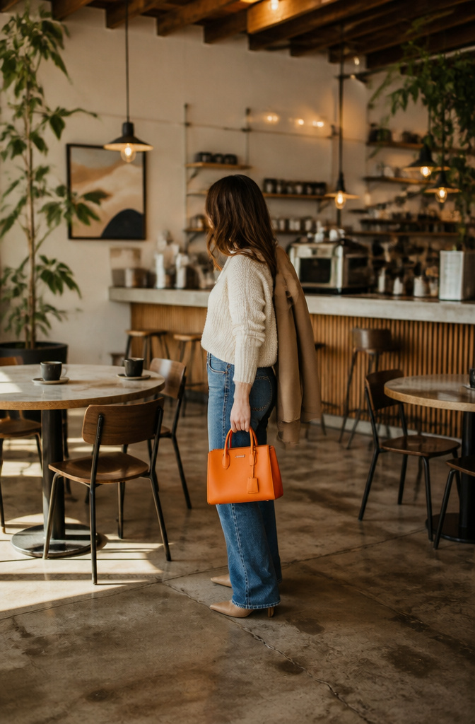
Denim works because it reads as its own neutral without flattening into beige anonymity. The indigo ground lets a hot pink sweater or a tangerine bag sit right next to it without the whole look shouting.
A medium-wash jean carries the weight here. In an outfit built on cream knits and cognac suede, the blue breaks up the monotone calories and gives the eye somewhere to rest. The same rule holds in reverse: dark denim with a white shirt and a gray wool blazer is the classic Casual Friday triangle, and swapping that blazer for brown suede shifts the mood west without changing the formula.
The jacket is the most useful bridge piece because it adds the neutral layer last, after the bright color is already in place. A Levi’s trucker over a Marine Layer stripe tee and olive linen pants ties two color stories together while the smooth cotton, rough linen, and stiffer denim build contrast by texture alone.
Light wash, dark wash, black denim, each reads slightly different against brights. Too light and the denim competes with the color for attention; too dark and the outfit turns heavy. Mid-range blues carry the widest range of brights without fight.
6. Incorporate Unexpected Details

An asymmetrical hem on a cream skirt kept my eye moving without fighting the cobalt blouse I wore to a friend’s gallery opening last spring. That single diagonal cut did more than any pattern could have, and it let the bright color stay the event.
Small prints work the same way. The passages point to leopard or cheetah spots as a neutral in disguise, almost a texture from across the room, though snakeskin or zebra stripes read livelier up close. A spotty top under a tomato-red blazer gives the jacket room to shout while the print whispers.
Lacy black pantyhose, airy oversized scarves, anything with a proportion that surprises the eye: these details hold a neutral-bright outfit together when the color alone might feel too blocky or deliberate. The detail should look like an afterthought the eye catches second, not a second focal point. That is the line between interesting and competing.
7. Style One Neutral as a Fashion Color

Olive is the neutral that taught me this trick. Last spring I tried a light blue leather trouser with an olive linen shirt and a beige trench, and the olive read as the intentional fashion color while the trousers looked like the accent. The outfit did not register as all-neutrals because one of them was doing the work a bright usually does.
Gray carries this weight too, especially a mid-to-dark tone with real body. The key is repeating your chosen neutral three times in the look, minimum. A gray blazer, gray suede belt, and gray bag will let a burgundy trouser or cobalt knit function as the supporting player rather than the star. The eye goes where you repeat.
Texture becomes your other color. A matte wool in that repeated neutral, a silk blouse in the single bright, and leather where the two meet gives the contrast that color would normally provide. Three finishes beats two colors most mornings.
8. Contrast with Bright Colors
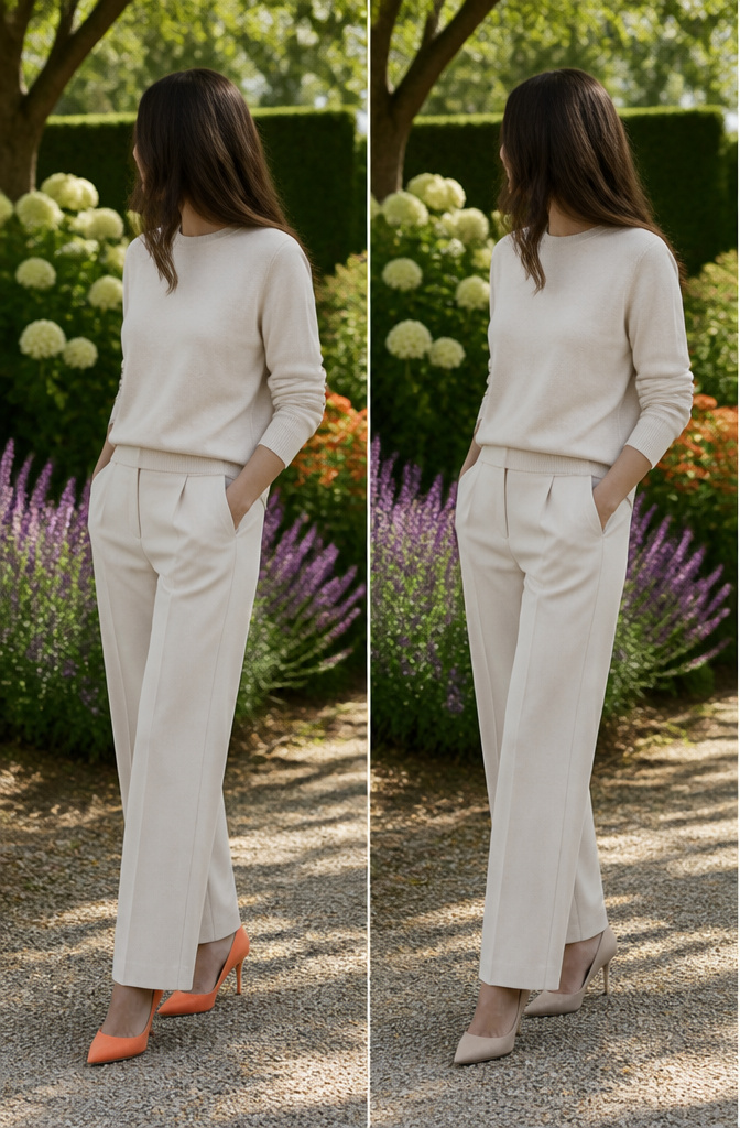
A single bright piece against a neutral base is the safest way to start if color still feels like a risk. The eye goes straight to one saturated point, and everything else you already own keeps doing its job.
Soft orange reads clean against light neutrals like warm white or oatmeal; the warmth in both sides talks to each other instead of fighting. Sage green works the same way as long as it stays matte. A sage green coach jacket over a bone turtleneck and charcoal trousers looks intentional, but the same cut in neon lime reads like a costume from a decade you did not mean to reference.
For a smaller step, shoes carry the whole load. A minimalist sneaker in soft pink suede turns a full neutral outfit into something with a point of view, and if the day goes wrong, the color walks out of the room when you do.
Turquoise and pink, the shades that usually sit unworn in the back of a closet, wake up against winter neutrals like taupe or deep gray. The colder base makes the bright colder too, as if it finally belongs there.
9. Layer Neutrals

A stack of neutral layers reads as a single, intentional piece rather than three separate items you forgot to match. The trick is working with shades that sit far enough apart to register as different, but close enough to keep the eye calm. Think cream over ecru, or warm camel against something with a touch of olive in it. The rule holds from interior work I have seen translated to clothes: let the tones vary and the texture does the rest.
One bright piece against that base feels anchored, not like an afterthought. The eye travels from the quiet depth of the layers to the single point of color and treats the whole outfit as designed. What kills the effect is matching neutrals too perfectly. A cream sweater and cream trousers in identical dye lots flatten everything and make the bright piece look like you threw it on to fix the boredom. Let your beige have a little gold in it, let your white carry a bluish cast, and the contrast between them becomes the architecture the bright color sits on.
I keep a cognac belt or a pair of suede pumps in the rotation for exactly this. They bridge warm and cool neutrals without breaking the monochrome, and when a single coral blouse or emerald scarf shows up against them, the color owns the moment instead of fighting its way in.
That is the difference between wearing a bright piece and styling it.
What Counts as Neutral
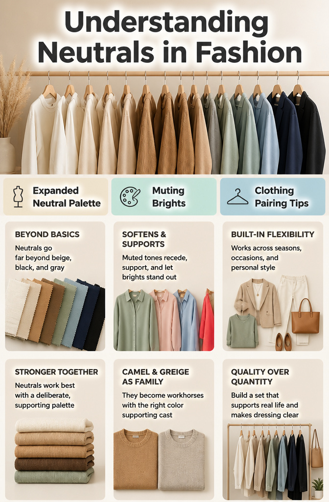
The old rule still gets passed around: a neutral means beige, black, and maybe gray if you’re feeling wild. That narrow definition leaves most of your closet out of the conversation, and the 2026 shift runs wider. White, cream, the full range of browns, navy, and black sit at the center, but muted tones like blush, sage green, soft blue, and olive-based earth tones act as functioning neutrals too. A shirt in faded sage behaves the same way a beige one does; it recedes, it supports, it lets a bright color do the shouting.
What changed my own thinking was treating camel and greige as family members rather than afterthoughts. One camel sweater became a workhorse because it sat in a deliberate palette with warm browns and softened whites. Another sat untouched because I had bought it as a generic "goes with everything" piece without that supporting cast.
This broader definition turns a small neutral capsule into something far more flexible. A blush or stone tone gives you the same grounding as beige but reads softer against skin, and navy does the work of black without the harsh edge. The point is not to collect more neutrals. It is to build a set of colors that support your real life and make getting dressed feel clear.
Warm Neutrals Against Cool Neutrals

Two shirts can both read as beige under store lights and still steer an outfit in opposite directions once the bright color comes in. The difference is undertone, and neutrals carry it exactly the way brights do.
Cream and camel lean warm because of their yellow-to-orange base, while slate and dove gray carry a blue or green cast that places them on the cool side of the scale. The practical test is to hold the neutral against your skin in daylight and note whether it picks up warmth or saps it. Then hold it against the bright piece you plan to wear. If the neutral and the bright share a temperature, they amplify each other without fighting.
A camel sweater with a coral skirt works because both carry that same underlying warmth. Swap in dove gray with coral and the look can slide into discord, not because the colors themselves clash but because their temperatures compete. Pick one dominant neutral first, then echo its warmth or coolness in whatever else you add. That rule has saved more outfits in my closet than any color wheel ever did.
Texture Pairings That Work

Texture keeps a neutral-and-bright outfit from flattening into a single plane. The eye reads the contrast in finish before it notices whether the palette is restrained.
These pairings give the most mileage:
- Silk with wool — fluidity against structure. The matte wool absorbs light while the silk catches it, so the neutral body and the bright accent each claim their own territory. This works across body types because the wool adds weight where projection helps and the silk drapes where softness does. Year-round, though best in transitional months.
- Denim with leather — casual surface beside clean finish. Straight or wide-leg premium denim in a clean wash acts as a neutral foundation; the leather, even as a small belt or bag, sharpens the whole. Skip this if the denim is distressed; the texture clash turns competitive instead of complementary.
- Cotton with cashmere — crispness warmed by loft. A fine-gauge cashmere sweater over a cotton poplin shirt gives the bright color in your jewelry or scarf a plush ground to pop against. The pairing reads expensive without shouting, and the cotton’s structure flatters straighter builds while cashmere softens angular shoulders.
- Suede with crisp cotton — softness sharpened by polish. Best in fall and spring; summer suede looks effortful, winter cotton looks stubborn.
- Linen with fine-gauge knit — airy texture with restraint. This is the summer answer to silk-and-wool: the knit keeps the linen from looking like vacation luggage, the linen keeps the knit from overheating. The combination needs a clear silhouette to avoid reading as pajamas.
Accessorizing Without Overdoing It

One mistake I used to make, wearing a cream top and trousers to the office, was piling on every bright thing I owned at once. The belt, the earrings, the bag, the shoes; suddenly I looked like I was trying to win a contest instead of dress for Tuesday. One statement piece beats several competing ones, and the math is simple: eyes land once, then relax.
A bright bag works harder than bright shoes for anyone who sits behind a desk or at a dinner table, where feet stay hidden for hours. Shoes only speak during the walk in and the walk out. The bag, though, sits right there through the whole meeting, that jolt of pink or turquoise against your neutral base doing its job without shouting for attention.
Metal finishes count as neutrals when they are quiet: your standard gold, silver, gunmetal. Rose gold or hammered bronze lean toward accent territory, and they behave like color, not like hardware. Two bright pieces can coexist if one of them is your actual neutral metal, but three bright elements is where I draw the line. A neon cross-body bag, airy oversized scarf, and lacy black pantyhose together work because the hose read as texture, not as a third color claim. Texture creates interest; competing brights create noise.
Layering Order for Different Seasons

Cotton or silk jersey sits against skin in every season because it breathes and slides under the next layer without bunching. I add a bright shell or tee as the second layer, not the first, so it stays visible when a neutral cardigan or blazer comes off indoors.
Forcold months, a cashmere crew or thin merino polo goes third, topped by a structured wool coat in camel, navy, or charcoal. The coat frames whatever bright piece peeks at collar or hem. When temperatures swing, I shed the coat and let the sweater read as the new outer shell rather than looking half-dressed.
Warm weather reverses the stack: the bright layer becomes a sleeveless top or cropped shirt, with a loose linen overshirt in sand or oatmeal as the only cover. The neutral goes on or off all day without clashing, since the bright piece was chosen to stand alone anyway.
Fabric weight matters more than color. A heavy bright knit under a light neutral jacket feels wrong both visually and physically; the drape pulls and the colors fight. If the day demands adding a layer, the bright piece should be thin enough to disappear under a neutral without bulk, or bold enough to stay on top and own the whole look.
Frequently Asked Questions
How do I wear neutrals without looking boring?
Mix textures like silk with wool or denim with leather to create visual depth before color even enters the outfit. Add one statement accessory, such as a sculptural belt or bright bag, to serve as intentional punctuation rather than an afterthought. Unexpected details like an asymmetrical hem or small print also keep the eye moving without competing for attention.
Can I mix different shades of neutrals?
Yes, but match undertones to keep the combination intentional rather than accidental. Warm neutrals like cream, camel, and sand share a yellow-to-orange base, while cool neutrals such as slate and dove gray carry a blue or green cast. Pair a deep charcoal with a pale dove gray for depth, or let cream sit over ecru with texture bridging the two.
What are some good neutral color combinations?
Navy with gray, camel with cream and sand, or slate with dove gray and clean white all work as controlled palettes. For a softer alternative to black, navy does the same framing work without harshness. Blush or stone tones read gentler against skin than beige while still supporting brighter pieces.
How can I incorporate bright colors with neutrals?
Introduce one bright piece as the focal point against a neutral base built from texture and tonal variation. Soft orange reads clean against warm white, turquoise wakes up against winter taupe, and a single coral blouse owns the moment when layered neutrals provide the architecture. Shoes in soft pink suede or a neon cross-body bag can carry the entire color load if the rest of the outfit stays quiet.